
Genius Pages only. The components described here belong to the Genius component set. They are not interchangeable with classic Pages components — even when the names look the same, the options and runtime behavior differ.
Tabs
The Tabs component lets users switch between different sections of content within the same view without navigating to a new page. It works as a parent wrapper for one or more Tab components – each Tab holds its own content, and only one Tab is visible at a time.

To add a Tabs component to a page, ask Genius to include one via a prompt, or drag it manually from the components overview.
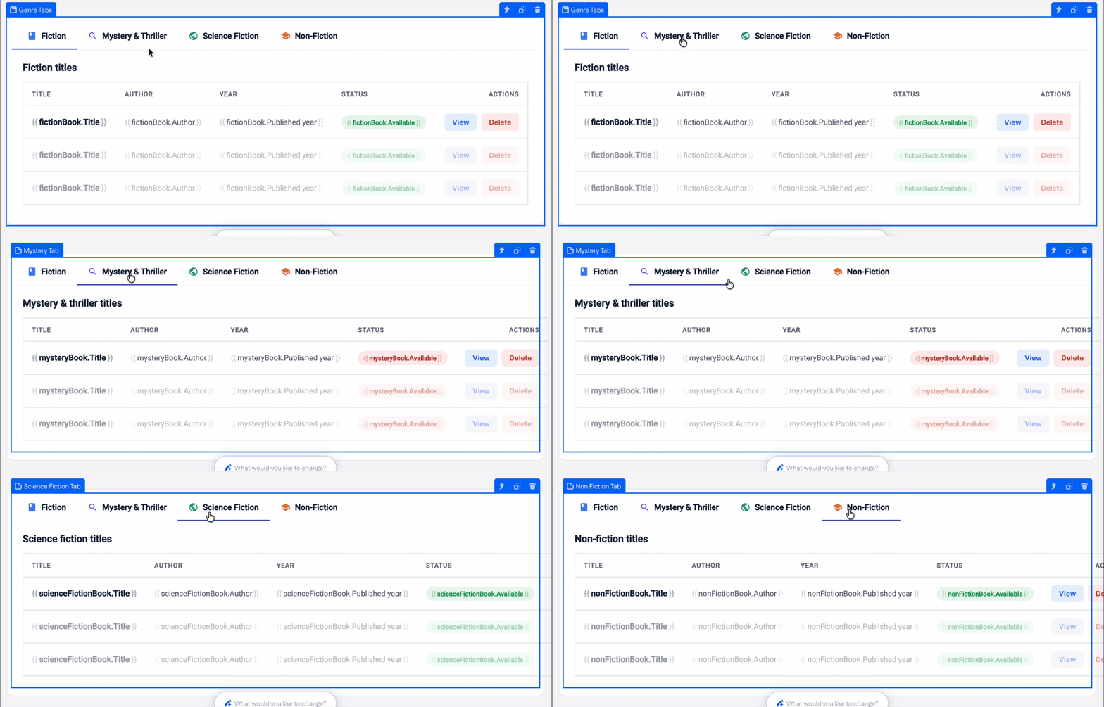
You can switch between tabs (child component is a single Tab) directly on the canvas while building – click a tab label and the builder shows that tab's content. Earlier Material UI–based Tabs required switching through the options panel; the Genius Tabs can be navigated inline.
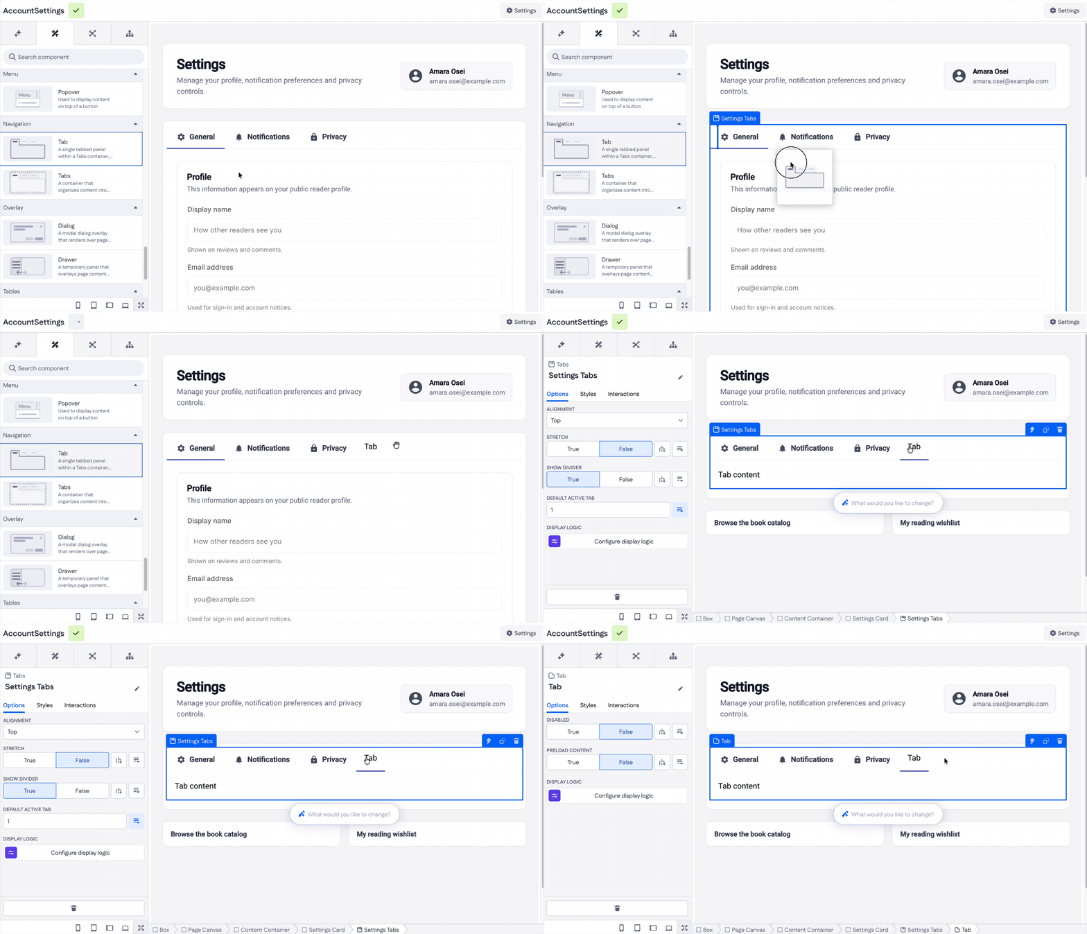
To add a new tab, drag a single Tab component onto the existing Tabs component from the components overview.
Options
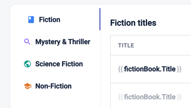
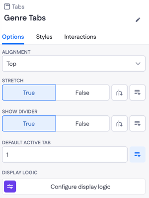
- Alignment — Top, Bottom, Left, or Right. Controls where the tab labels sit relative to the content. See tabs aligned left below:
- Stretch — True or False. When True, tab labels stretch to fill the available width. Mostly applies to horizontal alignments (Top or Bottom).
.gif?width=670&height=170&name=Screen-Recording-2026-09-02-at-1%20(1).gif)
- Show divider — True or False. Shows a divider line between the tab labels and the tab content.
- Default active tab — the tab number that's active when the page first loads (default: 1).
- Display logic — show or hide the Tabs component on certain condition. More in this article.
Several options (Stretch, Show divider, Default active tab) also expose the Configure data condition and Select property controls next to them, so their values can react to live data instead of being static. See the Menu and overlay article for how these two controls work – the behaviour is the same.
Interactions
The Tabs component supports one interaction trigger:
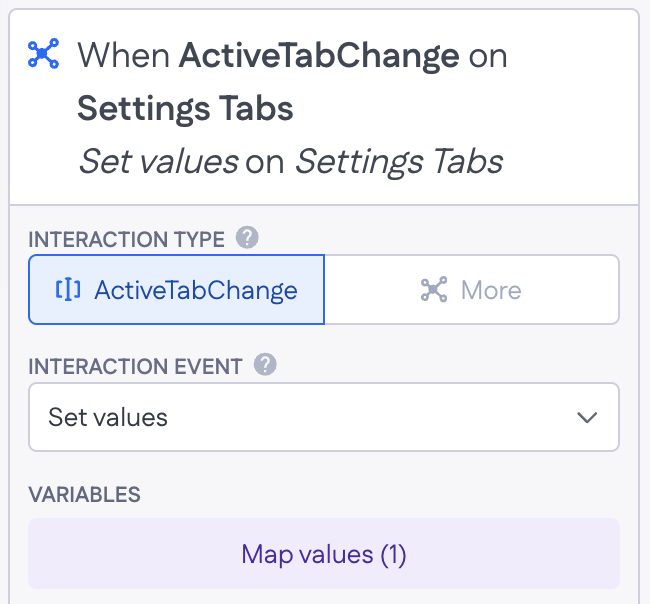
- ActiveTabChange — fires when the user switches to a different tab. Wire this to a function like Run Action, Set values, or Refetch page variable to react to the tab change.
Use case example:
|
|
On a settings page with tabs for General, Notifications, and Privacy, ActiveTabChange fires when the user switches. Wire it to Set values → update a |
Tab
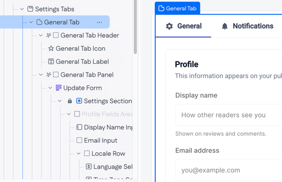
A Tab is a single section inside a Tabs component. It holds the content shown when that tab is active – any combination of other components (a Text, a Form, a Table, or a whole layout).
Options
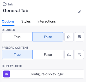
- Disabled — True or False. Disables the tab so users can't switch to it.
- Preload content — True or False. When True, the tab's content is rendered as soon as the page loads, even before the user opens the tab. Useful when the content is quick to render but you want it ready in memory; leave False when the content is heavy and only needed on demand.
- Display logic — show or hide the Tab entirely based on a certain condition. More in this article.
Both Disabled and Preload content expose the Configure data condition and Select property controls, so their values can be driven by data instead of set statically.
Interactions
- Select — fires when the user selects the tab. Wire this to any interaction (Run Action, Reset values, Refetch page variable, and so on) to react when the tab becomes active.
Use case example:
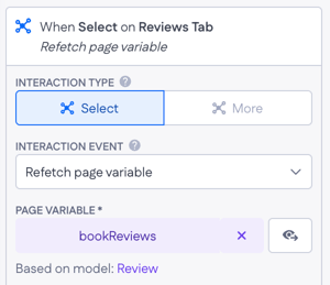 |
When the user clicks on the Reviews tab, Select interaction fires and runs Refetch page variable on the bookReviews variable – so the reviews list is always fresh, not cached from earlier in the session. |