Using display logic on your pages
Dynamically showing data based on filters.
With the display logic, you can create conditional logic, just like you would create a filter for a model. This allows you to display or hide a part of your page with complex logic using grouping and AND/OR logic.
Currently, you'll find the display logic (under the logic option category) inside the following two components:
-
Box
-
Conditional
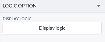
You can locate the display logic for these two components in the logic options category within their settings, once the component is placed on your canvas. The display logic supports various types of variables, allowing you to use data from data components, page variables, and form inputs.
Setting up the display logic
Note: we're using a Data container in the example below but you can also create this using the new page variable feature, read more about that here.
In this example, we will be applying the display logic to a detail page. In this detail page, we can view the details of a project, and create additional tasks that belong to the project. However, once the project is done we don’t want users to be able to add new tasks since the project is finished.
With the display logic within a Box, we will hide the ‘Create task form’ once the status of the project is set to ‘Done’.
To set the display logic within a Box, you first need to make sure the Box is placed within a data component, this way the box can filter its display logic based on the data used within the page.
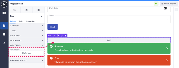
Here, the Box is placed within a Data container on a detail page that shows the data of a single project. You can see the Box is within a Data container because the blue edge of the box now shows purple, meaning data is connected to this component.
Open the Logic option tab in your box component settings and press the Display logic button to open the configuration wizard.
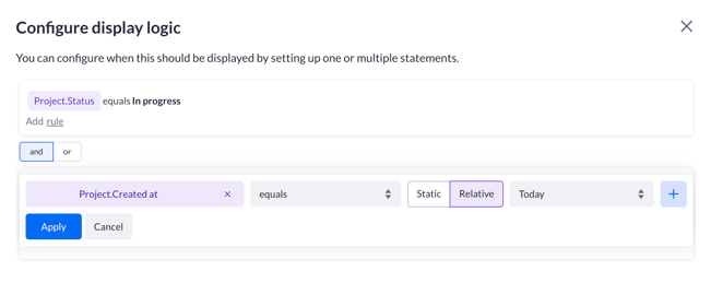
We only want to show the Create form whenever the project still needs to be finished.
Therefore we are setting up the filter in a way the Box will hide when the status is equal to Done.
For more information about setting up the data filter, check our Data filtering document.
After configuring the display logic filter, drag the Create form inside the box.
Everything placed inside the box will now follow the display rules.
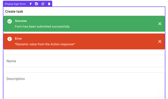
Result
We can now compile our page and test this. When opening up a project detail page that shows a project with the status ‘In progress’.
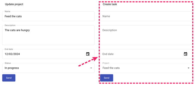
After changing the status to ‘Done’ and pressing Save, the box including its content will hide from sight, exactly the way we have set it up!

You can apply this to pages or parts of pages where you only want to show certain segments or data based on data in your application.
Keep in mind that it's also possible to use page variables when setting up the display logic filtering for the Box component:

Other use cases
You can use display logic for more precise use cases as well, for example, in the Create form we can hide an input if a different input has a certain value. An example would be when you need to register yourself and, if you have a partner, your partner as well.

In the example above you can register yourself but in the image above is a Conditional that only shows its contents when you click on the checkbox to verify that you have a partner. The conditional is configured like this:

We're checking whether the Checkbox is checked or not if it shows the partner inputs.

Request information
Page variables also have a built-in feature named 'Request information', this is the status of a page variable. This status allows us to show a loader when the data is still loading like the image below.

To create a loader like the image above you can create a public file that you can upload in a Media component like so:

In this example, the Media component is contained within a Conditional component. Within the Conditional component, we can select the Request information of a page variable like this:

If we check whether the component's loading state is 'True', we will see the spinner pop up that we just added.

Beware that the chances of seeing the loading state are very low if you have good internet speed and if the data you want to show isn't that big.
When compiling the page, we'll be reducing our bandwidth for this example. Here you can see the spinner pop up for a brief moment:

You can apply the same logic for the 'Is error', and 'Is success' request information. You can also use this logic in the Multi rule option of the Conditional component:

You can use the following form inputs in your display logic:
-
Text input
-
Text area input
-
Number input
-
Phone number input
-
Decimal input
-
Rating input
-
Email input
-
IBAN input
-
Password input
-
Price input
-
URL input
-
Checkbox input
-
Switch input