This article describes the Form input and control components available in Betty Genius–generated Pages, with their options and basic use cases.
Genius Pages only. The components described here belong to the Genius component set. They are not interchangeable with classic Pages components — even when the names look the same, the options and runtime behavior differ.
How inputs work in Genius Pages
When you drop an input component onto the page – either directly or inside a Form – a setup wizard appears to help you configure it, typically by asking which model property the input should bind to. The wizard runs every time you add an input.
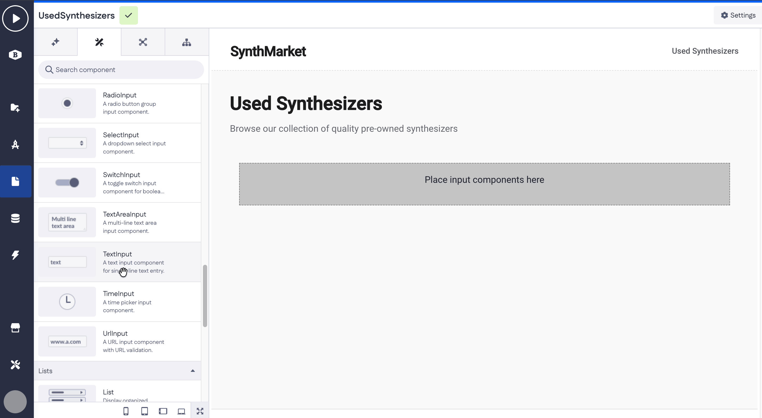
Most inputs share a common baseline of options:
- Property — the model or page-variable property the input binds to.
- Label — the visible label above the input.
- Default value — pre-filled value at page load.
- Placeholder — hint text shown when the input is empty (not present on Checkbox, Switch, Date, Date Time, Time, Radio, Select).
- Helper text — small text under the input.
- Required — True or False.
- Disabled — True or False.
- Display logic — show or hide the input.
The sections below focus on what makes each component different from this baseline. Where an option matches the baseline, it's not repeated.
Quick reference
| Component | Distinctive options |
|---|---|
| Autocomplete | Data source, Data for options, No options text |
| Button | Text, SVG path, SVG positioning, Disabled, Loading, Link to, Page, Open in |
| Checkbox | Default value (True/False), no Placeholder |
| Date | Format (YYYY-MM-DD), no Placeholder |
| Date Time | Format (YYYY-MM-DD HH:mm), no Placeholder |
| Decimal | Decimal separator (Comma/Point), Scale |
| Email format validation | |
| File Upload | Asset property, Allowed file types, Max file size, Drop zone title, Drop zone subtitle |
|
Multi Autocomplete |
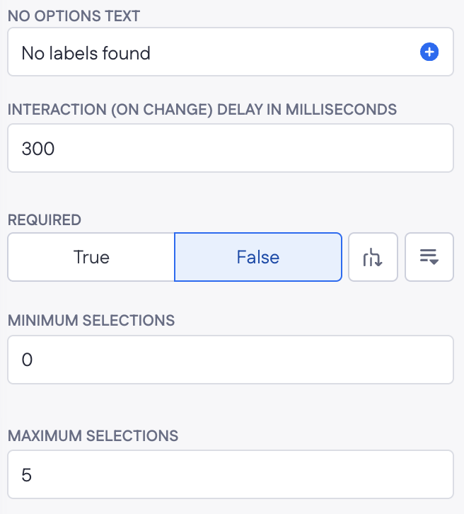
Data source, Data for options, No options text, Interaction delay, Minimum/Maximum selections |
| Asset property, Validation (Allowed file types, Max files, Max file size), Content (Drop zone title/subtitle, Add more text, Remove button text) | |
| Number | Whole numbers only |
| Password | Masked input |
| Phone | Phone format |
| Price | Currency symbol, Decimal separator |
| Radio | Data source, no Placeholder |
| Select | Data source, no Placeholder |
| Switch | Default value (True/False), no Placeholder |
| Text Area | Multi-line |
| Text | Single-line |
| Time | Format (HH:mm), no Placeholder |
| URL | URL format validation |
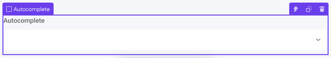
Autocomplete
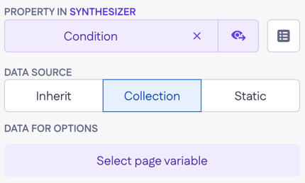
A dropdown that lets users pick one option from a list. The list comes from a collection page variable — when you generate a page using a prompt, Genius wires this up automatically. Autocomplete is the right choice for Belongs-to relations or long option lists where a Select would be too long to scroll through.
|
Distinctive options
|
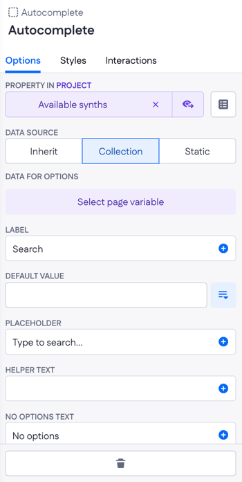 |
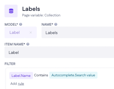
Note on search. If you add an Autocomplete manually by dragging it onto a page, search isn't wired up by default. To enable it, open the filter on the page variable that supplies the options and reference the Autocomplete's searchValue — for example, name contains Autocomplete.searchValue. The filter is flexible: you can match on any property (not just name), use any operator (contains, equals, starts with, and so on), and reuse the same searchValue across multiple page variables if one Autocomplete needs to filter several lists at once.
Example
On a “New synthesizer” Form, add an Autocomplete for the Brand (Belongs-to relation). Set Data source → Collection and point Data for options at a Brands page variable. By default the user opens the dropdown and picks from the full list of brands — they can’t filter by typing unless you add a filter on the Brands page variable like name contains Autocomplete.searchValue.
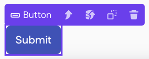
Button
Triggers a page action, navigates to a page, or submits a Form.
|
Options
|
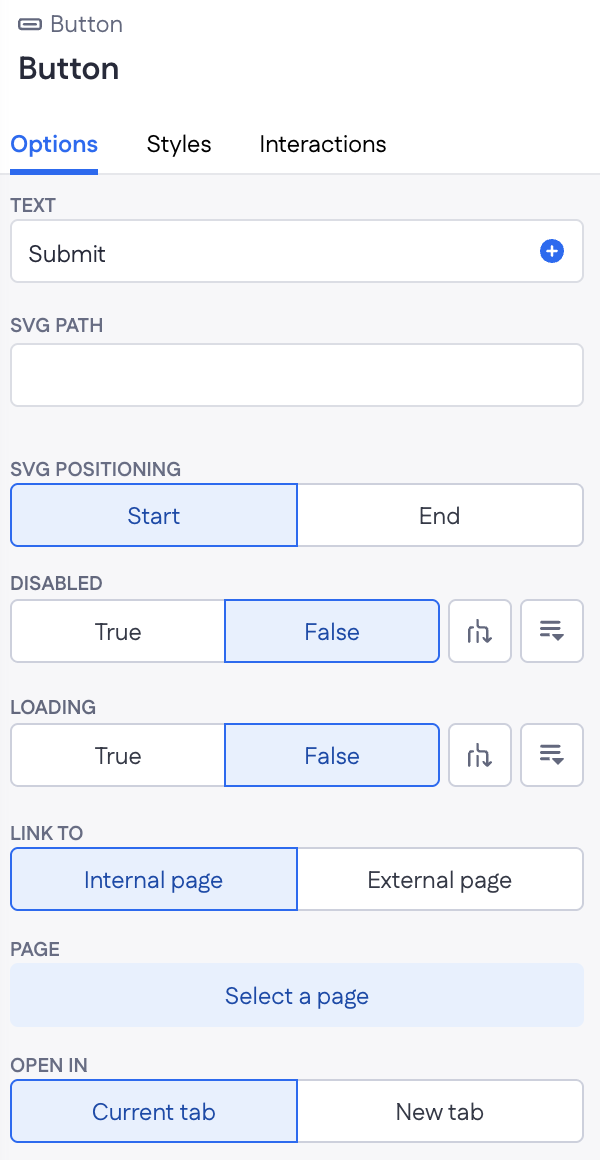 |
Note: connecting a Button to a runtime action happens via the Run page action interaction (configured on the Interactions tab), not as an option here.
Example
A "Save" Button at the bottom of an Edit form. Wire its Loading option to the Update action's is_loading response so the button shows a spinner during the save and re-enables itself when the record is updated.
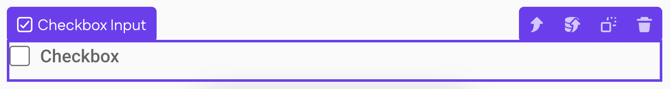
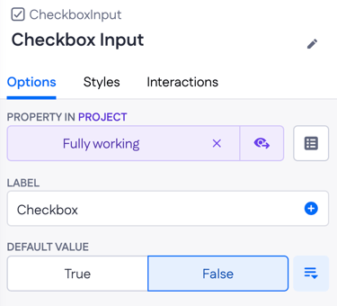
Checkbox
A boolean toggle rendered as a check box.
|
Distinctive options
|
 |
Example
On a settings form, a Checkbox input bound to user.email_notifications. Default value False so new users opt in deliberately.
Date
Picks a date. Use with Date properties.
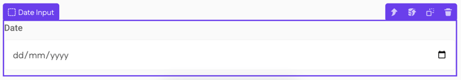
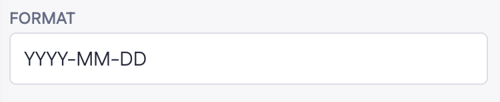
Distinctive options
- Format — the date display format (default:
YYYY-MM-DD). - No Placeholder option.
Example
On a booking form, a Date input bound to booking.check_in_date with Format YYYY-MM-DD.
Date Time
Picks a date and a time. Use with Date time properties.
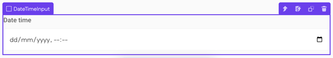
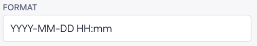
Distinctive options
- Format — the date-time display format (default:
YYYY-MM-DD HH:mm). - No Placeholder option.
Example
On an event form, a Date time input bound to event.starts_at so the user can pick both the day and the time of the event in one field.
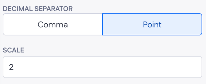
Decimal
A numeric input that accepts decimals. Use with Decimal properties.
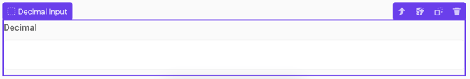
Distinctive options
- Decimal separator — Comma or Point. Controls which character is shown and accepted as the decimal separator.
- Scale — number of digits after the decimal separator (default: 2).
Example
On a measurement form, a Decimal input bound to sample.weight_kg with Scale 3 to capture grams precisely (for example, 1.250).
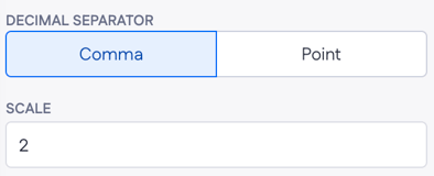
A text input with email format validation. The Required and Disabled options behave the same as other inputs; the email check runs automatically on submit.
Example
On a sign-up form, an Email input bound to user.email with Required → True.
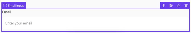
File Upload
Uploads a file from the user's device to the application's file storage. Has a larger set of options than other inputs because file handling involves both the file and its asset record.
|
Distinctive options
|
|
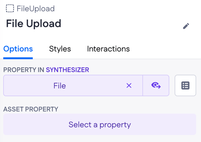
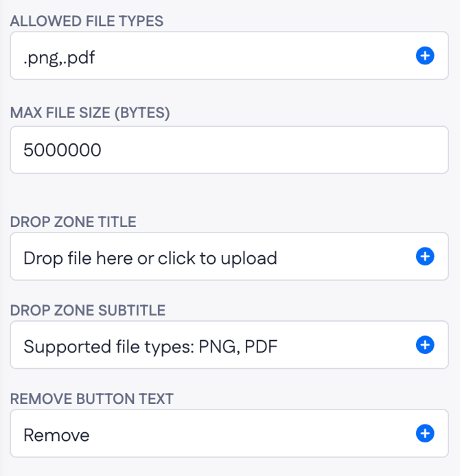
Note: You can configure Allowed file types (and other options) via an AI prompt, or set them manually in the option field using MIME types. For example, to allow all image formats, enter image/*
Example
On a job application form, a File upload bound to application.resume. Set Allowed file types to .pdf,.docx and Max file size to 5000000 (5 MB). Drop zone subtitle: "Supported: PDF, DOCX • Max 5 MB."
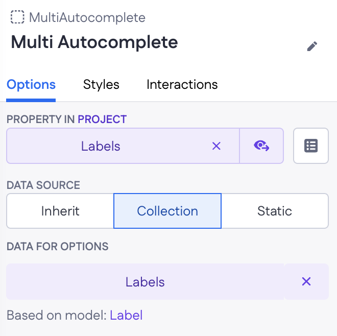
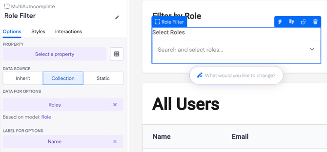
Multi-autocomplete
A dropdown that lets users pick multiple options from a list at once. Like Autocomplete, the list comes from a collection page variable, and Genius wires this up automatically when generating a page from a prompt.
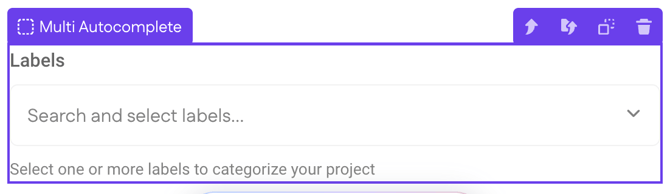
Multi-autocomplete is the right choice for many-to-many relationships — assigning multiple roles to a user, multiple labels to a project, or filtering a data table on multiple values at once.
|
Distinctive options
|
|
Example — assigning relational data on a Form
On a "New project" Form, a Multi-autocomplete for Labels (Has-many relation) is bound to a Labels page variable. The user picks several labels at once, and submitting the form attaches them all to the project.
Example — filtering a data table
On a Users overview, a Multi-autocomplete sits above the users Table and is wired into the filter of the users page variable. Picking "admin" and "member" filters the table to users with either of those roles. Adjust the Multi-autocomplete's filter rule on the variable to control whether the match is "any" (OR) or "all" (AND).
Multi File Upload
Uploads multiple files from the user's device to the application's file storage in one go. Used when a single record needs to hold a set of files — for example, a match record with several image attachments or a project with multiple supporting documents.

|
Distinctive options
|
 |
|
Validation options
|
 |
|
Content options
|
 |
Example
On a project intake form, a Multi File Upload bound to project.documents lets the user attach contracts, briefs, and reference materials. Set Allowed file types to .pdf,.doc,.docx, Max files to 20, and Max file size to 10000000 (10 MB) per file. Drop zone title: "Upload project documents."
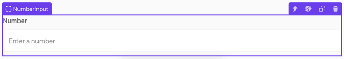
Number
A whole-number input. Use for fields that store quantities, counts, or any value without a decimal part.
Example
On an order form, a Number input bound to order_line.quantity.
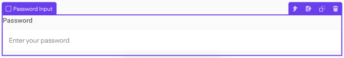
Password
A masked text input. Typically used in login or registration flows.
Example
On a registration form, a Password input bound to user.password with Required → True and Helper text "At least 8 characters."
Phone
A text input formatted for phone numbers.
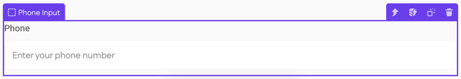
Example
On a contact form, a Phone input bound to contact.phone_number.
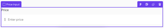
Price
A numeric input formatted as currency. Use with Price properties.
|
Distinctive options
|
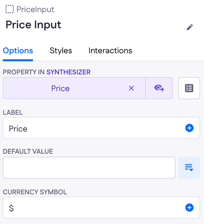 |
Example
On a product form, a Price input bound to product.price with Currency symbol € and Decimal separator → Comma for European pricing conventions.
Radio
Picks one option from a small visible set. Best for 2–5 options.
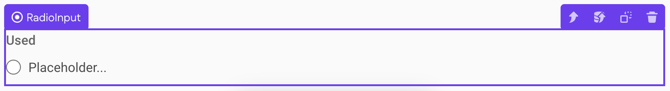
Distinctive options
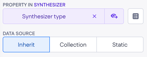
- Data source — Inherit, Collection, or Static. Same behavior as on Autocomplete.
- No Placeholder option.
Example
On a shipping form, a Radio input bound to order.shipping_method with three static options: Standard, Express, Overnight.
Select
A dropdown for picking one option. Best for short fixed lists; use Autocomplete for long lists.
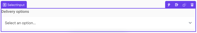
Distinctive options
- Data source — Inherit, Collection, or Static. Same behavior as on Autocomplete.
- No Placeholder option.
Example
On a synthesizer form, a Select input bound to synthesizer.type with static options: Analog, Digital, Modular, Hybrid.
Switch
A toggle alternative to a checkbox. Same boolean storage, different visual style — use the one that fits the visual context.

Distinctive options
- Default value — True or False.
- No Placeholder option.
Example
On a settings page, a Switch input bound to user.dark_mode so the toggle reads naturally as on/off.
Text Area
A multi-line text input. Use for descriptions, comments, or long-form text.
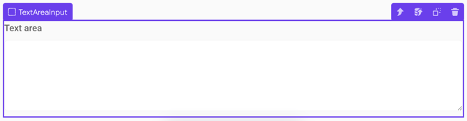
Example
On a synthesizer listing form, a Text area input bound to synthesizer.description for the seller's notes.
Text
A single-line text input. The default for short free-form text.
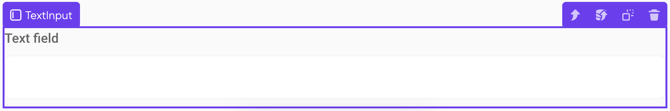
Example
On a contact form, a Text input bound to contact.first_name.
Time
Picks a time. Use with Time properties.
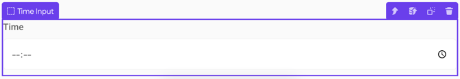
Distinctive options
- Format — the time display format (default:
HH:mm). - No Placeholder option.
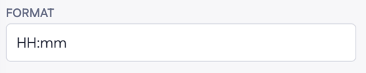
Example
On a daily schedule form, a Time input bound to appointment.start_time with Format HH:mm.
URL
A text input with URL format validation. The URL check runs automatically on submit.
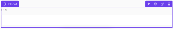
Example
On a profile form, a URL input bound to user.website so invalid URLs are caught before submission.