Form components serve to gather input from users and submit it to the action(s) connected to the form. In other words, by employing Form components, one can create web pages with input fields connected to a data model.
First steps with Form
After dragging a Form component onto your canvas, a configuration menu appears that allows you to create the form based on a data model or without.
- When creating a form based on a data model, you can select the model properties you wish to collect from users. These properties will be automatically created as input variables within the model action.
- When creating a form that isn’t based on a model, you will need to assign a name to the action created with the form, and this can be done without any data being associated with the form.
As you create a new form based on a model, input components based on the property type of the selected model property will automatically be generated.
As seen in the example, Text (single-line) and Email properties from the Employee model are selected in the configuration wizard of the form.

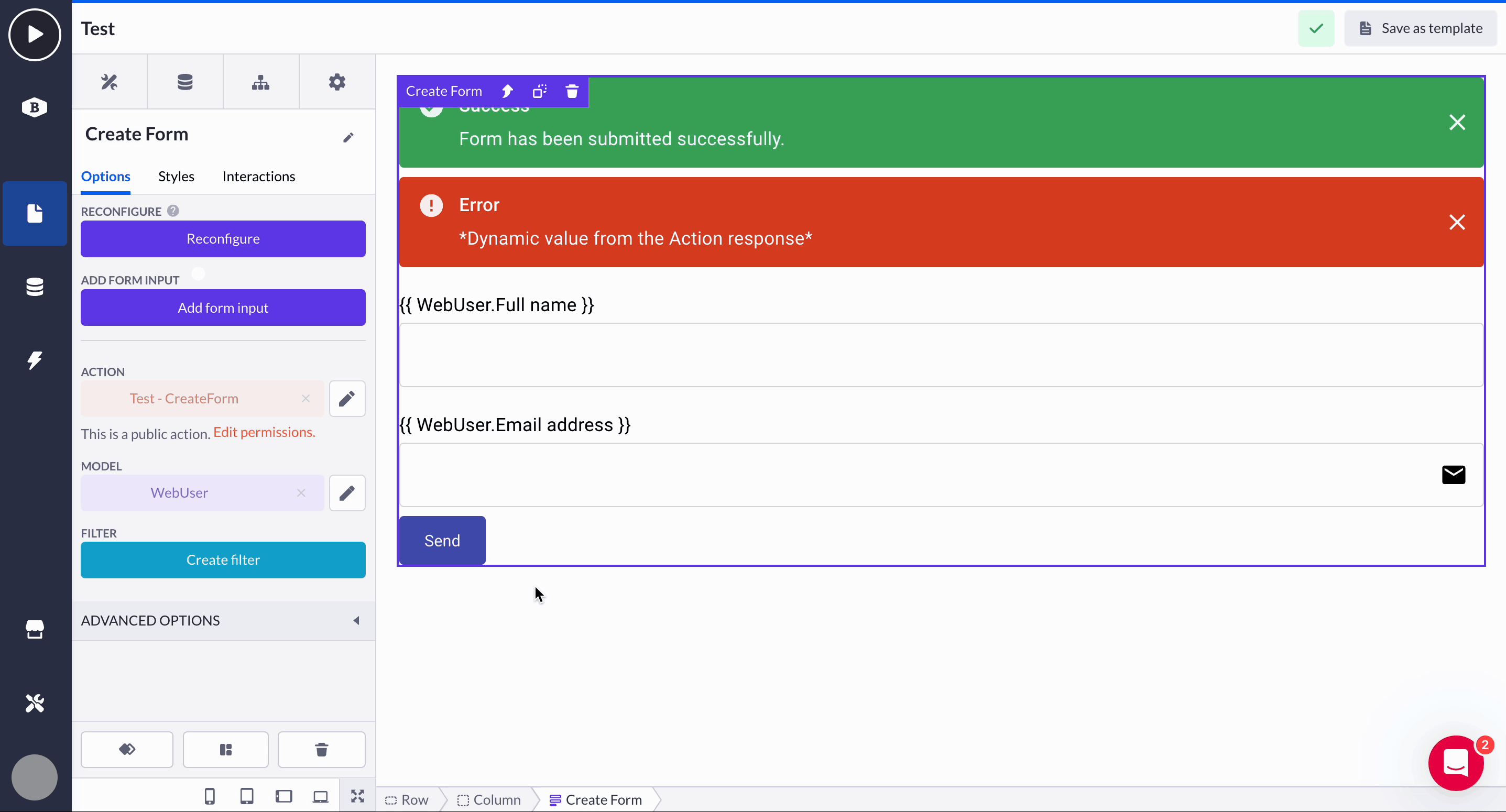
A standard Form component comes with a Submit button and two Alert components. The Submit button is connected to all the input fields you drag into the form, and when connected correctly, it will submit all the data you are asking from your users via the form.

Alert components are created alongside the Form component and are activated based on the action outcome and predefined interactions with the form. If the action submits the data successfully, the green success alert shows, and on an error, the red alert with the corresponding message will show.
- onActionError
This event is triggered when there is an error within the action flow. This specific event also passes the error messages so that they can be displayed within Alert component. - onActionLoad
This event is triggered when the action is processing the submitted data of an end-user
- onActionSuccess
This event is triggered when the action flow is executed successfully

The action and model connected to the Form are reachable and can be edited via the options:

What are Form input components?
Input components work together with Forms to collect information based on user input. Think about the various data points you might need to gather in a customer survey! The fields where users select their satisfaction level (Select), share their bank account number (IBAN), or indicate their age (Number) are all input fields. Form input components can be found along with other Forms in the component overview in Pages.

Best practice is to align the input field with the type of data you intend to gather. For instance, if you want respondents to rate their experience on a scale of 1 to 5, use Rating input component. If you need to offer a preferred payment method, like 'Credit card', 'PayPal', or 'iDeal', choose Radio button input component instead.
A variety of input components, corresponding to the data you would like to collect and can save in your application, are explained in Form input components.
Action syncing
When updating a form input, your action step may be automatically updated if the action synchronization feature is turned on. If you would like to enable action synchronization yourself, look into What is action syncing? article for more info.

Adding new inputs
While in the Form component options, select Add form input to launch the configuration wizard.
- Choose an input component from a dropdown displaying all available input options, complete with names and icons.
- Input type determines how to bind the new input to their form:
-
- Property-based - Select an existing model property to bind to the input. The list is filtered based on the chosen component. One can also create new properties within this flow
-
- Non-property-based: Alternatively, you can bind the input to an existing action input variable or create a new one by typing its name in the provided text field (shown by default).
.gif?width=670&height=345&name=Screen-Recording-2025-04-16-at-2%20(4).gif)
- Once you have configured the input component and its binding, click Save. The new input will be added as the last element within your Form.
Options: Forms and inputs
Form component
Options
-
Reconfigure
Enables you to rearrange or remove items within the Form. The input is also eliminated from the Form's action when removed via this wizard

-
Action
Navigate to the action where the Form is submitting its input to. Also, reach the action's permissions with Edit permissions button

-
Model
The model that this form is based on is a record that is being loaded in the context of the form.

-
Filter
Configure the filter based on the selected model. More about filtering - here.

Altering data
Input components in Forms (e.g., Date picker, Decimal, etc.) ignore the format from property details within data models. They load the raw database value, apply their own format, and display it in the input field. Formats are set directly on the input component.

Form vs other Forms
The regular Form component serves as a foundation for predefined forms, but to push your process faster, it's recommended to begin with a Create or Update form since most user actions involve creating or updating data, making it convenient to have these forms readily available.
However, if you need to pass multiple variables to your action, the regular form is ideal. For instance, if you want to delete several items simultaneously, you can use the regular form by adding multiple Hidden input components and linking them to the action behind the form. Additionally, you can integrate them with schema models, allowing you to gather data within your schema model and modify it later for various purposes.