Alert component
Learn about the Alert component: its characteristics, options, and common uses
After reading this article, you’ll know:
-
What the Alert component is and its major options
-
How to use the components in your application
-
The difference between the Alert component and other content components
The Alert component is a component that informs your users. You can have it pop up notifying a user that whatever he did was successful or that it failed. Most Form components have Alerts integrated for this reason. An alert can also suffice as a pane with information. Alert components that pop up make use of interactions, make sure to check out this article if you want to learn more about interactions.
Options
The Alert component has several options, the first option you'll notice is the Toggle visibility option. With this option, you can hide, or show, the component when you compile the page.

Title text allows you to set a title, for example, you can write down 'Note:' and have this Alert show somewhere on your page notifying a user with information. The option below can then contain the information that you want to show to your user. Also, note that you can add dynamic data here by clicking on the blue plus icon.
If you check the checkbox 'Allow to overwrite by the server response' this means that if you use this component in another component like a Create form, then if the action behind the form fails the error message will be shown here.

Body text is used to display larger portions of text, it works the same as the title text option.

Icon is exactly what the name implies, you're able to select an item here to show next to the title text of the Alert component. By clicking on the button you can scroll through all of the icons and search for one by using a keyword. If you check the 'Collapse' checkbox it'll give the Alert a small button on the right side to close the alert.

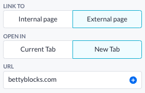
Link to is an option that is used if you want to link somewhere with your Title or Text component, the link can be opened in the current tab (when you compile the page) or an external tab. Linking to an internal page requires you to provide another Page as input, else you'll need to provide the component with an external URL.

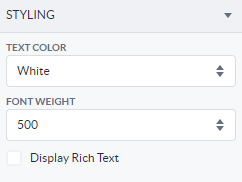
The Styling tab allows you to change the color of your text via the text color option. Make sure to check out this article about the Theme builder if you're uncertain what all the options are. The other option is the font weight this option changes how thick your text is, so if you want a text that's more bold use this option to increase the boldness.

Using the Alert component
Drag the Alert component onto your empty canvas, or above the components you have already put onto your canvas. (You can also drag the Alert component to the top of the page using the page tree).
With the Alert component on your page, you can customize it the way you prefer. Change the content, change the icon, hide it or not. Use it inside of a Conditional component and make it show under certain conditions, check out this article that uses this example.
You can also indirectly use this component by using the Create and Update forms in your application, Alerts will be generated within those components. Check out the interactions on these components to get an idea of how you can build the functionality of having Alerts pop up outside of forms.
Alert component vs other components
Whilst you can make outstanding Boxes with Texts yourself, including an Icon and whatnot configuring an Alert box is way easier than putting in the other component combined. The Alert's main purpose is to inform your users, there's no other component that does this better since the Alert component is super easy to configure and also has a lot of options to make it look precisely the way you want it to look.