After reading this article you’ll know:
-
Panel and Expansion panel components: their major characteristics and options
-
How to use these components in the page-building process
Panel & Expansion panel explained
Our platform's Pages offer two kinds of panel-based components - Panel and Expansion panel. Both serve as containers that can be used separately or within other user interface elements.
The Panel is a simple container with a title on top that can be used to organize the content in a specific way and make it stand out more within a page. For example, it can be an advertisement or contact details.
The Expansion panel is an improved version of the Panel useful for saving the vertical space on the page. It can be minimized and then expanded as it has a show/hide toggle function by default.
Options
In the Panel’s options, you can type in the title (and select its color), and pick up the panel color from the existing ones in the Theme builder. Inner and outer space options work similarly to other layout components (see Page component options).
The Expansion panel has broader options, a few of which are similar to the Paper component: you can make the edges of the component square and choose one of the three variants of display style. Other options include showing the panel as extended by default (or not) and there are more title style options compared to the Panel. The icon on the right side can also be changed into a different one, the position can be set to the left or right side of the top of the expansion panel and the color can be adapted to your liking.

Using the Panel(s)
Let’s have a quick look at how you can use the Panels in your page layout. As an example, we’ll create a contact details view with the Expansion panel.
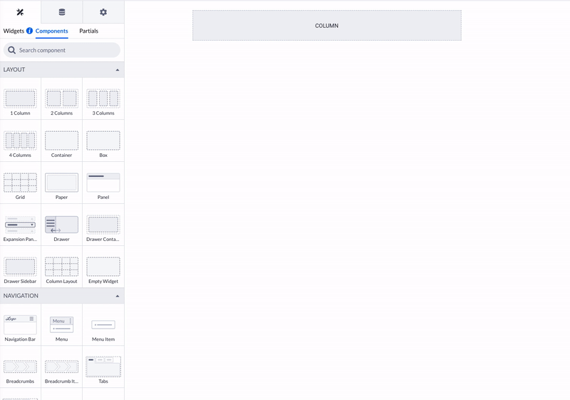
First, drop the Column at the section you want to work with. Then take the Expansion panel and place it in the Column. You can change the panel title to ‘Contact details’, and play around with other options like spacing and title style.
Since the Expansion panel already has a space for holding another component, you can place Text or Title within it. Then you click on that added component and proceed to filling its content like in the example below.
The Panel and Expansion Panel components are additional layout-building tools that can be effectively used to enhance the user interface (UI) by incorporating elements such as ads and contact details. These components can add a more visually appealing manner, making it easier for users to navigate through the content.