After reading this article you’ll know:
-
What the Paper component is and its major characteristics and options
-
How to use Paper as your layout-building element
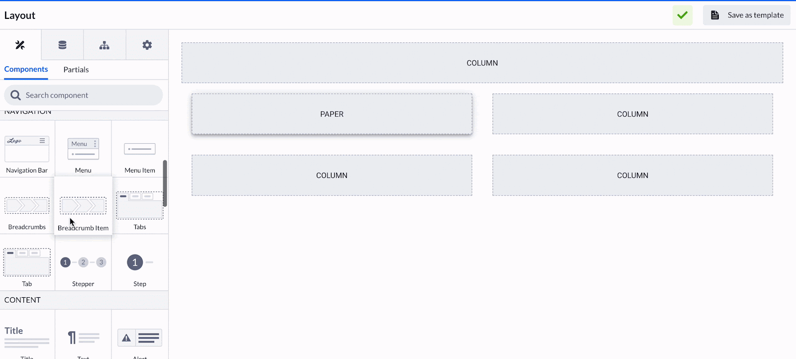
What is the Paper component?
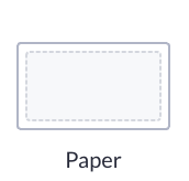
Paper is a layout-building component similar to the Box component with one notable feature - the capability to add shadows to containers, enhancing visual depth and adding a touch of realism to the interface.
Options
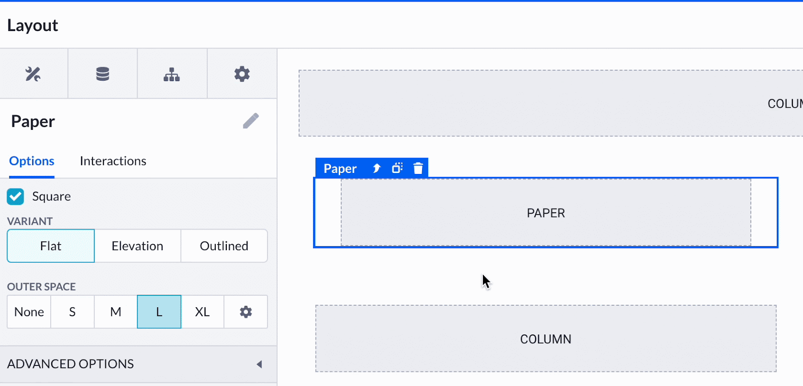
Paper has a rather limited amount of options. Let’s scan through them.
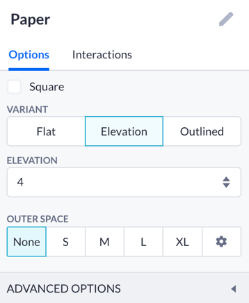
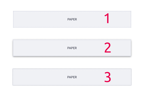
Firstly, you can tick a square option form to change the outline of your component subtly. You can also choose the variant of this component: flat (1) will be the same as the Box component, while elevation (2) casts the shade onto the parent component; the outlined (3) version has an extra border to it.
Paper also has outer space options that you can customize.
Using the Paper
Paper can be viewed as a styling element of your UI design. However in most cases, one can use the Box component which evidently has more flexible options. Paper is good to be filled with the Text component to create a space for an article, for example.
This subtle yet effective design element can make a considerable difference in the overall presentation of an application, creating a more immersive user experience.