Form components
Page builder's form components and their interactions with actions in your application.
Betty Blocks avatar
Written by Betty Blocks
Updated over a week ago

After reading this article you’ll know:

  • What the form components are and how they are configured within your application

  • How these components align with actions

  • Form and input components functions and options

Table of contents

Form components explained

Form components are forms with input fields and a submit button. The main goal of the form component is to gather the input of the user so that this can be submitted to the actions. Then it can go through the action’s configured flow and the user will receive either success or error messages.

Configure form: default, create and update

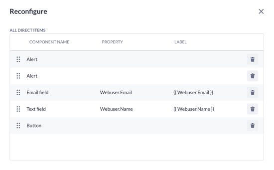
Using the form components, you can create web pages that are connected to your data model. When adding the form component to the canvas, one can first follow the configure form to select what model and properties the form is going to be based on. Depending on what kind of properties are selected, input components will be created within the form to match them.

This is the menu of the configure form when a form component is added to the application canvas. As you can see, there is a selected data model with chosen properties:

Create form

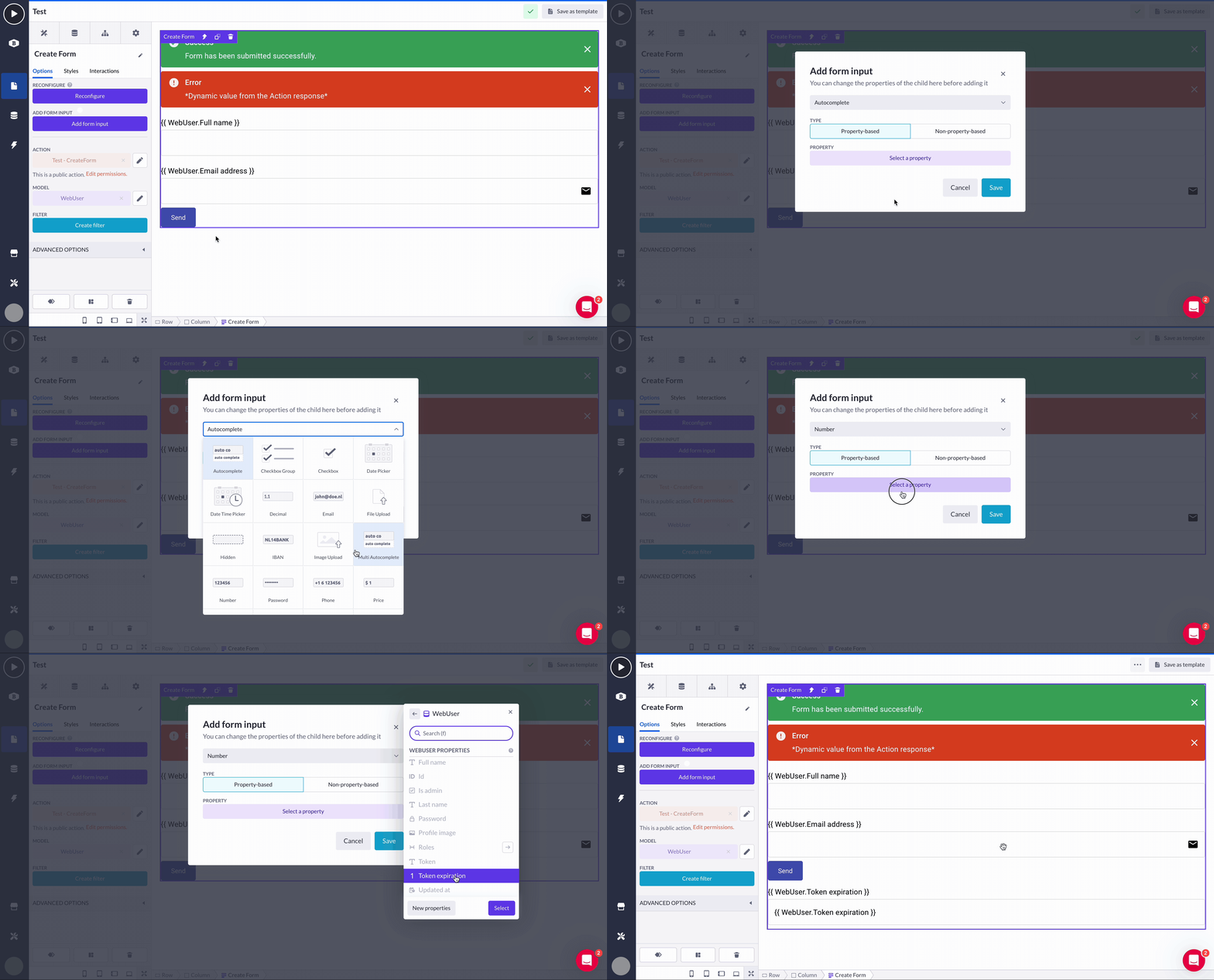
When dragged to the canvas, the create form also adds a success & error alert. These components give the end user feedback depending on the outcome of the action the form is submitting to. The form also has a submit button so that the end user can use this to submit the input data.

All these features are visible in this example of adding the create form (after completing the configure form):

The create form component is the same as the default form component with the exception that the action based on the create form will have a create record step (see the screenshot below). It will be added where the form input component values are assigned to the selected properties.

Update form

The update form has a build-in action that'll automatically be configured for you so that you can easily update the object from the form.

The features are visible in this example of adding the update form (after completing the configure form):

The action and its update record step:

Login form

When adding the login form on the canvas, you first follow the configure login form and select what authentication profile the form is going to be based on. The authentication profile is based on a model within the application and has defined the username & password property. Also, you will have to choose the page user will be redirected to after successful login.

Depending on the configured properties in the authentication profile, the login form will create the input components that match those selected properties.

The login interaction is configured within the form component. The end user’s credentials will be stored as a token in the local storage based on the result of the action and redirect them to the selected page.

That is what the added login form looks like on the application’s canvas. In the interaction menu, we chose that on the action’s success, our end user will be redirected to the home page:

The login form comes with an authentication user step within the action. The inputs of the form component are assigned to these properties to make sure the values the end user fills in are submitted to the action.

Form components

Form

Options

  • Action
    Navigate to the action the form is submitting its use input to.

  • Model
    The model that this form is based on is a record that is being loaded in the context of the form.

Filter

Configure the filter based on the selected model of the model option.

Interactions > Triggers

  • onActionLoad
    This event is triggered when the action is processing the submitted data of the end-user.

  • onActionSuccess
    This event is triggered when the action flow is executed successfully.

  • onActionError
    This event is triggered when there is an error within the action flow. This specific event also passes the error messages so that they can be displayed within the alert component.

  • onActionDone
    This event is triggered when the action flow is executed.

Interactions > Functions

Submit

This component function triggers the form to be submitted.

Input components

Input configuration

When adding an input component to an exiting form, you select what the intended property this input is going to be submitting. The combination of the selected input and property will determine the action input variable that can be mapped to the assigned rows within the action.

Textfield

The text field component enables end users of an application to fill in the text in the input. In the context of the form, this input can be submitted to the action where it can fulfill multiple use cases.

Options

  • Based on Property
    This is the property selected in either the form or input configuration. It is used for the connection between the component and the action input variable.

  • Label
    Configure the label of the input component to give context to the end user what it is intended for.

  • Value
    Configure the value of the input component to give it a default value or base it on a dynamic property.

  • Validation Options
    This functions as a dropdown to reduce the number of options.

    • Required
      When enabled, this input is required and informs the end user if there is no input.

      • Required message
        Configure what validation message is displayed.

    • Validation Pattern
      Fill in a regex pattern that the input needs to pass.

      • Pattern mismatch message
        Configure what validation message is displayed.

    • Min Length
      Configure the min amount of characters the end-user needs to fill in.

      • Value too short message
        Configure what validation message is displayed.

    • Max Length
      Configure the max amount of characters the end-user can fill in.

      • Value too long message
        Configure what validation message is displayed.

  • Autocomplete
    When this option is enabled, the browser of an end user will show autocomplete suggestions. More info.

  • Disabled
    This option sets the input to its disabled state. It prevents the values of this input from being submitted and an end-user from filling in any values.

  • Placeholder
    Show the placeholder text within the input component when a user has the input focused.

  • Helper text
    Adds text below the input to give an end user more information. When there are validation messages, this text will be replaced to display them.

  • Margin
    Configure the spacing around the input component.

  • Size
    The default sizing is available for the input component.

  • Full width
    When enabled, the width of the input will be based on the width of his direct parent container component.

  • Variant
    Select the pre-defined styling variants for the input.

  • Icon
    Displays an icon inside the input component to give context to an end user.

    • Icon position
      The icon can be displayed at the start or end of the input component.

  • Styles options
    This functions as a dropdown to reduce the number of options you see.

    • Configure the various colors used within the input component.

  • Advanced options
    This functions as a dropdown to reduce the number of options you see.

    • Test attribute
      This option allows you to set a data attribute on the component. It can be used to make the selection of these components easier when working with various tools such as testing tools, gathering metrics or even styling based on custom CSS.

Interactions > Triggers

  • onChange
    This event is triggered when the value of the input is changed.

Interactions > Functions

  • Clear
    Clears the value within the input.

  • Reset
    Resets the value within the input to its default.

Enable/Disable

Sets disabled the state of the input.

Text area

The text area component enables end users of the application to fill in multiple lines of text in the input. In the context of the form, this input can be submitted to the action where it can fulfill multiple use cases.

The options are the same as in the text field with the exception below:

  • Multiline

    This option toggles whether the input has multiple rows or not.

  • Rows
    This option specifies the number of rows in the text area.

Interactions

The interactions are the same as in the text field.

File upload

The file upload component enables the end users of the application to upload files in the input. In the context of the form, this input can be submitted to the action where it allows the user to populate 'file' properties.

The options are the same as in the text field with the exception below:

  • Max File Size (MB)
    Fill in a number for the maximum file size in megabytes as client side validation. On the property, the max file size can be set to validate from the server side with a max of 25 MB.

    • Invalid Max File Size Message
      Configure what validation message is displayed.

  • Hide default error

    • If the error message should be displayed on the component

  • Accept Files
    Configure the accepted mime type.

    Note: This will also affect the files the user can select when the file dialog opens.

Interactions > Triggers

  • onChange
    This event is triggered when value of the input is changed.

  • onError
    This event is triggered when the upload of a selected file fails

    • The error message is part of the event

  • onSuccess
    This event is triggered when the upload of a selected file completes

  • onLoading
    This event is triggered when uploading of a file begins or completes

  • onDone
    This event is triggered when the uploading is done, regardless of success or failure

Interactions > Functions

  • ClearFileUpload
    Clears the value within the input

Image upload

The image upload component enables the end users of the application to upload files in the input. In the context of the form, this input can be submitted to the action where it allows the user to populate 'image' properties.

The options are the same as in the file upload component overview with the exception below:

  • Show Image Preview
    When enabled, it will display a preview of the current or recently uploaded file.

  • Image Preview Width
    Defines the width of the preview in pixels.

  • Image Preview Height
    Defines the height of the preview in pixels.

The interactions are the same as in the file upload component overview.

Email

The email input enables end users of the application to fill in an email address in the input. In the context of the form, this input can be submitted to the action where it can fulfill multiple use cases.

Options

The options are the same as in the text field with the exception below:

  • Validation Pattern
    The email input comes with a default value to check if the input matches the format of an email address. Using the input on mobile devices also updates the keyboards to match the intended input of the user.

Interactions

The interactions are the same as in the text field.

Password

The password input enables end users of the application to fill in a password in the input. The default behavior of such inputs is hiding the characters that an end user fills in to make it safer. Also, it has browser-specific behavior and a mobile keyboard switch on mobile devices.

Options

The options are the same as in the text field with the exceptions below:

  • Validation Pattern
    The password input comes with a default value to check if the password matches the minimal requirements defined by Betty Blocks.

  • Icon
    Displays an icon inside the input component to give context to the end user. When clicking this icon it toggles the visibility of the characters within the input.

Interactions

The interactions are the same as in the text field.

Phone number

The phone number input enables end users of the application to fill in a phone number in the input. It has browser-specific behavior and a mobile keyboard switch on mobile devices.

Options

The options are the same as in the text field with the exceptions below:

  • Validation Pattern
    The number input comes with a default value to check if the input matches the format of a phone number. Using the input on mobile devices also updates the keyboard to match the intended input of the user.

Interactions

The interactions are the same as in the text field.

URL

The URL input is used to enable end users of the application to fill in a URL in the input. It has browser-specific behavior and a mobile keyboard switch on mobile devices.

Options

The options are the same as in the text field.

Interactions

The interactions are the same as in the text field.

IBAN

The IBAN input enables end users of the application to fill in an 18-digit IBAN number (with letters) in the input. It has browser-specific behavior and a mobile keyboard switch on mobile devices.

Options

The options are the same as in the text field with an exception:

  • Validation Pattern
    The IBAN input comes with a default value to check if the input matches the format of an IBAN format.

Interactions

The interactions are the same as in the text field.

Hidden input

The hidden input can be used to pass values to the action the end user is unable to directly update.

Options

  • Name
    This is the property that was selected in either the form or input configuration. It is used for the connection between the component and the action input variable.

Value

Configure the value of the input component to give it a default value or base it on a dynamic property.

Checkbox

The checkbox allows you to let the end users submit boolean values.

Options

  • Based on Property
    This is the property that was selected in either the form or input configuration. It is used for the connection between the component and the action input variable.

  • Label
    Configure the label of the input component to give context to the end user what it is intended for.

  • Value
    Configure the value of the input component to give it a default value or base it on a dynamic property.

  • Validation Options
    This functions as a dropdown to reduce the number of options you see.

    • Required
      When enabled, this input is required and informs the end user if there is no input.

      • Required message
        Configure what validation message is displayed.

  • Disabled
    This option sets the input in its disabled state to prevent the values of this input from being submitted and the end user from filling in any values.

  • Helper text
    Adds text below the input to give the end user more information. In case there are validation messages, this text will be replaced to display them.

  • Label Position
    The position of the label versus the checkbox.

  • Size
    The default sizing available for the input component.

Interactions > Triggers

  • onChange
    This event is triggered when the value of the input is changed.

  • IsTrue
    This event is triggered when the checkbox is set to checked.

  • IsFalse
    This event is triggered when the checkbox is set to unchecked.

Interactions > Functions

  • Check
    This component function sets the checkbox to be checked.

  • Uncheck
    This component function sets the checkbox to be unchecked.

Check/Uncheck

This component function sets the toggles to the checked value.

Number

The number input enables end users of the application to fill in a number in the input. It has browser-specific behavior and a mobile keyboard switch on mobile devices.

Options

The options are the same as in the text field with an exception:

  • Validation Pattern
    The number input comes with a default value to check if the input matches a numeric value. Using the input on mobile devices updates the keyboards to match the intended input of the user.

  • Min Length
    Configure the minimum value the end user needs to fill in.

  • Max Length
    Configure the maximum value the end user needs to fill in.

Interactions

The interactions are the same as in the text field.

Price

The price input enables end users of the application to fill in a number in the input. It has browser-specific behavior and a mobile keyboard switch on mobile devices.

Options

The options are the same as in the text field with an exception:

  • Validation Pattern
    The price input comes with a default value to check if the input matches a numeric value. Using the input on mobile devices updates the keyboards to match the intended input of a user.

  • Currency
    You are able to pass in the currency icon via text input. This action replaces the icon option.

Interactions

The interactions are the same as in the text field.

Decimal

The decimal input enables end users of the application to fill in a number in the input. It has browser-specific behavior and a keyboard switch on mobile devices.

Options

The options are the same as in the text field with an exception:

  • Validation Pattern
    The numeric input comes with a default value to check if the input matches a numeric value. Using the input on mobile devices updates the keyboards to match the intended input of a user.

Interactions

The interactions are the same as in the text field.

Select

The select input allows you to provide a menu of options based on the records of relational models or based on the values of a list property.

Limits

Currently, the dropdown shows 10 records in the menu of options when based on a relation.

Options

  • Based on Property
    This is the property that was selected in either the form or input configuration. It is used for the connection between the component and the action input variable.

  • Label
    Configure the label of the input component to give context to the end user what it is intended for.

  • Value
    Configure the value of the input component to give it a default value or base it on a dynamic property.

  • Label for options (relational only)
    Overwrite the label that is displayed in the dropdown menu of available options.

  • Validation Options
    This functions as a dropdown to reduce the number of options you see.

    • Required
      When enabled, this input is required and informs the end user if there is no input.

      • Required message
        Configure what validation message is displayed.

  • Disabled
    This option sets the input in its disabled state. This prevents the values of the input from being submitted and the end user from filling in any values.

  • Helper text
    Adds text below the input to give an end user more information. If there are validation messages are present, this text will be replaced to display them.

  • Margin
    Configure the spacing around the input component.

  • Size
    The default sizing available for the input component.

  • Full width
    When enabled, the width of the input will be based on the width of his direct parent container component.

  • Variant
    Select the pre-defined styling variants for the input.

  • Styles options
    This functions as a dropdown to reduce the number of options you see.

    • Configure the various colors used within the input component.

  • Advanced options
    This functions as a dropdown to reduce the number of options you see.

    • Blank Option
      This is the first option displayed in the dropdown and selected when an end user is not sending any value.

    • Test attribute
      This option allows you to set a data attribute on the component. It can be used to make the selection of these components easier when working with various tools such as testing tools, gathering metrics or even styling based on custom CSS.

Note: Some of the options are still under development, see them below:

  • Filter for options (relational only)
    Filter the records displayed in the dropdown menu of available options.

  • Order by for options (relational only)
    Change the ordering in the dropdown menu of available options.

Interactions > Triggers

  • onChange
    This event is triggered when the value of the input is changed.

Interactions > Functions

  • Reset
    Resets the value within the input to its default.

Note: Some of the options are still under development, see them below:

  • Clear
    Clears the value within the input.

Enable/Disable

Sets disabled the state of the input.

(Multi) Autocomplete

The autocomplete input provides a menu of options based on the records of relational models or based on the values of a list property. When typing, the component fetches records to show in the menu of options.

Limits

Currently the dropdown shows 20 records in the menu of options when based on a relation.

Options

  • Action input variable
    The action variable with the name provided in the input wizard. It can be used in the related form action.

  • Property
    The property that was selected in either the form or input wizard. It is used for the connection between the component and the action input variable.

  • Label
    Configure the label of the input component to give context to the end-user what it is intended for.

  • Value
    Configure the value of the input component to give it a default value or base it on a dynamic property.

  • Model
    The model this input is based on.

  • Filter
    Filter the records displayed in the dropdown menu of available options.

  • Order by
    Change the ordering in the dropdown menu of available options.

  • Label for options
    Overwrite the label that is displayed in the dropdown menu of available options.

  • Validation Options
    This functions as a dropdown to reduce the amount of options you see.

    • Required
      When enabled this makes this input required and informs if there is no input.

      • Required message
        Configure what validation message is displayed.

  • Disabled
    Sets the input in its disabled state this prevents the values of this input from being submitted and the end-user from filling in any values.

  • Helper text
    Adds text below the input to give you more information. When there are validation messages, this text will be replaced to display them.

  • Margin
    Configure the spacing around the input component.

  • Size
    The default sizing available for the input component.

  • Full width
    When enabled, the inputs width will be based on the width of his direct parent container component.

  • Variant
    Select the pre-defined styling variants for the input.

  • Styles options
    This functions as a dropdown to reduce the amount of options you see.

    • Configure the various colours used within the input component

  • Advanced options
    This functions as a dropdown to reduce the amount of options you see.

    • Blank Option
      The first option displayed in the dropdown and selected when the end-user is not sending any value.

    • Error message
      This option is to disable the built-in error message if it is passed as an interaction instead.

    • Test attribute
      Allows you to set a data attribute on the component. This can be used to make the selection of these components easier when working with various tools such as testing tools, gathering metrics or even styling based on custom CSS.

Interactions > Triggers

  • onChange
    This event is triggered when value of the input is changed.

  • onLoad
    This event is triggered when the options in the menu are loaded.

  • onSuccess
    This event is triggered when the options in the menu are loaded successfully.

  • onError
    This event is triggered when the loading of options in the menu gives an error.

  • onNoResults
    This event is triggered when the loading of options in the menu returns an empty list.

Interactions > Functions

  • Clear
    Clears the value within the input

  • Reset
    Resets the value within the input to its default

  • Enable/Disable
    Sets disabled the state of the input

  • Filter
    Filters the menu of default available options, this is on top of the configured filter for options option.

  • ResetFilter
    Resets the filters based on the filtering set by filter interactions, the default filter for options persists.

  • Refetch
    Refetches the records in the dropdown menu of available options.

Radio

The radio allows you to provide a list of options based on the list property. Only one option can be selected at a time.

Options

  • Based on Property
    This is the property that was selected in either the form or input configuration. It is used for the connection between the component and the action input variable.

  • Label
    Configure the label of the input component to give context to the end-user what it is intended for.

  • Value
    Configure the value of the input component to give it a default value or base it on a dynamic property.

  • Validation Options
    This functions as a dropdown to reduce the number of options you see.

    • Required
      When enabled this makes the input required and informs the end user if there is no input.

      • Required message
        Configure what validation message is displayed.

  • Disabled
    This option sets the input in its disabled state. This prevents the values of this input from being submitted and the end-user from filling in any values.

  • Helper text
    Adds text below the input to give the end user more information. When there are validation messages this text will be replaced to display them.

  • Label position
    The position of the label of the radio compared to the input.

  • Row
    The radios are displayed in a list or in a row next to each other.

  • Margin
    Configure the spacing around the input component.

  • Size
    The default sizing available for the input component.

  • Full width
    When enabled the width of the input will be based on the width of his direct parent container component.

  • Styles options
    This functions as a dropdown to reduce the number of options you see.

    • Configure the various colors used within the input component

  • Advanced options
    This functions as a dropdown to reduce the number of options you see.

    • Test attribute
      This option allows you to set a data attribute on the component. This can be used to make the selection of these components easier when working with various tools such as testing tools, gathering metrics or even styling based on custom CSS.

Interactions > Triggers

  • onChange
    This event is triggered when the value of the input is changed.

Interactions > Functions

  • Reset
    Resets the value within the input to its default

Note: The reset function is still under development.

Date picker

The date picker allows you to configure a form where an end user can select a specific date.

Options

  • Based on Property
    This is the property that was selected in either the form or input configuration. It is used for the connection between the component and the action input variable.

  • Label
    Configure the label of the input component to give context to an end user what it is intended for.

  • Value
    Configure the value of the input component to give it a default value or base it on a dynamic property.

  • Validation Options
    This functions as a dropdown to reduce the number of options you see.

    • Required
      When enabled, this input is required and informs the end user if there is no input.

      • Required message
        Сonfigure what validation message is displayed.

  • Autocomplete
    When this option is enabled, the browser of an end user will show autocomplete suggestions. More info.

  • Disabled
    This option sets the input in its disabled state. It prevents the values of this input from being submitted and an end user from filling in any values.

  • Helper text
    Adds text below the input to give an end user more information. When there are validation messages this text will be replaced to display them.

  • Format
    Defines the date format displayed in the input component.

  • Disable past dates
    Prevents an end user from selecting dates in the past.

  • Close picker after select
    The picker is closed after selecting a value.

  • Margin
    Configure the spacing around the input component.

  • Size
    The default sizing available for the input component.

  • Full width
    When enabled the width of the input will be based on the width of its direct parent container component.

  • Variant
    Select the Standard, Outlined or Filled styling variants for the input.

  • Picker Variant
    Select the dialog, inline or static variant for the picker.

  • Disable Toolbar
    Hide the toolbar within the picker.

Interactions > Triggers

  • onChange
    This event is triggered when the value of the input is changed.

Interactions > Functions

  • Clear
    Clears the value within the input

Note: Some of the options are still under development, see them below:

  • Reset
    Resets the value within the input to its default

  • Enable/Disable

    Sets disabled the state of the input

Date time picker

The date picker allows you to configure a form where an end user can select a specific date.

​​Options

The options are the same as in the date picker except for this one:

  • Use 24-hour format
    Displays the time in the input in a 24-hour format

Interactions > Triggers

  • onChange
    This event is triggered when the value of the input is changed.

Interactions > Functions

  • Clear
    Clears the value within the input

Note: Some of the functions are still under development, see them below:

  • Reset
    Resets the value within the input to its default

  • Enable/Disable

    Sets disabled the state of the input

Time picker

​​Options

The options are the same as in the date picker except for this one:

  • Disable past dates
    This has no use in a time picker.

Interactions > Triggers

  • onChange
    This event is triggered when the value of the input is changed.

Interactions > Functions

  • Clear
    Clears the value within the input

Note: Some of the functions are still under development, see them below:

  • Reset
    Resets the value within the input to its default

  • Enable/Disable

    Sets disabled the state of the input

Did this answer your question?