Tips for Pages
Templates
A template is a predefined layout that can be used while creating a page. The available templates can be chosen when the builder is creating individual pages, for example, Register form, Login form, or Error pages. The builder can give the project a jumpstart by using templates.
See the available page templates in this segment.

Error pages
An error page should always be accessible to guide users when a page is missing or unavailable. Standard error pages, such as 404 and 403, can be created using a default template. Alternatively, when setting up a new page, you can choose the Various error pages template and customize your page with the appropriate error type and appearance.
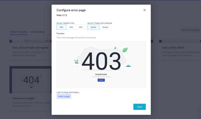
Best practice: Provide error pages with links to the home page and the most important application pages
Page size and limits
You can check the size of your page by in your browser's developer tools: Inspect > Network tab provided by your browser when you hard refresh the page (Shift+Command (Ctrl)+R). The advice is to check Disable cache at the top of the tab.
We recommend handling a limit of 2.5 MB for your pages, which will allow the average user to load the page with decent speed whilst not making the pages too big for it to affect your SEO.

When constructing pages in the page builder, it's important to avoid making them excessively large. Think of it like a car towing a trailer; overloading the trailer can make the journey difficult. Similarly, larger pages become more challenging to manage and result in longer loading times. These delays increase the likelihood of visitors leaving and reduce the efficiency of building. Therefore, select your content carefully and limit the number of components to ensure optimal page loading times.
You can manage this by restricting the number of components you add to the page. It is advised to use a maximum of:
-
50 Data table components
-
500 Button components
-
100 Media components
-
100 Text components
Custom styles
When creating a custom style (e.g, for a Button), start the name with the color (Primary, Secondary, etc.) followed by the attribute (rounded, thin, etc.). Example: Primary rounded.
More about styles: Using unified component styles
Caution! Avoid working on the same web page simultaneously with other builders. Any modifications made by one builder will not automatically update in the browsers of other builders who have the same page open. This can lead to overwriting others' changes, causing a loss of progress.
Naming conventions
The platform allows builders to freely name pages and establish their paths. Consistent naming conventions within the application will assist both the builder and others.
Page name and URL paths
There are a lot of combinations possible for naming the page name and URL path, so make it evident that the page name and URL path lead to certain pages.
|
Name: |
Path: |
|
Home page |
/ |
|
Login |
/login |
|
Reset password |
/login/reset-password |
|
Projects |
/projects |
|
Projects / Project details |
/projects/:project_id |
|
404 |
/404 |
|
403 |
/403 |
Renaming components
When adding several Data containers, Data lists, or input components, you soon lose track of where certain data comes from. Rename the component to make it evident what data is provided. Don’t change/delete the component type name, though!
Examples:
-
“DataContainer” > “DataContainer - Webuser”
-
“DataList” > “DataList - Tasks”
-
“TextField” > “TextField - Name”
Partials
When creating a partial, use a descriptive name as a partial name (for example, Header or Top menu).

The most common partials are the Header, Footer, Navbar, and Sidebar. Also, other parts of the page can be converted to a partial, so try to reuse it if that’s possible. Use input variables to make the partial more dynamic.
Standardized form
The forms can be used to create, update or delete records. This can be standardized by using the following rules.

-
Placeholders
Use placeholders in all input fields to make sure that an input field is never empty.
Best practice: Provide input components with a placeholder, so it’s more intuitive for a visitor to use the form.
-
Loading state when submitting
Toggle the submit button to a loading state when the visitor submits the form. This prevents visitors from submitting the form multiple times. -
Hide all alerts when submitting
It can be very confusing if an old success/error message is still visible when the visitor is submitting the form. -
Show the response: Display an alert or snackbar for both success and error responses. The success message can be static, while the error message can be dynamically generated from the server.
-
Clear all input fields
When the form responds in success, all inputs in the form can be cleared or set to default. This step is irrelevant when a redirect will be done after a successful response. -
Refetch the data table
When a table is present and a new record is created, the data table can be refetched so that the new record is immediately visible as a table row.
Read more about the Form component and creating common component/page interactions.
Actions
When a Form component has been dropped on the canvas, an action will be automatically created and assigned to the form. The naming convention of the actions can be categorized with the following prefix:
-
Page builder actions start with [PB], for example [PB] Login webuser
-
Sub-actions start with [SUB], for example [SUB] Create order line
Best practice #1
Create a sub-action in every auto-generated page builder endpoint action. You’ll benefit when the form component is removed and the action will also be removed. Furthermore, you have an option to manually trigger an action if necessary.
Interactions
Component interactions are interactions with a function between components based on a certain trigger.
Below is a list of interactions that can be good to know.
-
Link interactions to a form:
-
Toggle loading on the Submit button when submitting and processing is done.
-
Show error messages from the server in the alert/snackbar component.
-
Show a success message in the alert/snackbar component.
-
Clear the inputs after success.
-
-
The list of interactions has two interactions with the same name:
setCurrent Record. Don’t pick the wrong one! -
Prevent getting an infinite loop. For example:
-
onComponentRendered - Submit - Form
-
onActionSuccess - Submit - Form
-
-
Use the option Link to for redirecting to another page in a button and don’t use the interaction redirect because of SEO.
Search Engine Optimization (SEO)
SEO stands for search engine optimization, which is a set of practices designed to improve the appearance and positioning of web pages in organic search results.
When developing a customer-facing application, ensuring that search engines can locate the pages is crucial. Adhering to the following technical guidelines will enhance your page's indexation. The selection of content is a separate matter and is not covered in this document.
-
Correct use of H1, H2,.. H6
Compare each page to a book’s chapter. The H1 represents the chapter title, there should be only one per page. The H2 breaks the content up into sub-chapters. The H3-6 is used to further break up the content, making it easily scannable. -
URL paths
Clear and descriptive URLs help both search engines and users understand the content of the page. Avoid generic paths like/page1or/untitled. Use keywords in the path that reflect page topics (such as:/product-detailsor/contact-us -
Images should have a proper alt text
Provide each image with an alternative text to improve SEO ranking. -
Reduce page size
A smaller page leads to faster load times, which improves user experience and SEO rankings. Optimize images by compressing them and limiting the number of large components on a single page -
Use links for navigation instead of interactions
Elements need to have an HREF to enable search engines to crawl them, so use a reference to the page in the component settings instead of an interaction. If the application is using interactions to navigate to the next page, no HREF is added to the Anchor tag. -
Title, meta description, and favicon
The title, meta description, and favicon should be present to assist search engines in understanding what the web page is all about. Its primary job is to guide visitors and search engines on what to expect from the web page shortly and concisely. -
All pages should be reachable through the workflow of the application
When a page is not reachable through the workflow of the app, it is not necessary for the application and can be removed. ‘Orphaned’ pages clutter the page builder and can end up being a security hazard.
Caution! Public pages can be indexed by search engines. If you wish to know more about page indexing, please read more about it on this Google assist page.
Responsiveness
Responsiveness is the approach that suggests that design and development should respond to the user’s behavior and environment based on screen size, platform, and orientation. Keep in mind that the visitors of your application don’t always use a desktop, but may also visit the page using a mobile phone or tablet. For that reason, all pages should be responsive. Some tips can help you:
-
Think vertically
In other words, don’t make the pages too wide. You can force this by using a container. -
Fixed-width columns
Set a fixed width in the column of a data table so that a scroll bar will be shown when the data table is wider than the visitor’s screen. -
Hide components for small devices
In some cases, it’s better to hide specific components on small devices (i.e., tablets and mobiles) when they are not necessary or when there is no space. -
Progressive Web App
The best solution for tablets and mobiles is a Progressive Web App (PWA) to use as a native mobile application. PWA is still a website and it looks and feels like an app and includes push notifications and offline capabilities.
Security
A builder should know how to set up a secure page. A page should apply to the following requirements.
Authentication profile
Pages that are meant to be private must have an authentication profile in place. This acts as the first line of defense for safeguarding data within Pages. Without logging in, users will not be able to view the page.

When a page has an authentication profile, access is limited to authenticated web users. Users who are not logged in will be redirected to the login page and will not be able to view the page. Secured pages must ensure that data is accessible only to logged-in users.
If a page is designed for users with specific roles, confirm this within the page and redirect users who do not meet the criteria. "Why? I use a menu bar that hides the button, so access to that page is blocked." Nevertheless, a page can still be accessed directly via its URL, allowing individuals to circumvent your 'clever' security measure.
Validations
Prior to form submission, conduct a frontend validation of input values where applicable, such as required fields, minimum length, and regex patterns. Although these checks can be easily altered by visitors, they assist in preventing the submission of invalid data. Implement server-side conditions for additional input validation..
Web users
Web users should be able to register for an account. The passwords must contain at least 8 characters, uppercase and lowercase letters, numbers, and symbols
Furthermore, web users should be able to reset their passwords. The old passwords shouldn’t be reusable
When logging in, two-factor authentication is recommended. If there are too many failed login attempts, a web user’s account should be blocked from logging in for at least 5 minutes.
Web users should be able to delete their accounts to comply with the GDPR. The developer needs to reflect on how this affects the webuser's created data.
Parameters
When using parameters, either path parameters or query parameters, always keep in mind that they can be manipulated through the URL. When retrieving data based on given parameters, always check whether the webuser is allowed to retrieve that data.
In some scenarios with sensitive data (like a password-forgotten page), it’s better to save a globally unique identifier (GUID) and use this as a parameter in the URL. A record ID can be guessed more easily by changing the numeric value. GUIDs are written in the form of eight (hexadecimal) digits, then three times four digits, and finally another twelve digits, such as “3F2504E0-4F89-11D3-9A0C-0305E82C3301”. The chance of creating the same GUID twice is very small and it’s very difficult to guess by the visitor.
Roles & permissions
Role permissions define what actions a user can perform based on their assigned role, such as creating, reading, updating, deleting, or exporting data. It is crucial to ensure that each role is granted the appropriate permissions. At the model level, only read permissions are configured within Roles and permissions.
Find more information in What are model permissions?

All other permissions, such as creating and deleting records, are configured through the action's settings.

Others
-
Delete/disable unused actions and endpoints
Developers should, at a minimum, disable unused actions and pages, though deleting them is preferable. Retaining them in the application can create security vulnerabilities and lead to confusion among developers about which endpoints or actions are active.
-
Use the checkbox “Filter value from logs” for sensitive data
An endpoint (POST) can have incoming sensitive data like a password. This data can be hidden from the application logs when it’s a single input variable (no custom model) by checking the checkbox Filter value from logs.
Split up pages
A builder of a page can be very optimistic by creating a lot of components and functionality on one page. The downside is that the maintenance of the page can be complex, and there is a potential degradation of performance.
The solution is to split up the page when Tabs, Steppers, Dialogs, and/or Drawers have been used. Instead of using a Dialog and Drawer on a page, a master-detail page can be created to show the data. In this way, the page size can be limited.
Check out the article: Creating a master-detail page
Custom components
If a custom component is required on a page, it is recommended to establish a GitHub repository. Even for minor modifications, having a GitHub repository with the custom component can assist you and your colleagues in locating it later.
Deleting
Pages
A page can be assigned to different components (Form > option Redirect after successful submit) or an interaction (redirect). When deleting a page, those dependencies aren’t linked anymore. The builder can check the dead ends by compiling one of the pages. An error will appear that shows the location of the error and the error text.

Components
Deleting a form means that the generated action will also be deleted. Keep this in mind.
Best practice
Do you use custom styling on a button? Before you delete your component, you can add it as a custom style so that you can reuse it.
Actions
An action can have multiple dependencies. For that reason, check the dependencies before you delete them.