App Blueprint gives you an instant visual overview of your application's structure. As you build with Genius AI, every page, action, model or MCP server you create appears on the blueprint right away, placed inside its layout and connected to the pages it links to. You get a bird's-eye view of your app without opening each page one by one.
As applications grow, it gets harder to keep the whole picture in your head. You have pages, layouts, buttons, the connections between them, and a growing list of things you want to change next.
App Blueprint solves this by turning your application into a schematic you can actually look at.
Create a page with Genius, and it appears on the canvas in the right place, with its connections drawn in. That means you can check the result at a glance and confirm that the new page sits where you expect it to, rather than clicking through the app to find out.
How to use App Blueprint?
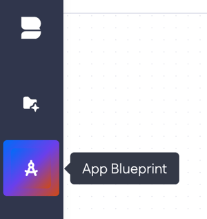
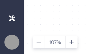
Find App Blueprint at the top of the builder bar – press it to open the schematic overview of your application.
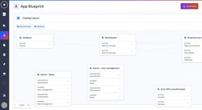
Here you can see the canvas you can pan and zoom (the zoom control sits in the bottom-left corner). Every part of your application appears as a card, grouped by layout and connected by lines, so you can follow the structure at a glance.
New entities appear automatically
Whenever you use Genius to create entities in your app — or create them manually — they appear on the blueprint as soon as they’re created.
By default, App Blueprint shows:
-
Pages and their key components, plus the connections between pages
-
Layouts that group related pages
-
Data models and their properties
-
Automations, including native actions and Wasm actions
-
MCP server folders, including the actions inside them
Navigate to an item
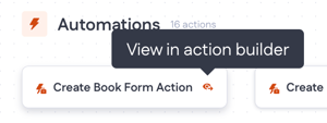
To jump straight to any item, press the eye icon next to it. For example, the eye icon on an action opens it in the action builder. This turns the blueprint into a starting point for your work, not just a place to look.
Choosing what to show
A row of toggles at the bottom of the canvas lets you control what appears on the blueprint: Pages, Models, Properties, Automations, and MCP servers. Turn a layer off to focus on what matters — for example, hide Properties to see just your models, or show only Pages for a cleaner view of your navigation.

Layouts and pages
Layouts are the frames your pages live inside. They appear as grouped containers, each showing how many pages it holds and which pages are used as navigation items.
For example, adding a Wishlist page to a book catalog app drops it straight into the Catalog Layout, alongside the pages already there (Book Overview, Add Book, Book Details). You don't have to place it or connect it yourself to see where it landed; the blueprint reflects the new structure right away.
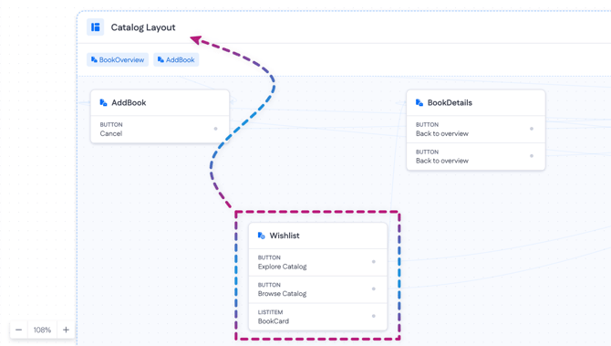
Inside a layout, you see the individual page cards, for example, Book Overview, Add Book, Book Details, and the newly added Wishlist (A).
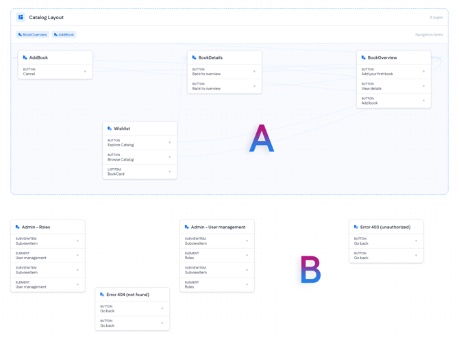
Some pages have their own layouts, and they are positioned outside of the layout, like Admin and Error pages in the case of our application (B).
A layout represents the structure that pages share. For example, the Book Details page uses the Catalog Layout, which is also used by Add Book, Wishlist, and other pages — and in the App Blueprint view, those pages are visibly grouped together in one container.
Read more about layouts and how they work on the platform in Page layouts and widgets.
What's inside a page
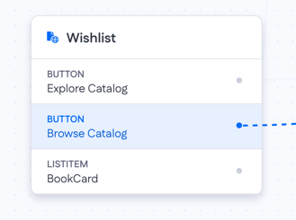
Each page card shows the key elements it contains, labelled by type, so you can see what a page is made of without opening it. On the Wishlist page, for instance, you can see:
- BUTTON — actions on the page, such as Explore Catalog and Browse Catalog.
- LIST ITEM — a repeating item that renders each record, such as Book Card.
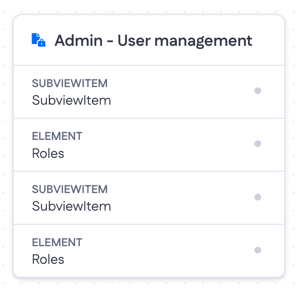
Across the other pages you'll also see types like ELEMENT (a building block placed on the page, such as User management or Roles), SUBVIEW ITEM (a nested view embedded in a page, as on Admin - Roles), and LIST ITEM (a repeating item that renders each record, such as BookCard on the Wishlist page).
Connections between pages
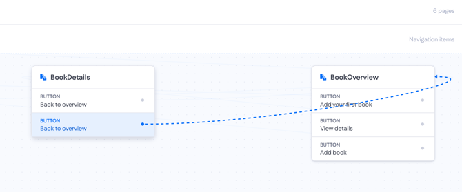
The dashed lines show how pages link to one another, so you can trace a user's path through the app. When a new page is generated, its connections are drawn in too.
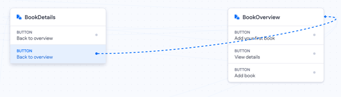
For example, the Back to overview button on the Book Details page connects to the Book Overview page, so you can see at a glance that clicking it takes the user back to the overview. Within the Catalog Layout, the same kind of links tie together Book Details, Book Overview, Wishlist, and Add Book, giving you the full navigation flow in one view.
This makes it easy to confirm the AI wired the navigation the way you intended, and to spot any links that are missing or point somewhere wrong.
Downloading your application code
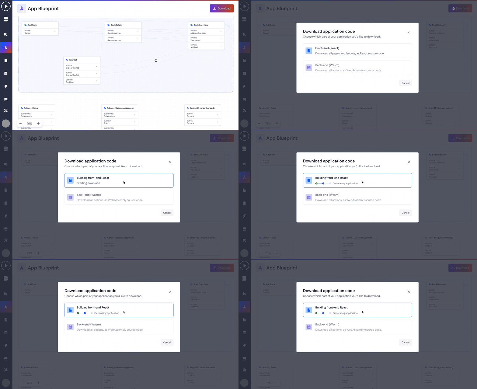
The Download button in the top-right corner lets you export your application as source code. You can choose which part to download:
- Front-end as React source code (all your pages and layouts)
- Back-end as WebAssembly source code (all your actions).
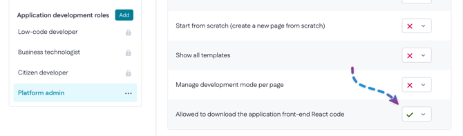
Note: Access to the download capability is controlled by role-based permissions, managed via My Betty Blocks > Roles and permissions (organization level), so you can decide which roles are allowed to download the application code