Genius Pages only. The components described here belong to the Genius component set. They are not interchangeable with classic Pages components — even when the names look the same, the options and runtime behavior differ.
List
Renders a vertical list of items. The list type follows standard HTML semantics – ordered (<ol>) for numbered lists, unordered (<ul>) for bulleted lists. List Items live inside as children and define what each row contains.
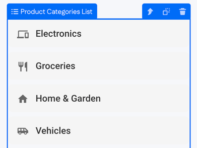
When Genius generates a list of records from a prompt, it usually creates one List Item per record and renames each item to match the data it represents – for example, "Office Asset Item" rather than the default "List Item." Inside each item sits a Text component bound to the relevant property, like the room name.
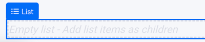
When a List is manually added added to the page, it shows an "Empty list – Add list items as children" placeholder.
You can use Genius AI at any point to create a specific type of list. For best results, select the parent List component first so Genius can generate all the items and content inside it.
Options
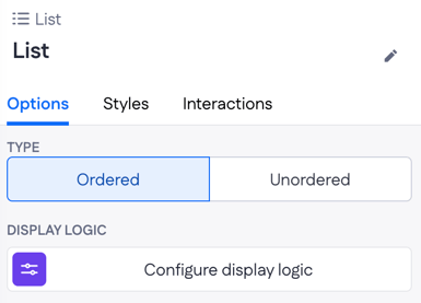
- Type — Ordered (numbered) or Unordered (bulleted).
- Display logic — show or hide the List.
List Item
A single row inside a List. Each List Item holds the components that make up that row – typically a Text, sometimes an Icon plus a Text, or a more complex layout if the row needs to show multiple fields.
When a List Item is empty, the canvas shows an "Empty list item" placeholder. The placeholder disappears once components are placed inside.
Options
- Link to — Internal page or External page. Turns the whole row into a link.
- Page — the target page when Link to is Internal page.
- Open in — Current tab or New tab.
- Icon — an icon shown alongside the row content (for example,
AccountCircle). - Display logic — show or hide the List Item.
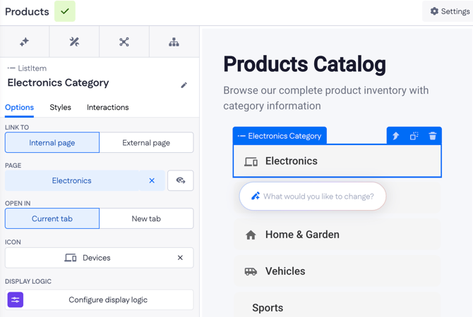
When Genius generates a list of records from a prompt, it usually creates one List Item per record and renames each item to match the data it represents – for example, "Meeting Room Item" rather than the default "ListItem." Inside each item sits a Text component bound to the relevant property, like the room name.
Example
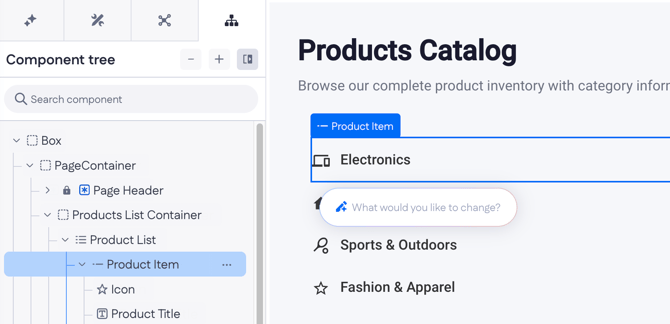
On a Products Catalog page, Genius generates a List of clickable product categories. Each row has an icon, a category name, and links to a Products page that's filtered to that category. The component tree looks like this:
- Product List
- Product Item (Icon: Devices, Link to: Products page)
- Product Title (Text bound to the category name)
- Product Item (Icon: Devices, Link to: Products page)
On the page, the user sees rows like "Electronics," "Home & Garden," and "Fashion & Apparel," each with its icon and the whole row acting as a navigation link. To switch to a numbered style, change the List's Type from Unordered to Ordered.