After reading this article, you’ll know the following:
-
Major characteristics and options of the Subview component
-
How to use these components in your application
-
The difference between Subview and other components
What are Subview components?
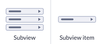
Subview component functions as a navigational list for relational data, making it particularly valuable when used to show details from a particular record in back offices. Often integrated with another component, the Subview allows for organized and intuitive navigation through related data entities.
Subview item is a child component of the Subview component. This is the actual navigational item that can be linked to a relational model.
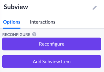
Subview options
Reconfiguring: This option provides an overview of all 'direct children' within an existing Subview component on the canvas. Users can:
-
Move or delete Subview items.
-
Add new items using the
Add Subviewitem button.
-
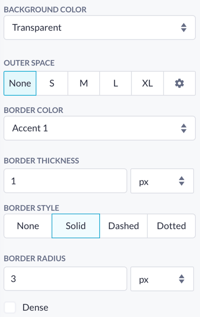
Background: Customizes the background color of the Subview to match the application's design theme, as selected through the Theme builder.
-
Outer space: Adjust the outer spacing of the Subview. Options range from None to XL, and additional advanced settings can be accessed via a cogwheel icon.
-
Border color and border thickness: Defines the color of the Subview border for additional styling.
-
Border style:
-
None: No border.
-
Solid: A continuous line.
-
Dashed: Framed by short dashes.
-
Dotted: Framed by series of dots.
-
-
Border radius: Adjusts the curvature of the border corners, with higher values creating more rounded corners.
-
Solid: A continuous line.
Subview item options
-
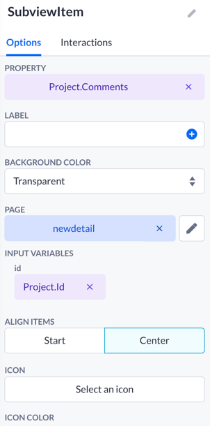
Property: select the specific property of the model to display in this Subview item.
-
Label text: set a custom label for the property. This label appears next to the property value and helps identify the displayed information.
-
Background color of each Subview item.
-
Page redirection on click: Configure the item to redirect to a specific page upon clicking, with an optional input variable to refer to a specific page ID.
-
Align items within the Subview item to Start or Center.
-
Icon and icon color: add an icon to the Subview item and choose its color to enhance visual identification.
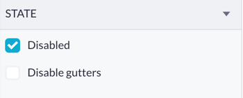
State options:
-
Disabled: render the Subview item in a disabled state, making it unclickable
-
Disable gutters: remove the padding around the item
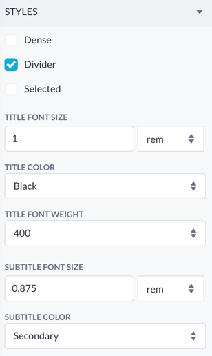
Styles options:
-
Styles: include Dense (closer spacing), Divider (adds a line between items), and Selected (highlights the active item).
-
Text customization: options for text style, color, and weight for both title and subtitle.
Styles: include Dense (closer spacing), Divider (adds a line between items), and Selected (highlights the active item).
Text customization: options for text style, color, and weight for both title and subtitle.
Using Subview components
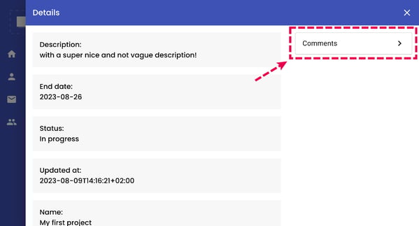
Subview component is typically used within a Detail view to provide additional navigation options, enabling users to redirect to specific pages. For example, a Detail view might display a particular project’s basic information in a back office application managing projects.
A Subview component within this view could list related properties such as Comments or Reviews. Each Subview item would navigate to a page displaying detailed information about these related entities, facilitating easy access and management of relational data.
-
Select the area to drop the Subview component. The configuration window will open:
-
Select your model’s relation to be displayed in the Subview
-
Select the page to be redirected to after clicking the Subview item
-
Pick up the input variables. These optional input variables refer to a specific page ID, for example
-
Save your configuration

2. Now you can edit options for this particular Subview item by clicking on it. For example, you can add an icon to it, and change the styling

3. To add a new Subview item, go to the Subview (parent component) and click ‘Add Subview item’ in the reconfiguring options, or just pick the Subview item component from the component overview, and drop it in the desired position within the Subview component.
Subview and List components
The Subview component, designed for relational data navigation, offers extensive customization options for background, border, and layout, aligning with themes. Its modular design and dynamic reconfiguration make it ideal for complex back-office applications requiring additional data interactions.
The List component is suited for displaying general-purpose lists such as tasks or messages. It provides a straightforward setup and flexible item rendering, making it perfect for non-relational data use cases.