After reading this article, you’ll know the following:
-
Major characteristics and options of Data table & Data table column
-
How to use Data table in your application
-
The difference between Data table and other data components
What is the Data table component?
Data table component is a powerful tool for displaying multiple records of various properties simultaneously. It is particularly useful in applications where users need to view and interact with large datasets efficiently.
Data table column is a Data table’s child component that displays different data types within a table. Columns can be added separately from
Each Data table has columns and rows containing specific values from a particular model. After you've selected a model, you can select the properties that will be displayed in the columns of your table.
Sometimes you'll have to add a Data table column in case it's required to extend a table for some more items.
Using Data table
If you have a model named ‘Employee’ with properties such as ‘ID’, ‘Name’, and ‘Email’, etc., these properties can be represented as columns within the Data table. If the model has 15 records, all of these records can be displayed in the table, offering a compact and simple view of the dataset.
-
Drag and drop the Data table component onto your page where the employee directory will be displayed.
-
Select a needed model in the configuration window
-
Choose the properties to be displayed in the table
-

2. In case you want to add another column, it can be done in two ways:
-
Select the Data table column component and place it in the Data table
-
Go to the Data table options and press
Add columnbutton
Whatever way you choose, the configuration window for adding a column will open. You can select a property from a chosen model, or even add a new property to a model.
Read more about Displaying data within your pages.
3. Next customizations are done via the Data table component options. If you have a detail page prepared, you can enable the Row click option. For example, here we’ll select an Employee detail page. If done right, then clicking on each separate row of the table will open the employee’s detail page.
4. To enable displaying more rows with records, go to the Data table’s Pagination options. Also, you might want to add a search bar functionality to your table - make sure you check the Search options below.
Data table options
The Data table component has a set of primary options that include:
-
The reconfiguring option provides an overview of all 'direct children' within an existing Data table component on the canvas:
-
You can move or delete Data table columns, and add new columns using the 'Add column' button
-
2. Selecting a model to connect to the Data table
-
Create a filter for a model and set the order for properties
-
Search on property enables you to add a search bar to your Data table and a property by which this search is processed
-
Hide text-overflow option in a Data table controls how text is displayed in columns. When turned on, it cuts off long text with an ellipsis (...); when turned off, it shows the full text even if it spills over the column's edge.
-
Enable Row click functionality to allow users to interact with individual rows, such as navigating to a detailed view. Row hover color changes the background color of a row when the mouse hovers over it.
3. Pagination options allow you to divide large datasets into smaller pages for easier navigation and better performance. You can choose one of three pagination options:
-
Always show: Pagination controls are always visible
-
Showing labels like ‘5 of 10 pages’
-
-
When needed: Pagination controls appear only if records exceed the rows per page.
-
Never show: No controls are displayed, used when all data fits on one page or for alternative navigation methods.
-
Pagination labels display the current page number (X) and the total number of pages (Y), helping users understand their position within the dataset.
-
Rows per page text is displayed at the bottom of your Data table
-
Rows per page (max 50): Sets the maximum number of rows displayed per page, up to 50.
-
Placeholder rows: Temporary rows shown during data loading to maintain layout and provide visual feedback.
4. The styling options are the following:
-
Height adjusts the overall height of the Data table, allowing you to control how much vertical space the table occupies on the screen.
-
Sticky header keeps the header row fixed at the top of the table while scrolling, making column titles always visible for better navigation and context.
-
Size changes the size of the table rows, with ‘Small’ providing a more compact view and ‘Medium’ offering a slightly larger presentation (default one)
-
Background customizes the background color of the table, ensuring it matches the application's design theme. You can also set a specific background color for the header row, differentiating it from the rest of the table
-
Square controls whether the table columns have square corners. Turning it on gives a more modern, boxy look, while turning it off allows for rounded corners
-
Striped alternates the background color of rows to create a striped effect, improving readability by making it easier to distinguish between adjacent rows.
-
Variant of this component:
-
Flat has no additional styling effect
-
Elevation casts the shade onto the parent component
-
Outlined version has an extra border to it
-
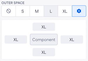
5. The only spacing option you have is outer space where you can choose between having from None to XL outer space. Also, if you press on the cogwheel icon, the menu below with more advanced options will open.
6. Messages options: Custom messages displayed with your Data table component to inform users about various states or actions.
-
Error message: Built-in and interaction-based messages for displaying errors, such as “Failed to load data.”
-
No results text: Message displayed when no data matches the query, which can be static (e.g., “No results found”) or dynamic.
Data table column options
-
Initial visibility determines whether the column is visible when the table is first loaded. This allows you to hide certain columns by default and show them only when needed.
-
Sortable: enables or disables the ability to sort the column by clicking on the header. When turned on, users can organize the data in ascending or descending order.
-
Header type defines the style and size of the text in the column header, such as "Body 1" for a primary style and "Body 2" for a secondary style, etc.
-
Content specifies whether the content in the column is static (fixed text or values) or dynamic (changes based on data, such as values from a data model).
-
Body type determines the type of content displayed in the column body, such as text, numbers, or other data formats.
Styling options:
-
Column alignment: Aligns the content within the column to the left, center, or right, helping to improve readability and layout consistency.
-
Width sets the width of the column, allowing you to control how much horizontal space each column occupies.
-
Background: customizes the background color of the column, enhancing the visual appeal and helping to differentiate it from other columns.
-
Border color defines the color of the column's border, providing an additional styling element to highlight or separate columns within the table.
Data table vs Data list component
Data table component provides more extensive configuration options, such as multiple columns, sorting, filtering, and advanced data manipulation, which makes it suitable for detailed data analysis and comprehensive management tasks where complex data structures and interactions are required.
The Data list component is designed for straightforward data display. It offers simple list, grid, or inline layouts with basic pagination, loading states, and custom messages, making it ideal for simple, visually oriented data presentation.