After reading this article, you’ll know the following:
-
Major characteristics and options of the list components
-
How to use List components in your application
-
The difference between List and Data list components
What are List components?
The list components are used to display content in a sum-up style, much like a bullet list, and are often used for navigation and summarizing information, or for showcasing a list of data that doesn't change at all (like a menu). This set of components List, List item, List subheader can be applied when you want a side menu, the items there would be a form of a list.
-
List is the foundation, acting as the container for all other list elements. It defines the overall layout and style of the list, allowing you to customize its appearance.
-
List item component is nested within a List component and serves as individual navigational links or informational points.
-
The List subheader provides additional context or categorization within a list.
List options
-
Reconfigure: The reconfigure option shows an overview of all 'direct children' available inside an existing List component on the canvas. Using the Reconfigure button, you can move or delete List items, and with the Add List item button, add another item to the List component.
-
Styling options: Users can customize background color, padding, and outer spacing (S, M, L, XL, or custom). The Dense option reduces the spacing between items.
List item options
Each item can include a title, subtitle, and an icon, and can indicate a selected state to show which item is active. Key features include:
-
Primary text and secondary text define the main and supplementary content.
-
Background color: customizable to match the application’s theme.
-
Linking: can link to internal pages or external URLs.
-
Alignment: items can be aligned to start or center.
-
Visual options: display an icon (with customizable icon color) or an avatar (via URL). Icons can be shown as avatars for a more visual representation.
-
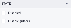
State options:
-
Disabled: when enabled, the item is not interactive.
-
Disable gutters: removes the padding around the item for a more compact look
-
-
Styling options:
-
Styles: include Dense (closer spacing), Divider (adds a line between items), and Selected (highlights the active item).
-
Text customization: options for text style, color, and weight for both title and subtitle.
-
List subheader options
The List subheader provides additional context or categorization within a list. Its main features include:
-
Text: customizable subheader text.
-
Inset: determines whether the subheader is inset from the left margin.
-
Styling: options for background color and text color.
List components in use
Let’s create a simple sidebar navigation with three menu items.
-
Simply drag and drop the List component into a prepared space, in our case - a Drawer sidebar component
-
Click on each List item separately to access their options
-
You can reach the List component (parent) via the component tree
-
2. Select a new icon to reflect the purpose of a List header and choose the internal page to be redirected to after clicking on this item.
List vs other components
Understanding the distinction between List and Data List components is crucial for optimal application design in Betty Blocks:
List component:
-
Primarily used for navigation and static content display.
-
Ideal for creating side menus or displaying fixed items that don’t change frequently.
-
Includes titles, subtitles, and icons, making it perfect for guiding users through an application.
-
Text within a List item can be made dynamic, but using the List component for dynamic data is inefficient and complex.
Data list component:
-
Designed for frequently changing data, such as database entries needing regular updates.
-
Not suitable for navigation purposes because varying data lengths can disrupt the layout.
-
Optimized for listing dynamic data entries, ensuring flexibility and ease of updates.
List component is best for static, navigational elements, while the Data list component in displaying dynamic data, ensuring efficiency and a stable user experience.