After reading this article, you’ll know the following:
-
Major characteristics and options of the Data list and List with data
-
How to use these components in your application
-
The difference between a Data list, a List with data, and other data components
What are Data list components?
Betty Blocks offers two primary data list components: the Data list and the List with data.
Data list component is designed to simultaneously showcase multiple records of a data property. The key feature that sets the Data list apart from the Data container component is its ability to render multiple records at once, rather than focusing on a single record. This makes it ideal for scenarios where users need to view and interact with a collection of data items, such as product catalogs, user directories, or any other data sets that require comprehensive viewing.
Unlike simple lists, this component is not restricted to a list format but can be displayed in a grid layout.
List with data component simplifies the setup process by offering a configuration wizard, which guides users through the initial setup, reducing the time and effort needed to get started.
Data list options
The Data list component has a set of primary options that include:
-
Selecting a model to connect to the Data list
-
Create a filter for a model and set the order for properties
-
Search on property enables you to add a search bar to your Data list and a property by which this search is processed
-
-
Type defines the layout alignment of Data list items on a page:
-
List: Arrange data items vertically in a single column, one after the other.
-
Grid: Organizes data items in a matrix of rows and columns, providing a structured, multi-column layout.
-
Inline: Displays data items horizontally in a single row, aligned side by side.
-
Pagination options allow you to divide large datasets into smaller pages for easier navigation and better performance. You can choose one of three pagination options:
-
Always show: Pagination controls are always visible
-
Showing labels like ‘5 of 10 pages’
-
-
When needed: Pagination controls appear only if records exceed the rows per page.
-
Never show: No controls are displayed, used when all data fits on one page or for alternative navigation methods.
-
Rows per page (max 50): Sets the maximum number of rows displayed per page, up to 50.
-
Placeholder rows: Temporary rows shown during data loading to maintain layout and provide visual feedback.
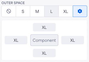
The only spacing option you have is outer space where you can choose between having from None to XL outer space. Also, if you press on the cogwheel icon, the menu below with more advanced options will open.
Messages options: Custom messages displayed with your Data list component to inform users about various states or actions.
-
Error message: Built-in and interaction-based messages for displaying errors, such as “Failed to load data.”
-
Show on load: Options to display a message, content, or a skeleton screen while data is loading.
-
Loading text: Text shown during data loading can be static (e.g., “Loading... ") or dynamic.
-
No results text: Message displayed when no data matches the query, which can be static (e.g., “No results found”) or dynamic.
Using the Data list component
Let’s say, a company wants to create an online client directory for staff to easily find their contact information and details. We are going to create a simple page using the Data list and other supporting components.
-
Drag and drop the Data list component onto your page where the client directory will be displayed.
-
Select a needed model via options
-
Choose the property to order the list by
-
2. Choose the layout type for your case. The default list type works in ours but if you’d like to see the images of your users first, you’d better apply the grid
-
We’ll select the pagination type ‘When needed’ and extend the placeholder rows to 10.
-
Go to the messages section and come up with no results text
3. Now you need to think about what other components would you use to display data from the model. In this case, we’ll use:
-
Title component to show a customer’s name and the
-
Text component to display the email address
-
Drop a Divider at the bottom
When pressing the + in the Content field, you’ll be able to select the properties.
4. Finally, compile your page to see how it’ll look in a runtime environment.
Data list vs other components
In the context of Data page components, both Data list and List of data have the same functionality, with the only difference being that the latter comes with a configuration wizard that guides you through setting up the component.
In many cases, one might want to use the Data table component as it provides more extensive configuration options, such as multiple columns, sorting, filtering, and advanced data manipulation, which makes it suitable for detailed data analysis and comprehensive management tasks where complex data structures and interactions are required.
The Data list component is designed for straightforward data display. It offers simple list, grid, or inline layouts with basic pagination, loading states, and custom messages, making it ideal for simple, visually oriented data presentation.