After reading this article, you’ll know the following:
-
Major characteristics and options of the Carousel components
-
How to use these components in your application
-
The difference between the Carousel and Media components
Carousel, often referred to as an image slider or slideshow is a graphical control element used to display a series of images or content sequentially. Typically, it allows users to navigate through the items by clicking on navigation buttons or by enabling auto-play functionality, where the items transition automatically after a set interval.
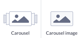
The Carousel image component is a child component designed to be used exclusively within the Carousel component. It represents each individual slide within the carousel.
Carousel options
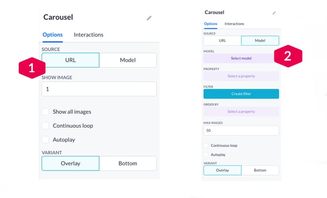
The Carousel component has two sets of primary options. They are displayed depending on whether you choose the URL or Model source.
-
If you select URL as a source, you first pick one or more URLs for images (shown in the next section). Then the following options are available:
-
Show image: select the number of images you want to be shown by default
-
Show all images option allows viewing and editing of all added images
-
Continuous loop will keep the carousel displaying images in a loop
-
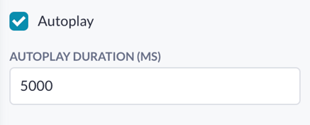
Autoplay enables an automatic switch between slides. When enabled, you can set the autoplay duration value (in milliseconds)
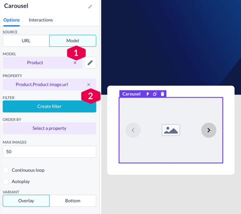
2. When selecting Model as a source, the options available to you are:
-
Model & property selection: connect a model with a needed (image) property to be displayed within a carousel
-
Create a filter for a model and set the order for properties
-
Max images: limit the number of images to be displayed from a model
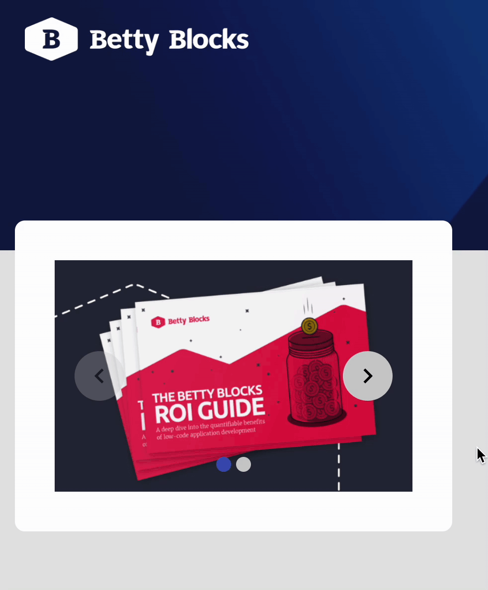
No matter if you choose a URL or Model as a source, there’s an option to choose a carousel variant:
-
Overlay is a default option with which you’ll have the Carousel’s navigation elements displayed on top of an image
-
Bottom variant provides a simple menu at the bottom of the Carousel to navigate your slides. This variant is more versatile as it also allows you to use various additional styling options: button colors, active and inactive colors, etc.

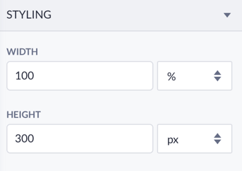
Below you’ll find basic styling options - width and height - aimed to set the size of your images within a page.
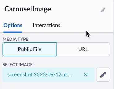
Carousel image options
Carousel image component - a child component that can only be used within the Carousel component. Therefore, its options are limited to media type: public file or URL that you can change anytime.
Using the Carousel component
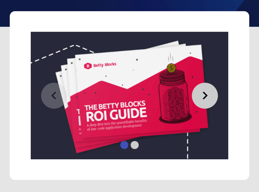
Imagine you have an e-commerce website and want to highlight its featured products on the homepage. Using the Carousel component, we can create an engaging product showcase where users can easily browse through highlighted items. Each product can be represented by a Carousel image component, displaying the product image, and a quick link to the product details page.
-
First, prepare space on your page. We will use cards created with the Box components. Also, there are some images uploaded to the public files that we are going to use in this case.
-
Drag the Carousel component and drop it onto the Box. In the dialog window, we’ll leave the URL source and add one more image (
+Add image button):

3. Let’s select Show all images and add a new image to the Carousel. Navigate to the Carousel image you want to edit by clicking on it. Then go to options Public file > Select image, and choose your pre-uploaded image.
4. Select the URL media type if your image is stored on a cloud and you have a link to it.

5. After adding all the images, compile your page to see the result and what adjustments you need to make.
To data model as a source for the Carousel, come back to its options and click on the Model source button, then select the needed model (1) with an image property (2).
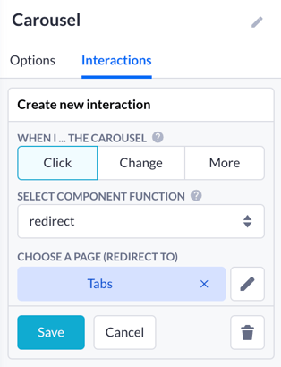
It is also possible to add an interaction to your Carousel image and use it for redirecting users to other pages:
Carousel vs Media
In the context of Content page components, both Carousel and Media components offer unique features. Media excels at displaying single images or videos in a static and focused way, ideal for highlighting individual content. In contrast, Carousel rotates through multiple pieces of content within the same space, making it perfect for showcasing products, art galleries, testimonials, etc.
With smooth transitions and engaging displays, Carousel creates captivating, space-efficient presentations, making it the preferred choice for highlighting multiple pieces of content appealingly and interactively.