After reading this article, you’ll know the following:
-
Major characteristics and options of the Chip component
-
How to use this component in your application
-
The difference between the Chip and other components
Chip component explained
Chip component is a simple content component available in Pages. It is essentially a concise textual element encased in a compact, colored rectangle, often used to express data such as status, labels, or categories in a compact form.
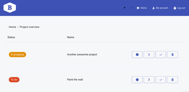
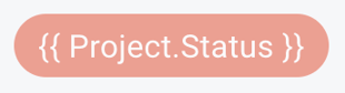
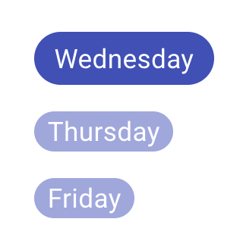
The Chip can serve as a tag and filter for a specific record(s) or show the status of a process, task, or object. For instance, in a project management application, the chip may be used to represent the status of a project, such as 'In progress', 'Done', or 'To do'. The color-coded functionality of the Chip component allows users to perceive the status of an object at a glance without having to delve into detailed information.
Options
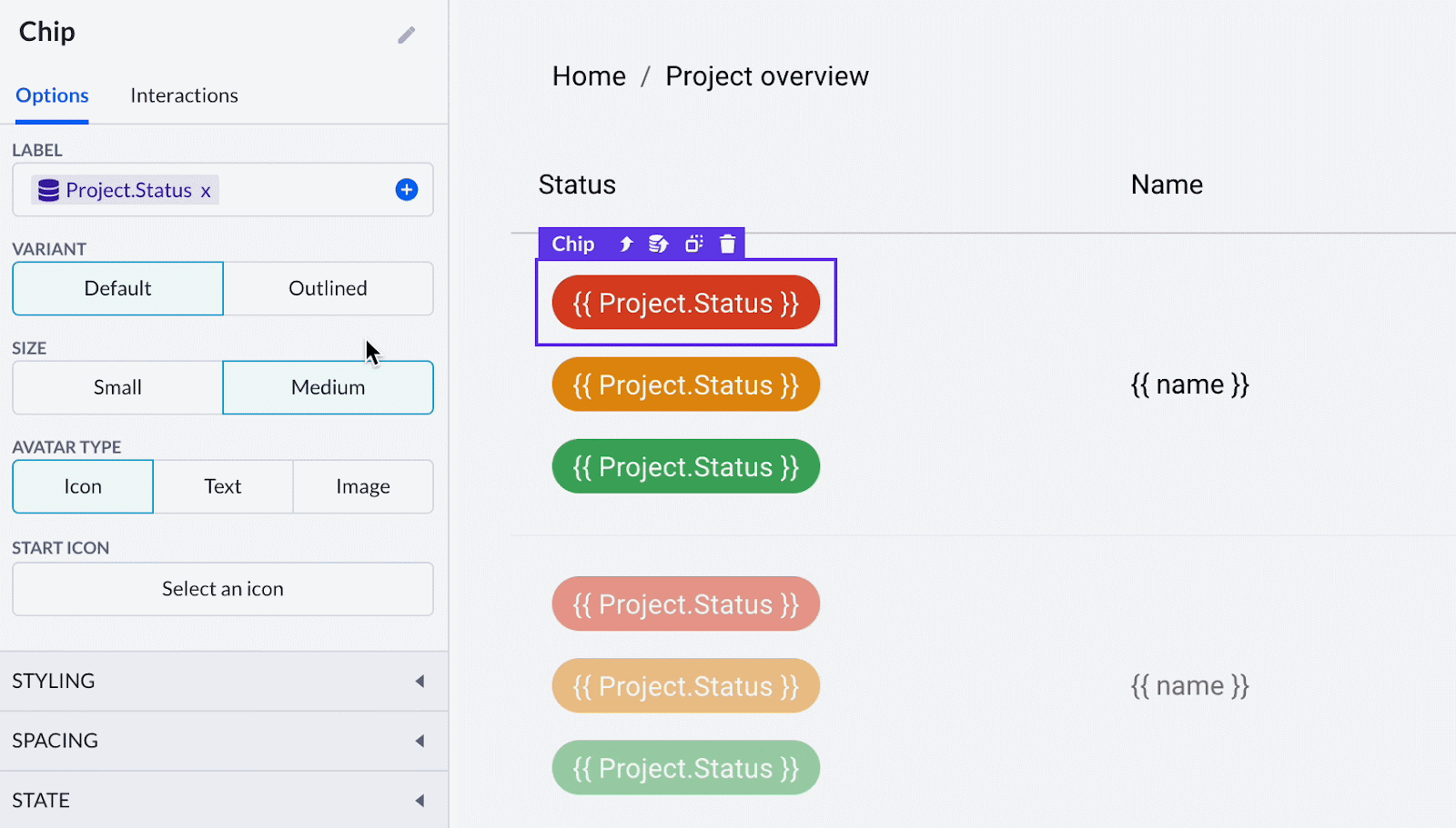
The Chip component includes the primary, styling, spacing, and state options.
-
Label displays key information, data for it can be dynamic and static
-
Choose between the default and outlined variants for your Chip
-
Size varies between small and medium
-
With the Avatar type option, you can add an icon, text, or image-based avatars for your Chip. The option below is changed according to your choice: start icon, avatar text, and image URL
Below you’ll find basic styling options - to customize your Chip's text style, color, and text color. Spacing options only enable you to customize the outer space of this component setting.
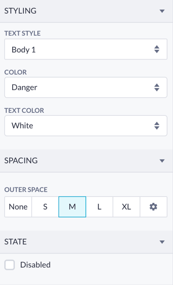
Lastly, you can turn on the disabled state to make the Chip look inactive.
Using the Сhip component
The Chip is used as a child component - you drop it into a prepared space on your page. For instance, it’s usually added to one of the Data table columns. All you have to do is create an additional blank column with the Add Columns button and then proceed to Save without adding a property. Then you can drop the Chip right into this Column.

After the Chip is added, you can select it and proceed to set the value to be shown as a label. Most likely, it’s going to be a dynamic value so you need to press a round + button in the label’s input field and select the properties of a preferred model.

Chip and other components
In the context of Pages, the Chip component is typically used to display a small, interactive element that represents a piece of information or an action. The Chip shows the tags, filters, or other small pieces of data clearly without giving any additional information.
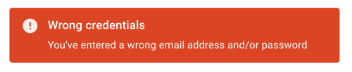
On the other hand, such components as the Alarm and Snackbar are more informative as they display notifications or alerts to the user. The Alarm component is helpful with time-sensitive alerts or reminders, while the Snackbar component shows non-intrusive messages or notifications that can be dismissed by the user.
The Chip component, despite its simplicity, serves as an efficient tool in building user interfaces as it can quickly communicate important information in the form of tags.