After reading this article, you’ll know:
-
What the Stepper and Step components are, their features, and use cases
-
How to use this component in your application
-
The difference between the Stepper and Tab components
What is the Stepper component?
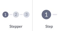
The Stepper component serves as a container for organizing and presenting sequential steps of a process. Each step represents a distinct stage or action within the overall workflow. Users can progress through the steps sequentially, completing tasks or providing necessary information at each stage.
The Step component is a child component of the Stepper that can be used within it.
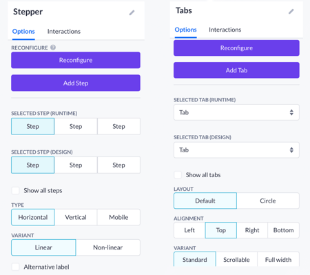
Options
Within the Tab(s) components, the options include reconfiguring, step-selecting, layout, and styling.
Reconfigure options allow you to add, delete, and change the order of Steps in the Step menu. While adding a new Step, you can also select an icon and its alignment in the menu.
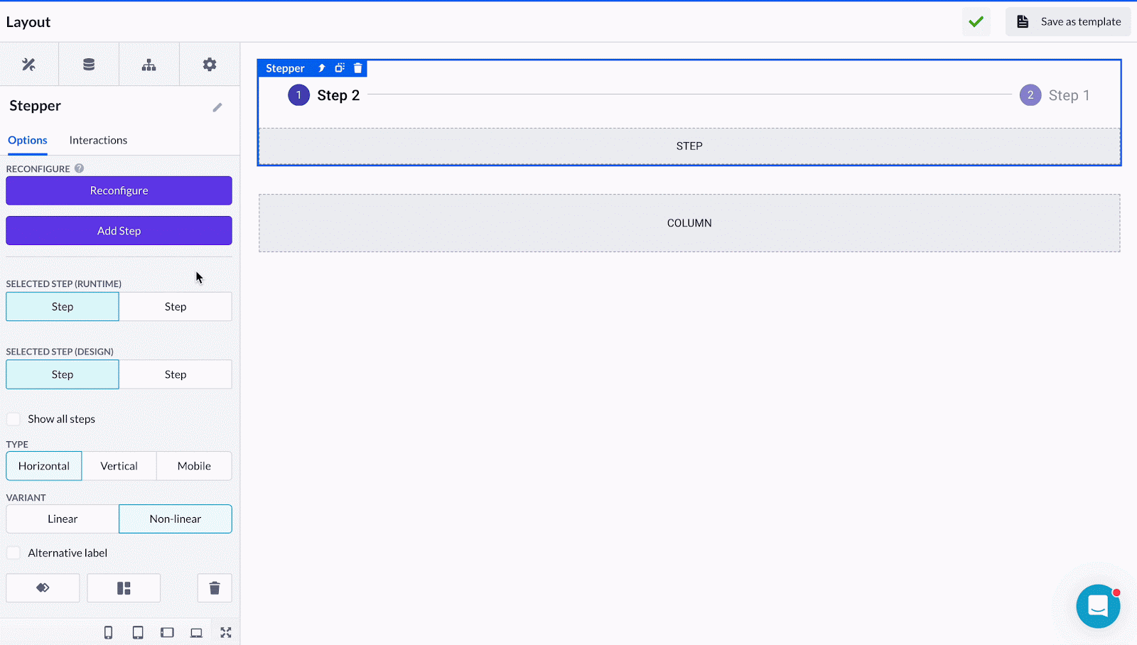
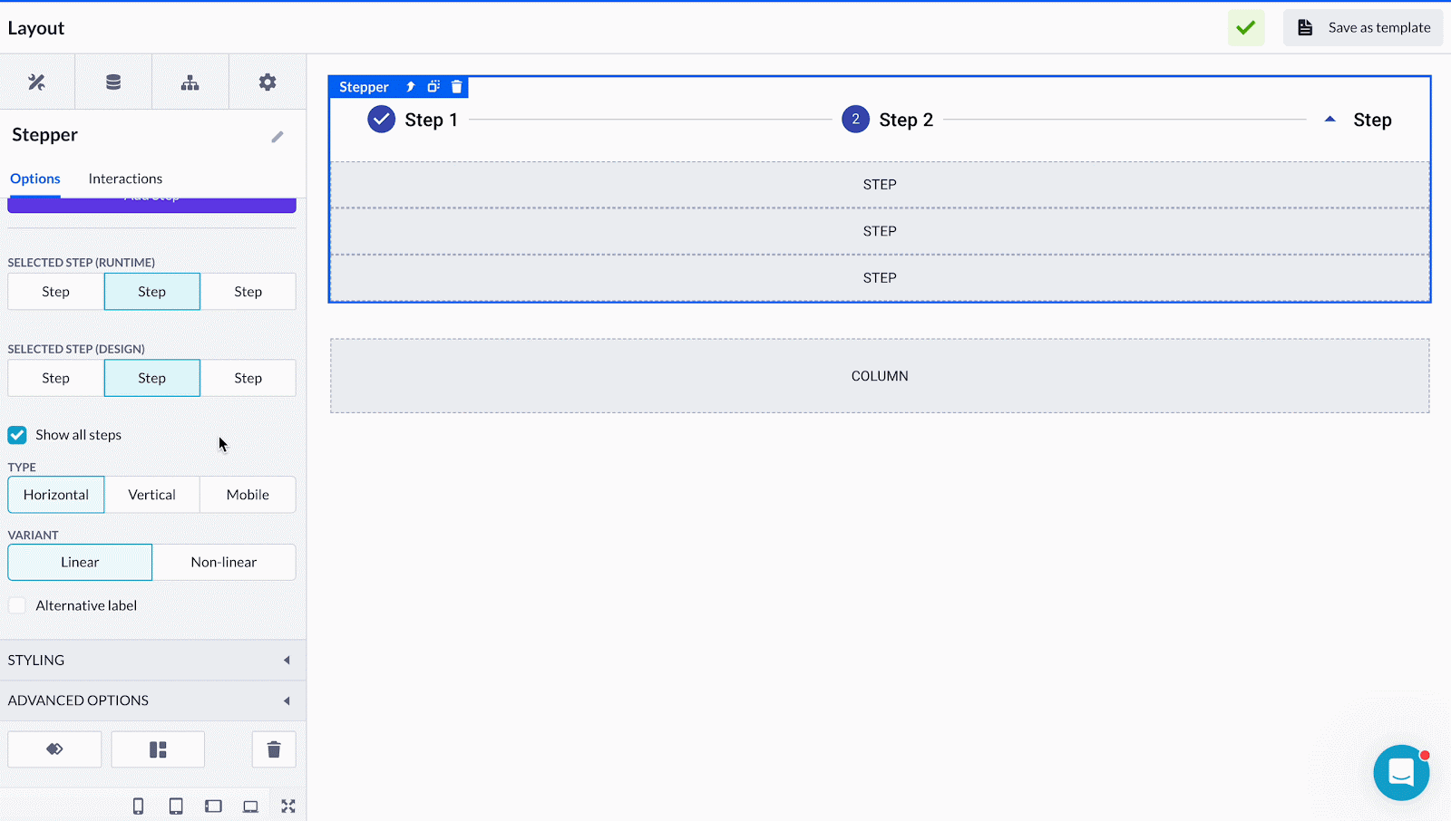
Selected step option enables you to choose the main tab to be displayed in both the runtime application (compiled page) and while designing in the Page builder. Tick the Show all steps option to show the content space for all existing Steps while designing in the Page builder, and also to mark every Step as active in the compiled (runtime) application.
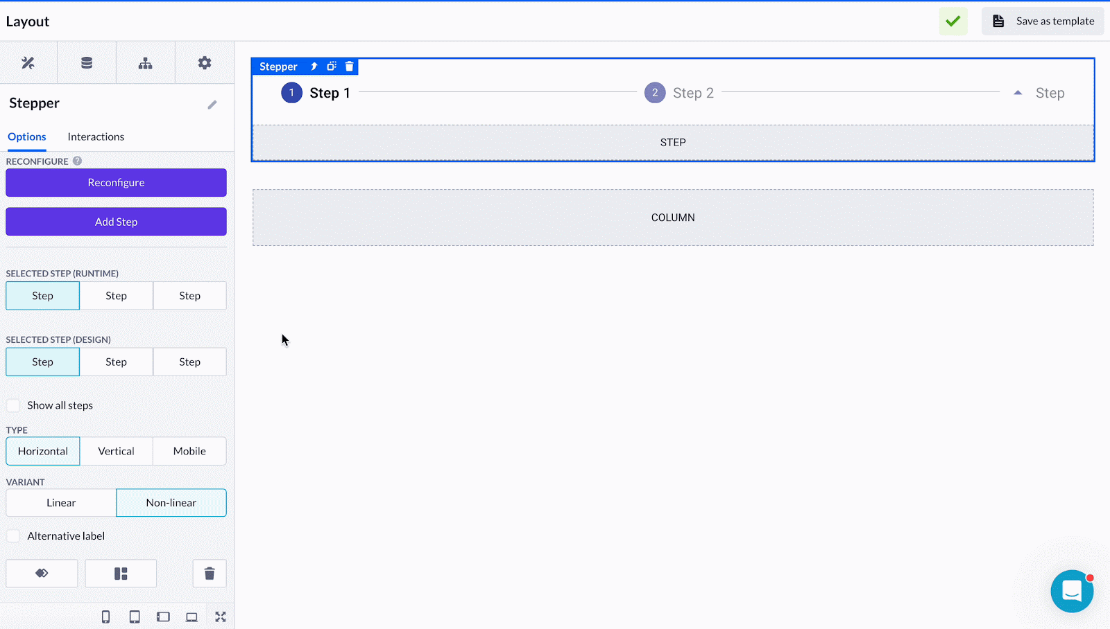
The rest of options include:
-
Stepper type, used to change the alignment (vertical or horizontal) or enables you to switch to the mobile view type which has some additional color selection options.
-
Variant is an essential option that has two options:
-
Linear - allows you to restrict the user from proceeding to the next step until the current one is filled and confirmed
-
Non-linear works similarly to the Tabs component, it enables switching between the steps freely
-
-
Alternative label gives you a small rearrangement of the icon and text within the Stepper
Styling enables you to customize the Stepper items and choose: step text style, active and inactive colors, active label color, etc.
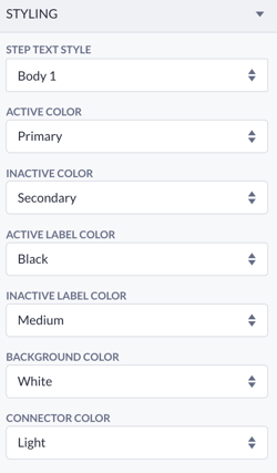
The primary colors for your application can be selected via the Theme Builder.
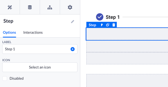
Single Step options include changing the label name (will be displayed while designing and in the runtime) and selecting an icon instead of the default (circled number). Each step can be also disabled separately.
The Stepper component provides a dynamic way to guide users through the multi-step processes within applications. It is the most common way to get your users through the registration, payment, testing flows, etc.
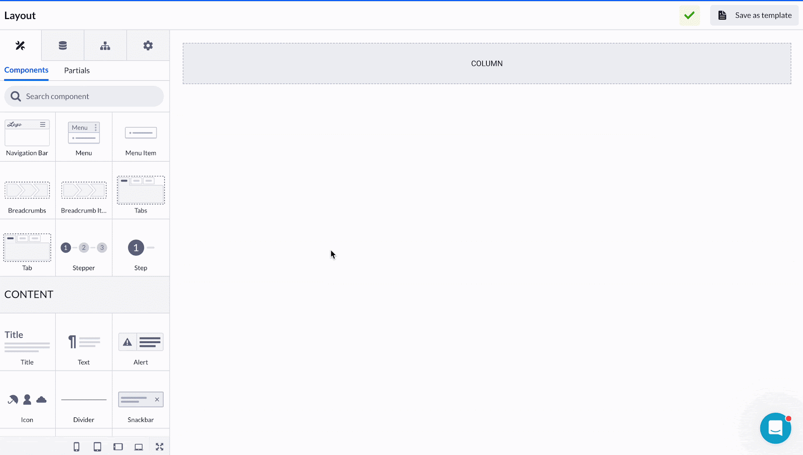
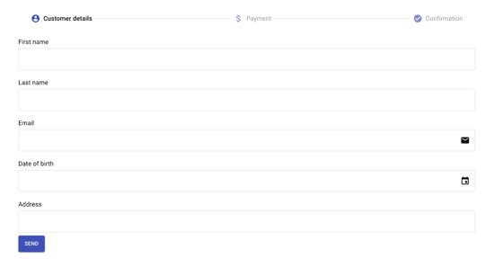
Let’s say we want to build a user purchase flow on our page. Drop the Stepper component onto the prepared Column. Then we’ll add some more Steps on top by either dropping the Step component onto the Stepper or via the Add Step button in the Stepper options.
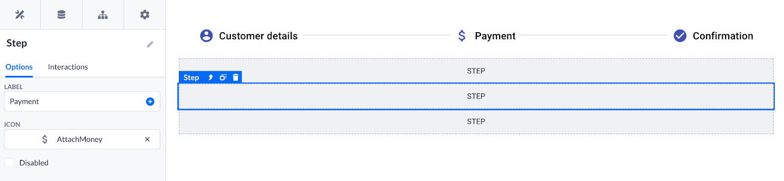
Press Show all tabs to reach every single Step and rename their labels to:
-
Customer details
-
Payment
-
Confirmation
Next thing, you can fill in each Step with Form components. Make sure the components are placed directly into a desired Step space. Configure the Form including fields that you want your users to fill in.
Besides that, you can use the Box component for more advanced alignment and positioning options for future content.

Eventually, the Stepper with the Form we’ve just created will look like this in the runtime:
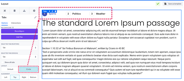
Steppers vs Tabs
Both the Stepper and the Tabs have features in common. You can compare their primary options with the image below:
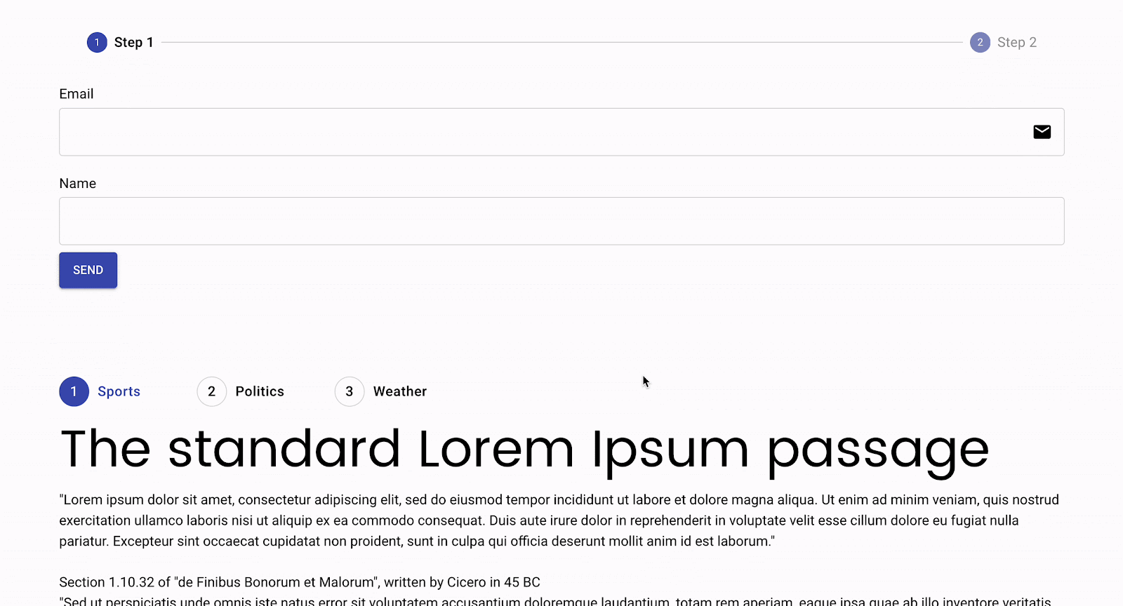
These two components have similar looks, especially if you change the Tab layout style to Circle.
You can use both the Stepper and Tabs to enable users to switch between various pieces of content that you want to leave on the same page but somehow united by categories.
However, one would rather use Stepper to enable users to fill in some forms step-by-step. Keep the Linear option on in the Stepper options so that your user can only reach the second step after completing the first one.

Finally, let’s compile this page to see how it functions in the runtime so that you can see this difference.
The Stepper component helps developers to design intuitive multi-step processes easily, keeping user engagement and task completion. Using its features and customization options, you can create the desired user path that aligns with the application's specific requirements.