After reading this article, you’ll know:
-
How to use the Icon and Avatar components in your application
-
The options and features of these components
-
The difference between the Icon and Avatar
What are the Icon and Avatar components?
The Icon component serves as a visual representation of an action, item, or concept within your application. Icons are commonly used to enhance user experience by providing intuitive visual cues and improving navigation.
The Avatar typically appears as a small circle containing either an icon, a letter, or an image, providing a quick visual identifier. Avatars are used in various parts of your Betty Blocks application to represent users, teams, or items. For example, on a project detail page, you might use avatars to showcase key contributors or stakeholders involved in the project.
Icon options
Icon’s options can be divided into primary and badge. Primary options include selecting the icon from the list of available ones. You can also search the icon using the search box on top of the menu.
Below the icon select, you can pick up the color for your icon (see Using the Theme Builder) and link it to either an internal (by selecting it below) or an external page (via pasting a URL).
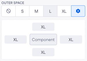
The only spacing option you have is outer space where you can choose between having from None to XL outer space. Also, if you press on the cogwheel icon (⚙️), the menu below with more advanced options will open.
Badge options allow you to add a tiny icon informing users about unread notifications. Create a badge by ticking Add badge. You might want to tick the Hide badge if value is 0, so that the icon stays clear when there are no notifications to read.
Type in the number value into the content field, or use the dynamic value by pressing the + button on the right. You can also pick up the badge and badge text colors. If you want to change the position of your badge, use four options in the anchor origin. Finally, you can select between a standard variant of your badge (the one with a number value) and the dot which is even more minimalist and doesn’t include the number.
Avatar options
Avatar’s options are divided into primary, styling, and spacing. When you drop it onto the page canvas, you can select one of the three Avatar types:
-
Image enables you to insert the URL to the needed image and add alternative text to it
-
Letter shows the initials of the user the avatar belongs to. You can select a couple of letters to be shown, as well as the background color
-
Icon type allows one to select an icon from the list and a background color for it
Each type of Avatars has three variants: circle, round, and square (see the GIF below).
Styling options are the same for each type of Avatar component: you can select width, height, font size, and weight. Spacing is limited to the same options as explained in the Icon.
Using the Icon and Avatar components
The Avatar is used as visual identifier of a user or team. When creating a user detail page, you might want to work with one of the Card components and give it a slight customization by adding the Avatar.
Icons can be used in a huge number of ways across your application. Usually, icons serve as navigation icons leading users to different parts of the web application, or enabling users to share, bookmark, or hide some specific content on the page.
We dropped a couple of Icons below the articles placed in Tabs. Besides choosing a page to be redirected to after clicking the Icon, you can also use interactions for more advanced options. For example, let’s enable switching to the next article (in a separate tab) after clicking on this particular Icon.
Avatar vs Icon
Both icons and avatars serve distinct purposes within layout-building practices:
Icons serve as visual representations of actions, items, or concepts, that prove intuitive cues for navigation. They symbolize functionalities within an application, such as search or menu options.
Besides that, icons can be found merged with other Page builder components. For example,
you can select an icon from the Button component options.
Betty Blocks platform offers a range of icons for interface design, users have access to a variety of options sourced from Material Icons. These icons are selected from the Material-UI library, explore more and choose from various icons via this link.
Avatars are typically small circles or squares. They too contain icons, letters, or images, acting as visual identifiers for users, teams, or items. They personalize user interfaces, representing individuals or groups in applications like project management platforms.
Avatars personalize users, while icons serve broader purposes such as navigation and signaling specific items. However, both facilitate quick recognition within the application's ecosystem by personalizing user interfaces.