After reading this article, you’ll know:
-
What the Menu component is and its major options
-
The difference between the Menu and other navigation components
-
How to use the Menu component in your application
What is the Menu component?
In applications with multiple pages you want your users to have a good experience when navigating from their landings page to their destination page. To make sure users can move around, we use navigation components like the menu component.
The menu component is a navigation component that allows you to add a dropdown menu feature to your application. On your page a menu button will appear, and when clicked, a dropdown with menu items will appear that provides the user with a navigation list that you can customize.

The main Menu component exists out of 2 segments, the menu segment, which shows as the parent item on your page, and one or more menu items. The Menu item is the navigator within the menu component.
With each variant, its own text, icon and position sub-options appear.
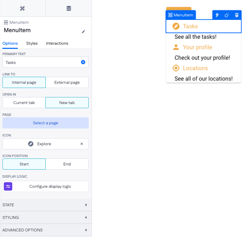
Options
Menu component
The Menu component has a view unique options to the navigation segment. The reconfigure options allow you to re-order the child items in the Menu component, and the Add Menu Item option triggers a wizard in which you can set the text and Icon for a new child item that will be created once the configuration is complete, you will still have to select a page on the Menu item once it is on your page.
Besides the basic styling options, the Menu component also allows you to choose which kind of variant you would like the parent component to be, in which you can choose the Text, Outlined, Contai,n or Icon options. To choose where you want the child items to appear from it's parent component, change the position option from a corresponding start position.

Menu item component
Inside the Menu item component, you can specify user navigation by configuring the Link to and Page options. The Styling and Icon options provide flexibility to personalize the visual appearance of each menu item. You can also enable internal pages to open in a new browser tab, enhancing navigation consistency with external links.
To show certain buttons to specific users or depending on the data of the page, you can use the display logic option. For example, you could decide to not show the "Back office" menu item to users that don't have the admin role in your application. To enable this you will have to make use of page variables that can be selected in the logic component.
Using the component
To use the Menu component and Menu items, you can simply drag the Menu component into the part of the page where you want to enable navigation. Looking at best practices we often see menus on the top or left-hand side of a page.
After placing the Menu, you can change the component to use the styling and text that you prefer.
Follow up by using the "Add Menu Item" option in the Menu component to add Menu Items corresponding to the pages you would like your users to navigate to.

After adding the Menu items, make sure to style them individually to your liking, and set the Page redirection to the page you wish the user to navigate to.
Once all that is done you can press the compile button and test your Menu and Menu items.

You can directly drag and drop ‘body’ or ‘container’ components into the menu, giving you much more design flexibility for building submenus. This allows for much more advanced configurations such as:
- Multi-column submenu layouts
- Deeply nested navigation structures
- Incorporating notification centers within the menu
- Fully customizable, layout-rich menu designs
Menu vs other navigation components
The menu component is like the other navigation components beneficial for sending users in a certain way. The navigation bar is a great option for a ready-to-go header of your application. Breadcrumbs, Tabs, and Steppers and great for quick access to multiple views, over one or multiple pages.
Versus these components, the Menu component stands out as a smaller customizable feature that allows you to provide your users with navigation wherever you need it.
Besides being compact, the display logic on the Menu component also allows you to show and hide Items where you need them, making it an amazing option to use all around your application.
Use the Menu component in custom headers or smaller segments in which you want to provide navigation options. As a compact and quickly configured tool, it offers speedy navigation for almost any use case.