After reading this article, you’ll know:
-
What Title & Text components are and their major options
-
How to use these components in your application
-
The difference between the Title & Text components versus other content components
What are Title and Text components?
Both the Title and the Text component are considered to be one of the most fundamental components within your toolkit. They're used to display text, text that you can type in yourself in the 'content' option, or text that you can display based on variables or data in your application.
Options
The Title & Text components have a few standard options, you are able to change the content of the component by either typing your own text into the box or by using data from various variables. You can also do both, the image below will display 'Project: name_of_project', with whatever project is inside the page variable.

Text style is an options that allow you to change what kind of text you want to display, for example, you can use 'Header 1' to display the header text for your page. You could also use Body 1 or Body 2 to display your text more broadly.
Text alignment enables choosing the position of your text, either left, middle, or right.
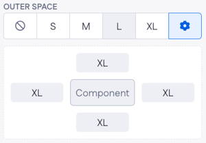
Outer space this is the space around the Title or Text component. By pressing the cogwheel icon you can also specify per side of the component how much space you want there to be.
Link to is an option that is used if you want to link to somewhere with your Title or Text component, the link can be opened in the current tab (when you compile the page) or an external tab. Linking to an internal page requires you to provide another Page as input, else you'll need to provide the component with an external URL.

The Styling tab allows you to change the color of your text via the text color option. Make sure to check out this article about the Theme builder if you're uncertain what all the options are. The other option is the font weight this option changes how thick your text is, so if you want a text that's more bold use this option to increase the boldness.

Using Title & Text components
Drag either the Title or the Text component onto your empty canvas (they work very similarly), or above the components you have already put onto your canvas. (You can also drag the canvas to the top of the page using the page tree)
When the Title or Text component is on your page you can customize it the way you prefer. Change the content, or convert it to a link.
Theme color inheritance
Text elements and headers automatically inherit styling from your theme. This ensures a more consistent look and feel across your application. When you update the text style color in the theme settings, all Text and Title components using theme color inheritance will automatically reflect the change. If needed, you can still override the text color by selecting a different general theme color manually.
Title & Text components vs other components
The Title & Text components are an important tool for many applications, having text with information is fundamental for any application.
There's not really any other component that could replace either one. You might ask yourself when should I use the Title and when should I use a Text component? The answer to this question is that when you have a lot of text that needs to be displayed, or text that shouldn't stand out, use the Text component. If you need to have a smaller text that needs to stand out, use the Title component instead. The correct use of the Title component text styles: H1, H2,.. H6, is to compare each style to a page of a book’s chapter. The H1 represents the chapter title; there should be only one per page. The H2 breaks the content up into sub-chapters. The H3-6 is used to further break up the content making it easily scannable.
Other components do use text like, for example, the Card component and the Navigation bar component. The text in those components is native to those components, meaning they don't make use of the Text component itself. The text in those components does work very similarly though.