After reading this article you’ll know:
-
Major characteristics and options of the drawer-based components
-
How to use these components in the page-building process
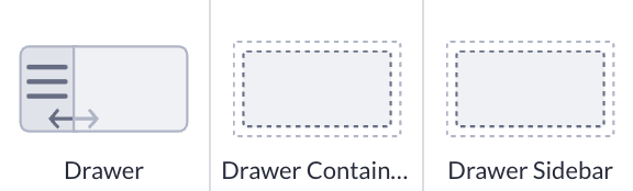
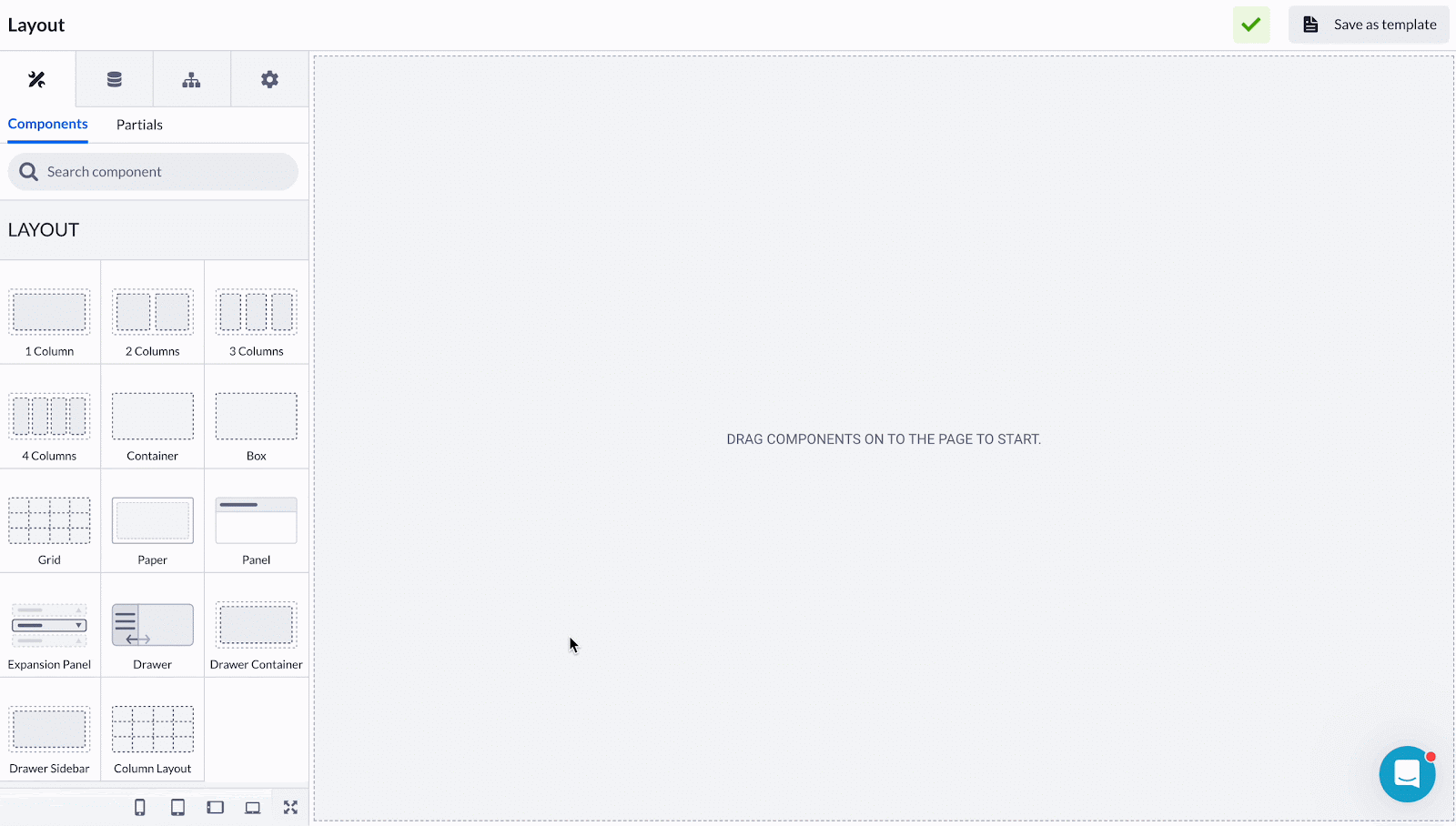
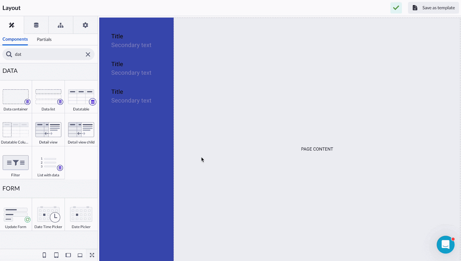
Drawer and its child components
When working with a vertical page layout, you need some specific components to align your page content. That’s when the Drawer component comes into play. At its core, the Drawer serves as an alternative to traditional top-of-the-page menus, offering users a lateral navigation option. Combining the two child components - the Drawer sidebar and Drawer container - you can create sleek side menus for various use cases.
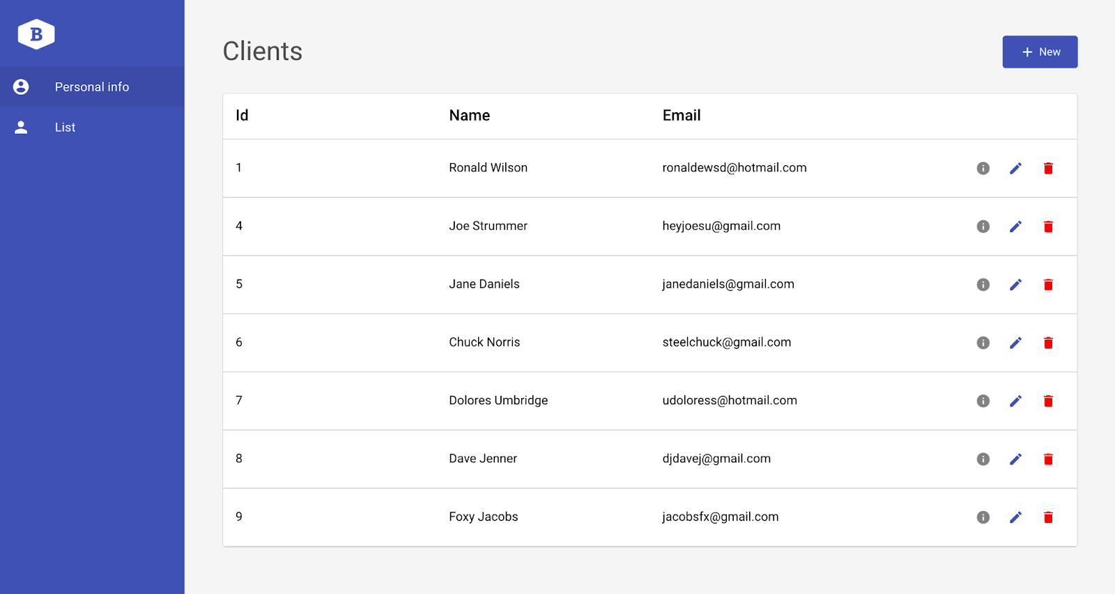
The Drawer's primary function shines in scenarios where users prefer side-oriented navigation. In the Back office template context, it displays record details, simplifying workflows and optimizing screen space.
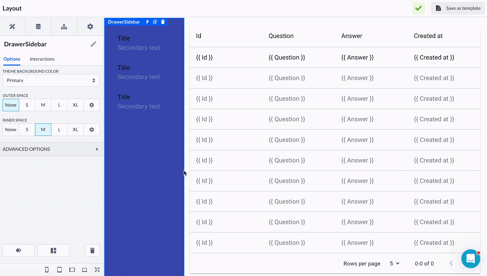
The Drawer container serves as the backbone, holding its contents and enabling easy interaction and layout management. The Drawer automatically includes this container, highlighting its essential role in the component hierarchy.
Similarly, the Drawer sidebar is a fundamental element within the Drawer component. While its inclusion as a standalone component may be debatable, its mutual relationship with the Drawer is significant in shaping cohesive navigation experiences.
Options
Considering that the drawer-based components complement each other, we can view their options as a step-by-step flow.
-
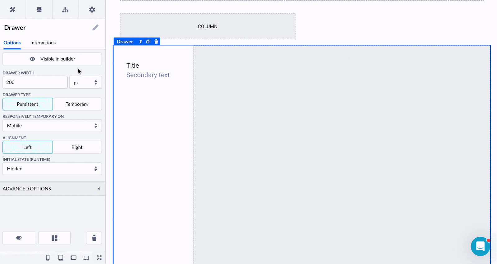
Drawer (a parent component) has a couple of useful options allowing you to:
-
Toggle the component visibility on and off in the builder mode - when a page isn’t compiled, you may hide the Drawer on the side and fill in the content space only
-
Regulate the Drawer width by percentages, pixels, etc.
-
Choose the Drawer type:
-
Temporary drawers provide quick overlays for extra info, good for brief actions or additional details
-
Persistent drawers stay put, serving as navigation centers with main menu options for easy movement through complex apps
-
-
Select the alignment: from left to right or vice versa.
-
Define the initial state: visible when a page is compiled or not.
-
-
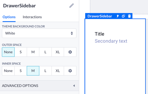
Drawer sidebar and Drawer container have the same styling-based options:
-
Theme background color which you can choose by first setting up your color scheme via the Theme builder.
-
Inner and outer spacing options are rather basic and work in the same way as for other layout components
-
Using the Drawer component
The Drawer is handy when an application has a complex hierarchy of navigation options or when there is a need for quick access to secondary functions or settings. An example of vertical navigation can be seen in applications like Slack or Trello, where users can access different channels or boards by clicking on items in the sidebar.
To get started building a page with a sidebar, simply create a blank page and drop the Drawer component onto it. You can switch colors in the Drawer sidebar options and duplicate the List items that come out of the box with it.
In a typical use case, the Drawer container is filled with the Data table or Data list. Again, it is easily done by just dropping one of these components into the Drawe container space. Then you proceed with Data table configuration.
Afterwards you can navigate back to the parent Drawer component and experiment with its options to see what works best for you. Each time you reach your milestone while editing, check your progress by compiling your page.
Drawers and other navigation components
As mentioned before, the Drawers are used for specific use cases and can be used to build navigation on your pages. Sometimes you need some alternatives for the usual Navigation bars which offer only horizontal page alignment.
In any case, using Drawers as well as Navigation bars often involves adding them to partials], which are reusable units containing different components. This ensures consistency across multiple pages, as any changes made to the partial automatically apply to all associated pages.
You can read more about different types of navigation elements and the choice between them in the Navigation on your pages article.