Input components are used to gather various kinds of information from your application users; the type of input component you choose depends on the specific information required.
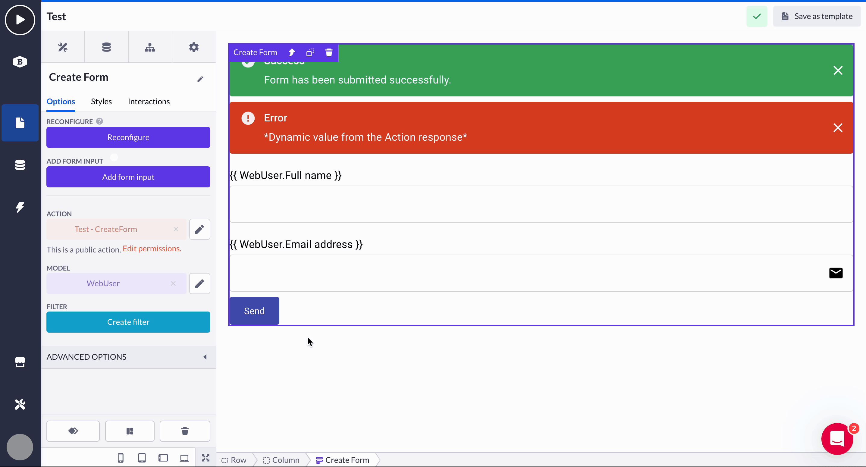
Any Form component can be customized right from the start by dragging it onto your canvas and adding input components into the form field. Using the Create form, Update form, or Login form will certainly save you effort, but there are times when you'll need to add additional inputs into these forms as well as into the regular Form.
To add a new input component, click on your Form and select the option Add form input and follow the configuration wizard. Select a Form input type: property-based (connects form input based on a data model) and non-property-based (binds the input to an existing action input variable or creates a new one).
The classic way of adding Form input variables via dropping them from the components overview into an existing Form on the page. Further configuration is the same (explained in Form component.

Within the input fields, you can also modify various options, such as the format in which you want users to provide information, for example, requesting a date in either DD/MM or MM/DD format.
Input component options
Common options
Because most input components share the same (or highly similar) option items, let's cover them beforehand. That will leave us more space for explaining some unique features of each input component.
Property
This is the property selected in either the form or input configuration. It is used to connect the component and the action input variable.

Label
Configure the label of the input component to give context to the end user what it is intended for.

Value
Configure the input component to give it a default value or base it on a dynamic property.

Autocomplete
When the Autocomplete option is enabled, the browser of an end user will show autocomplete suggestions based on values that were previously entered in the field by that end user in the same browser.
Autofocus
If enabled, the input component is focused on page load. When there are multiple inputs with this option enabled, only the last input component will be focused.
Disabled
The Disabled option sets the input to its disabled state. It prevents the values of this input from being submitted and an end-user from filling in any values.

Placeholder
Show the Placeholder within the input component to demonstrate the format/example of how the input text has to look.

Helper text
Adds text below the input to give the end user more information. When there are validation messages, this text will be replaced to display them.

Margin
Configure the spacing around the input component.

Size
The default sizing is available for the input component.

Place label above input
Toggle the 'Place label above input' option to display the input label on top of its main field.
Full width
When enabled, the width of the input will be based on the width of his direct parent container component.

Variant
Select the pre-defined styling variants for the input.

Icon
Displays an icon inside the input component to give context to an end user.

Validation options
Validation is key to ensuring that data input aligns with specific rules and conditions. The platform provides a set of validation options that help developers control the type and quality of data entered by users. Below is a brief explanation of the most common validation options for input components.
Required / Value required message
Ensures a field must be filled before proceeding. Essential for mandatory inputs like names, email, passwords, etc.

Validation pattern
A regex-based rule that enforces specific input formats (e.g., emails or phone numbers).

Pattern mismatch message
Displays 'Invalid value' message by default when input doesn’t match the pattern, but can be customized (also using variables).

Min length / Max length
Ensures input meets a minimum character length, useful for fields like passwords.
Value too short / Value too long messages
Shows “This value is too short” by default if the input is below the minimum length.
Displays “This value is too long” if the input exceeds the character limit.

Styling options
Styling options are used to customize the appearance of input components. These include settings like hiding the label, adjusting background and border colors (with hover effects), as well as setting labels and text colors, error messages, etc. to match your design needs.
For more detailed guidance, refer to the Styling best practices and Color use articles.

Advanced options
Interaction (change) delay allows you to set a delay (in milliseconds) before an action is triggered after user input. Another feature is the Test attribute, which lets you add a custom data attribute to components, making it easier to identify and interact with them in testing tools, for metric gathering, or applying custom CSS.

Input components & their unique options
After covering the options shared by most input components, we provide a detailed overview of each individual component and its distinctive options to consider.
Text
Text component enables end users of an application to fill in the text in the input. In the context of the form, this input can be submitted to the action where it can fulfill multiple use cases. Text (single-line) property works well with this input field.

Multi-line text
Multi-line text field component enables end users of the application to fill in multiple lines of text in the input. In the context of the form, this input can be submitted to the action where it can fulfill multiple use cases. Text (multi-line) property works well with this input field

See the unique options for this component:
-
Multiline
This option toggles whether the input has multiple rows or not.
-
Rows
This option specifies the number of rows in the text area.

Number
Number input enables end users of the application to fill in a number in the input. It has browser-specific behavior and a mobile keyboard switch on mobile devices. The Number (or Decimal number) property works well with this input field.

Password
Password input enables end users of the application to fill in a password in the input. The default behavior of such inputs is hiding the characters that an end user fills in to make it safer. Also, it has browser-specific behavior and a mobile keyboard switch on mobile devices. The Password property works well with this input field.

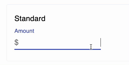
Price
Price input enables end users of the application to fill in a number in the input. It has browser-specific behavior and a mobile keyboard switch on mobile devices. The Price or Number properties work well with this input field.

See the unique option for this component:
-
Currency
You can pass in the currency icon via text input or a variable

- The currency option is used as an adornment on the price input field to prefix the currency (“€” or “$”) before or after the input’s value

Decimal
Decimal input enables end users of the application to fill in a number in the input. It has browser-specific behavior and a keyboard switch on mobile devices. The Number with decimal property works well with this input field

Both the Price and Decimal input components include these configuration options:
1. Decimal separator (point or comma)
When Point is selected as the decimal separator, a comma is automatically used as the thousands separator

A comma cannot be inserted for grouping unless Show group (thousands) separator is enabled:

Other rules applied in the runtime of your application:
- You can only insert a point once
- When submitting a value to the action, the internal (raw) number value is used (1,234.56 → 1234.56 will be sent and saved into the database)
- The applied input formatting works only in runtime. Static default values in the design time will not reflect it
- The chosen decimal separator (. or ,) is compiled at runtime and cannot be changed dynamically per user
- The inputs only accept point (.) decimals without group (,) separators
2. Scale (Number input)
This option defines the number of characters allowed after the (second) decimal separator - a chosen point or comma:

Notes:
The maximum input value is 10 trillion (
10000000000000)The minimum input value is -10 trillion (
-10000000000000). There is an option to set a lower maximum/minimum value if neededImportant! When adding the Price and Decimal components for the first time, expect a one-time setup delay of 30 to 60 seconds
Email input enables end users of the application to fill in an email address in the input. In the context of the form, this input can be submitted to the action where it can fulfill multiple use cases. The Email address property works well with this input field.

Autocomplete
Autocomplete input provides a menu of options based on the records of relational models or based on the values of a List property. When typing, the component fetches records to show in the menu of options.

Limits
Currently, the dropdown shows 20 records in the menu of options when based on a relation.
Options
-
Model
The model this input is based on. -
Filter
Filter the records displayed in the dropdown menu of available options. -
Order by
Change the ordering in the dropdown menu of available options. -
Label for options
Overwrite the label that is displayed in the dropdown menu of available options.

-
Add checkboxes
Enable checking the options provided via the Autocomplete

-
Close dropdown after select
The dropdown of the Autocomplete form closes after your selected an option -
No options
Adds text below the input to give you more information. When there are validation messages, this text will be replaced to display them.

Date picker
Date picker allows you to configure a Form where an end user can select a specific date. The Date property works well with this input field.

Options
-
Format
Defines the date format displayed in the input component.
-
Locale / Hour format
Define local time and 12 or 24-hour format

Date time picker
Date picker allows you to configure a form where an end user can select a specific date. The Date time property works well with this input field.

Options
The options are the same as those for the Date picker.
Time picker
Time picker allows you to configure a form where an end user can select a specific date. The Time property works well with this input field.

Options
The options are the same as in the date picker except for this one:
-
Format
Defines the time format displayed in the input component.

Switch
Switch works like the Checkbox, except the boolean toggle is shown with a slider instead of a checkbox.
Select
Select input allows you to provide a menu of options based on the records of relational models or based on the values of a listed property. The List property works well with this input field.

A unique option includes:
-
Allow users to empty selection
When enabled, users can avoid selecting any kind of value from the list.
Image upload
Image upload component enables the end users of the application to upload files in the input. In the context of the form, this input can be submitted to the action which allows the user to populate Image properties.

Unique validation options:
-
Hide default error
Suppresses the default error message when an invalid file is uploaded.
-
Accept files: Limits accepted file types to images (e.g., image/*), with the option to make this dynamic using variables. Configure the accepted mime type.
-
Max file size (MB)
Sets a limit on the maximum file size allowed for uploads, in megabytes.
-
Invalid file size message
Displays a custom message if the uploaded file exceeds the set size limit.

File upload
File upload component enables the end users of the application to upload files in the input. In the context of the form, this input can be submitted to the action which allows the user to populate File (or Image) properties.

The File upload options repeat the ones of Image upload.
Checkbox
Checkbox allows you to let the end users submit boolean values. The Checkbox property works well with this input field.
A single unique option includes:
-
Label position
Set the label text position around a checkbox.
Checkbox group
Checkbox group functions similarly to a single Checkbox but allows end users to submit multiple boolean values. It uses a relational connection to a relational object, where the Checkbox property is ideal for handling these inputs.

Hidden
Hidden input can be used to pass values to the action the end user is unable to directly update. Depending on the expected input of the hidden input field: the text, number, or checkbox property works best with this input field.
Configuration:
During the configuration of the Hidden input, you may choose what kind of value you expect in the Hidden input, being: Text, Number, or Checkbox.

Options:
-
Action input variable
A property that was selected in either the form or input configuration is used for the connection between the component and the action input variable.
IBAN
IBAN input enables end users of the application to fill in an 18-digit IBAN (with letters) in the input. It has browser-specific behavior and a mobile keyboard switch on mobile devices. The IBAN property works well with this input field.

Multi Autocomplete
The main difference between Autocomplete and Multi Autocomplete is that Autocomplete allows users to select a single option from a dropdown list of suggestions based on their input, while Multi Autocomplete enables users to select multiple options from the list.
In Autocomplete, once an option is selected, the input is finalized. In Multi Autocomplete, users can continue selecting additional options, often using checkboxes for easier selection.

Phone
Phone input enables end users of the application to fill in a phone number in the input. It has browser-specific behavior and a mobile keyboard switch on mobile devices. The Phone number or Number properties works well with this input field.

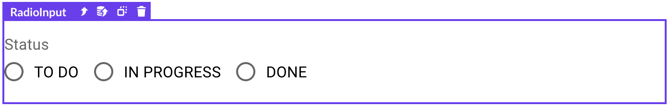
Radio
Radio allows you to provide a list of options based on the List property. Only one option can be selected at a time. The List property works well with this input field.
Options
-
Label position
Set the label text position around a radio item.
-
Row
The radios are displayed in a list or a row next to each other.
Rating
Rating component allows you to collect a score from 1 to 10 (customizable) and parse this to the Form action. The Number property works well with this input field

Unique options include:
-
Is read-only
Stops the user from being able to change it
-
Number of icons
Allows you to define the score of the given rating from 0/1 to 0/10.
-
Precision
When enabled, Allows users to select half an icon. Enabling to give a,5 rating up to 10.
-
Size
Changes the size of the rating icon.
Rich text editor
Rich text editor allows you to collect text, and save its styling and formatting. The Rich text property works well with this input field.

Options
-
Height
Sets the height of the component using its parent height -
Width
This option specifies the width of the text area. -
Spacing
Allows you to set the outer space of the component, with options to define the space per side: top, left, right, bottom.

Toolbar options:
-
Bold - Write the selected text in bold
-
Italic -Write the selected text in italic
-
Underlined - Writes the selected text while underlined
-
Strikethrough - Write the selected text with a strikethrough
-
Code inline - Allows you to write code structure in the rich text editor and allow javascript or other coding tags to pass through the action.
-
Code block - Allows you to write an example code block using javascript or other coding tags
-
Numbered list - Lists the text in a numbered order
-
Bulleted list - Lists the text in a bulleted order
-
Left alignment - Aligns the text on the left-hand side of the rich text field
-
Center alignment - Aligns the text on the center of the rich text field
-
Right alignment - Aligns the text on the right-hand side of the rich text field
-
Justify alignment - Aligns the text according to the parent component it is placed into, justified.

URL
URL input is used to enable end users of the application to fill in a URL in the input. It has browser-specific behavior and a mobile keyboard switch on mobile devices. The URL property works well with this input field.
