After reading this article you’ll know:
-
How to approach organizing navigation in your application
-
What components are used for building a navigation
-
The difference between vertical and horizontal navigation types
-
Best practices for using basic navigation components
As you start building your application with Betty Blocks, you want to make sure that the user interface is well-designed and everything is reachable within a few clicks. For this reason, you have to think a little bit ahead of time and plan the user’s journey across your application, in particular, you need to pay attention to the way navigation is built. Here we will describe everything you need to know to build navigation on your application’s pages.
Also, check out this video that we made about navigation:
Information architecture & wireframing
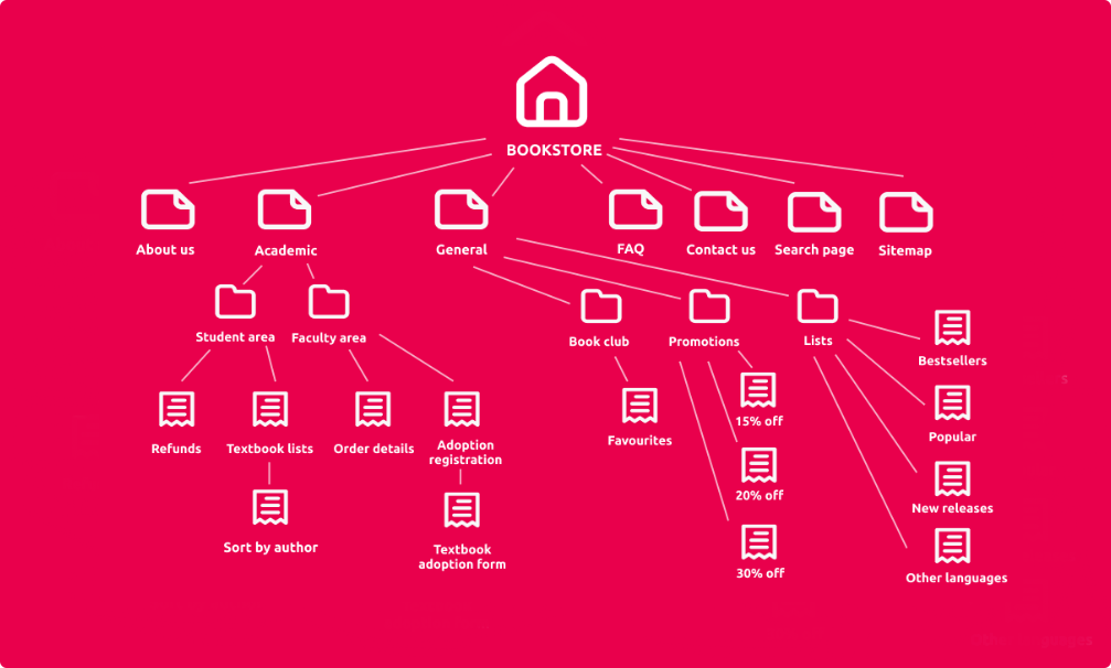
One of the first things you might think of when starting to build a new user interface is the information architecture (IA) that makes information findable and understandable within an application. It’s always reasonable to know a hierarchy of all elements on the website to design a successful user flow and navigation. Look at this example of a bookstore’s sitemap. Does it give you an idea of how you could structure a user’s journey across the application?
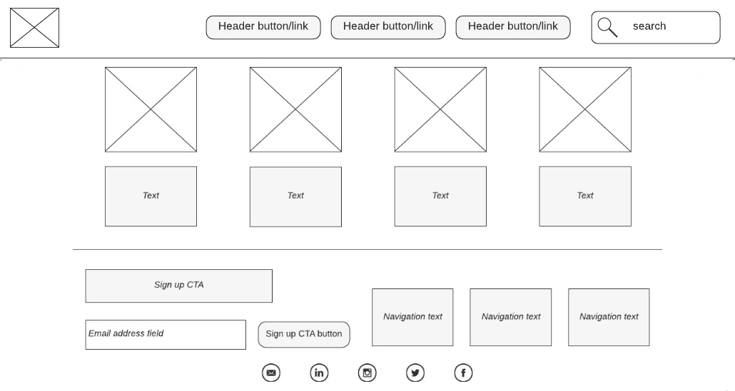
Next, goes wireframing which pushes the application’s structuring to the next level enabling stakeholders to visualize the blueprint. Wireframes are basic design layouts that display information about your product. Create a few drafts of pages and try to think of how users will be able to switch between them. Such schematic drawings can be done using various tools: from pen and paper to our platform’s page builder or applications as Figma, Balsamiq, or Adobe XD.
How do I build navigation?
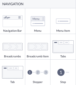
The page builder offers a lot of component options that can be applied for various purposes. They are split into sections, one of them is Navigation which represents the most popular component solutions for building the navigation flow in your application: a navigation bar (also known as application bar), menu and menu items, breadcrumbs and breadcrumb items, tab(s), stepper and steps. You can find a general overview of each component in the Navigation component reference.
However, not only navigation components can serve navigation-building purposes, and you’ll find out what we mean by that in the next section.
Horizontal & vertical navigation
The most common navigation type is horizontal. You can see it on most web resources that you visit. Within our platform, you have to apply a navigation bar (or app bar) to the top of the page. It is well-suited for applications with a limited number of primary navigation options or tabs.
One of the main advantages of the app bar is its visibility. Users can easily access primary navigation options without obstructing the content. It provides a clean and minimalist look, also making it ideal for mobile applications and websites. See how such kind of horizontally aligned page is built in Setting up your page.
The navigation bar used as a header keeps your main navigation items (like the buttons that you see in the example above) on the application bar whenever your position on the website is. The best idea is to turn it into a partial to reuse on other pages.
More information about creating, customizing, and reusing a navigation bar is available in the Working with a navigation bar article.
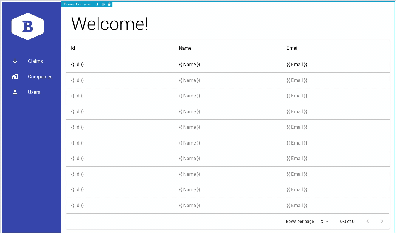
Vertical navigation, often found in the form of a sidebar, is an alternative approach to organizing user interface elements. It typically appears on the left or right side of the screen and can be expanded or collapsed as needed.
If you want to align your page vertically, you can use the drawer component and create a side menu (like in the back office template) and a drawer container beside it. This pattern is particularly useful when an application has a complex hierarchy of navigation options or when there is a need for quick access to secondary functions or settings. An example of vertical navigation can be seen in applications like Slack or Trello, where users can access different channels or boards by clicking on items in the sidebar. In order to get started building a page with a sidebar, simply create a blank page and drop the drawer component onto it.
Choosing between horizontal and vertical navigation depends on the specific requirements and goals of the application:
-
Horizontal navigation is great for simplicity and straightforward primary navigation and works best if you only have a few items. It is often used in business-to-consumer applications
-
Vertical navigation is more versatile and can contain more options. This type will be useful in case you have a lot of deeply nested elements or menu items
-
In some cases, a combination of both may be used, with horizontal tabs for primary navigation and a foldable vertical sidebar for additional features and settings
Navigation solutions
Now that you have enough knowledge of the type of navigation you want to proceed with, we can move on to some essential best practices with other important navigation page components.
Tabs
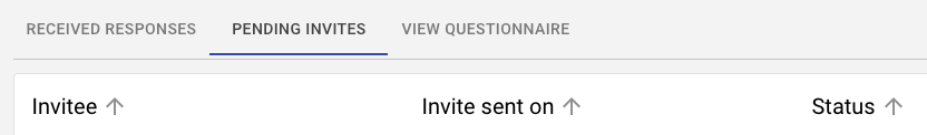
Using tabs as a part of navigation is an excellent solution for organizing content within a detail page or section. They allow users to switch between views and categories. In the example below, you can see the manager’s overview of a questionnaire. Administrators can switch between three tabs without opening separate pages.
The tabs application is rather straightforward: simply drop them onto the desired place on the page. You have a couple of options to choose from:
-
Reconfigure: rearrange the positions of existing tabs or delete them separately
-
Add tabs: set the properties for a new tab and add it to the existing tab panel

Note: As your pages become bigger and more complex, the page builder performance might decrease a lot. In these cases, we recommend using buttons or list items that can be styled in a similar way as tabs or steps but include redirection to separate pages.
Breadcrumbs
When you have some deeply nested items, you can use breadcrumbs to make navigation easier and more consistent. Breadcrumb items reveal the user’s location within an application and enable them to come back to the previous pages.
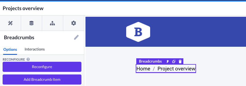
Drag and drop the breadcrumbs component onto an empty column (usually it is placed in the top left corner of a page, just below the navigation bar) and you will get a simple navigation scheme. By choosing a separate breadcrumb item, you will be able to set the name, page to be redirected to by clicking, text color, etc. Reconfiguration options are basically the same as for tabs.
Stepper
Used in some very specific cases, steppers guide users through the linear process with multiple steps, making complex tasks more manageable. You can create an intuitive workflow, employing them for such use cases as flight checkout or registration. Sometimes they are also applied to questionnaires, enabling users who fill them out to see their progress and places they can come back to.
When you drag steppers component to your page canvas, two steps will be added automatically. You can add more steps through the Add step option and edit existing steps by clicking on a single step just below the step overview. Other options include:
-
Step selection and step design (changes the look from a number to a tick)
-
Choosing a stepper type (horizontal, vertical, or mobile)
-
Tick Show all steps to view all steps as highlighted
-
Variant stands for the choice of linear (step by step) and non-linear (ability to jump from step one to step three, for example) filling for users
-
Alternative label scarcely changes the look of the stepper

Implementing these navigation solutions into your Betty Blocks applications can significantly enhance the user experience, improve usability, and access to the most essential features and content. Depending on your application's complexity and user needs, you can combine these components to create a comprehensive and intuitive navigation system. Always give yourself some time for experimentation. Good luck!