After reading this article you’ll discover:
-
The most common components you can use on your page and their functions
-
What is a page layout and what variations can it have
-
How to set up a page layout and build a simple home page with these components
As you start building an application, you might have many questions: What should I have on my page? Which components I’d better use? How do I structure elements of the page and make them coexist in harmony?.. And so on. Don’t worry, though it might seem overwhelming at first sight, by employing the drag-and-drop functionality of Betty Blocks’ page builder, anyone can easily and quickly implement their ideas.
As with any other platform, we have our own rules, approaches, and best practices. Taking one step at a time, we are going to build up your knowledge of using the page builder starting from the basics. One of these basics is the ability to create a user interface because the success of your application depends a lot on its simplicity and usability. Here we go.
What’s on a page?
Each web page consists of two important elements: layout and content. The layout defines a page's structure, while content is displayed within this structure. Of course, for content to be positioned correctly, we first need to ensure that the layout is well-prepared and arranged. Therefore, the best practice is to define your user interface structure before building your application.
An application layout serves as a blueprint that structures the page elements and determines how the different components are organized and presented to users. Imagine it as the interior design of a house – it dictates where the rooms, furniture, and decorations are placed to create a harmonious and functional living space. In the context of software development, an application layout defines the arrangement of buttons, menus, text fields, images, and other user interface elements of pages.
Betty Blocks and its page builder give you an extensive choice of components for building user interface layouts. Obviously, you won’t need all of them when you just start building your first application, so here we will concentrate on some commonly used components for building a typical page.
Navigation-building components
The first best practice highlights that you have to start building your page from top to bottom. What can you usually see on top when you open the home page of some product? Most likely that will be the navigation bar, also known as the application bar - an essential header component and the key functional element of every UI as it can get users to different parts of an application.

For this reason, each navigation bar has a bunch of buttons within it, and usually, it is turned into a partial to be reused on other pages as well. That’s how you make sure the navigation is clear and consistent.
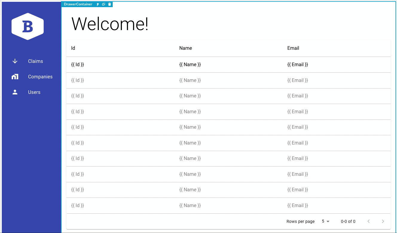
If you want to align your page vertically, you can use the drawer component and create a side menu (like in the back office template). The side menu navigation works better in case your information architecture has a lot of top-level items that cannot be grouped into several blocks. However, whether to choose vertical or horizontal navigation is mostly a question of personal preference.
Layout components
A page layout is about creating an intuitive and visually appealing environment for users to engage with your application features and content. So one should pay a lot of attention to arranging elements thoughtfully and logically.
While application bar positioning is pretty clear and straightforward, everything that comes in the middle of the page can be a bit tricky as you have to know the functionality behind the most important components to create a proper composition and alignment. Let’s have a look at how the layout components can help us.
Columns are blocks that enable the structuring of your page’s layout, and they also define the width of your design. Within columns, we can put all kinds of elements as content, data, forms, buttons, etc.
By default, the number of columns per page width is 12 on a desktop, 8 on a tablet, and 4 on a mobile device. So, depending on the type of content displayed within the user interface, you may divide the page’s width on the desktop, for example, into two (6+6), three (4+4+4), or more columns.
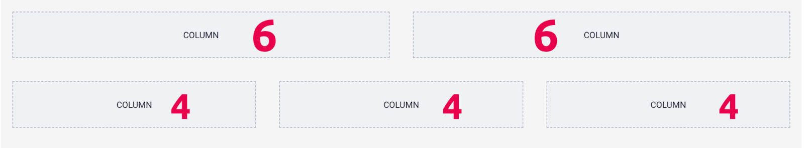
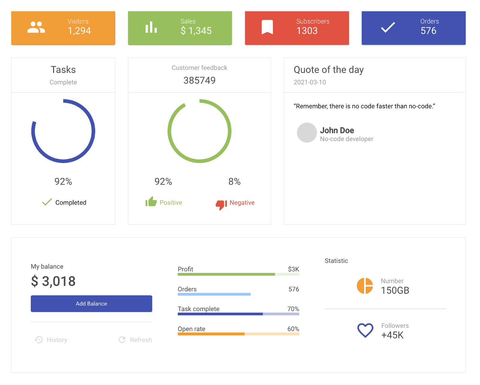
Have a look at this example of page layout, taken from the Inspirational dashboard template. Without a doubt, it’s visible how columns are divided into ‘3-3-3-3’ on top, ‘3-4-5’ in the middle, and ‘12’ at the bottom.
Another example shows how a page layout might even change from a ‘3-3-3-3’ card view to a single-column view. It depends on the type of content that is going to be displayed.
As you add one or several columns (or some other layout components) to a page, they are automatically united in a row - an underlying horizontal element that groups other page components in one line.
Switch between columns and rows using the up arrow (↑) on your keyboard or the one beside the name of the selected component. If you need to delete several columns or boxes, it’s faster to do so by deleting the row they belong to. Read more about navigating between components and their hierarchy in this article.
The column/row at the bottom of your page is called the footer. Usually, it is made to contain some useful links or contact information. The alignment that you see in the example below is created using a three-column structure.

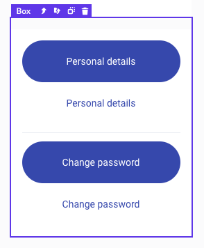
Boxes are layout-type components that create empty containers for your page. Once you fill a box with other components, it allows you to display these components in the way you want. For example, you can change the alignment of such elements as buttons.
Other components
Another core element of user interfaces is a button. It enables direct communication between your users and an application. Coming in different forms, sizes, and shapes, buttons can contain multiple interaction options, for example, they can redirect users to different pages, open panels, set filtering, etc.
There are other kinds of buttons like the open page button with the ‘open page’ interaction configuration built-in and the action button that comes with a pre-created action behind it, which can bring you straight to the action builder.
No application is created without text. The most frequently used content components are title and text. Both of them include static or dynamic content and have multiple styling options, like the choice of fonts, text style, alignment, etc.

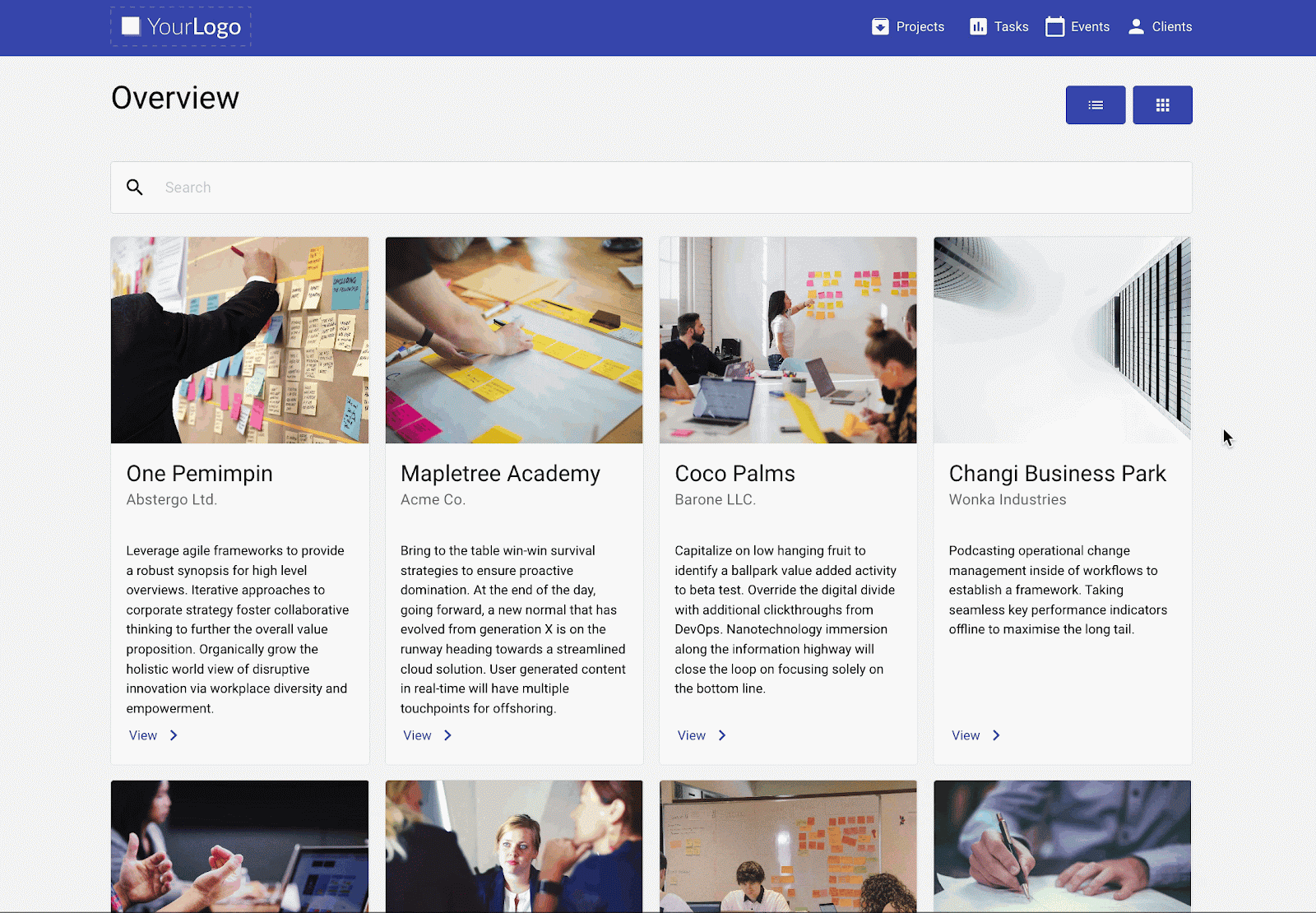
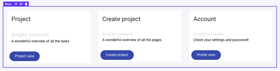
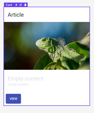
If you want to direct users to different pages, articles, or projects with their own unique names, images, and descriptions, then you definitely need to try card components. Coming in square columns, they contain pre-defined titles, texts, media, and buttons.
Creating a basic home page
All right, let’s get back to practice with a classic horizontal alignment and build a new home page. For this one, we are going to use the basic header and footer page template, create a simple layout applying some knowledge about columns and boxes, and build a simple navigation to other pages with card components and buttons.
Header and footer
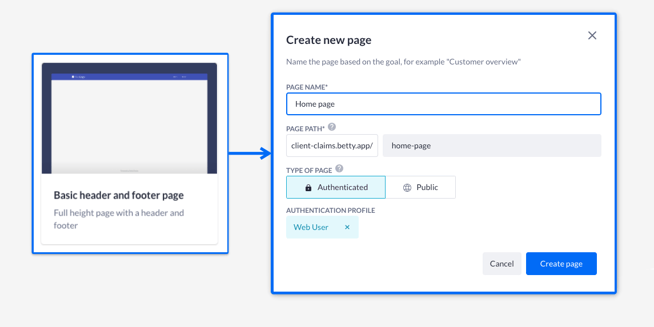
Let’s begin by heading to the page builder and creating a new page. Choose the basic header and footer template and follow the instructions in the modal.
Note: You can avoid setting up partials and just choose the option ‘Add without configuration’.
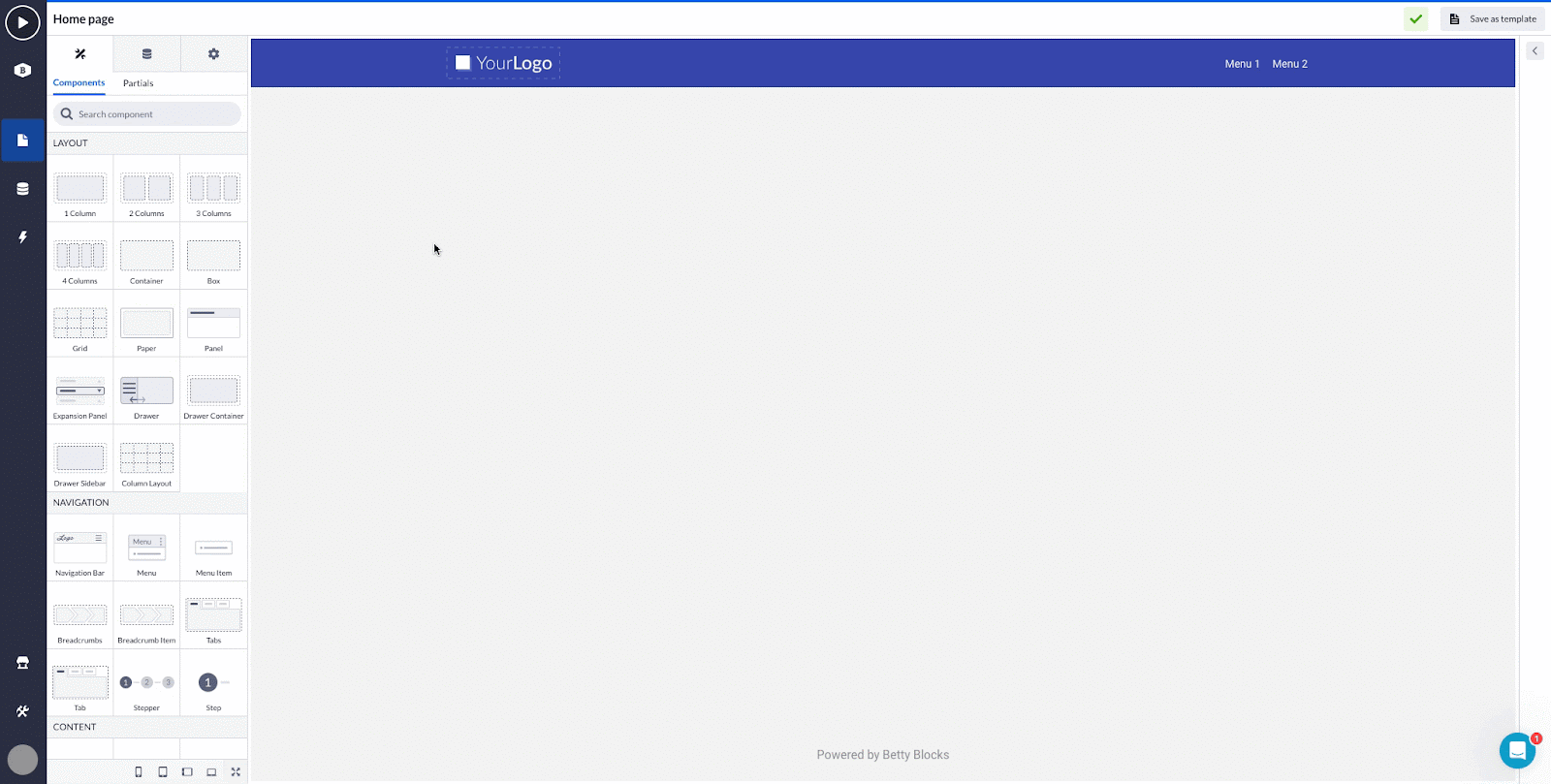
If you click through the canvas of the page, you’ll notice that it consists of three basic parts: the header with the navigation bar, the box in the middle, and a footer created with the box and title components.
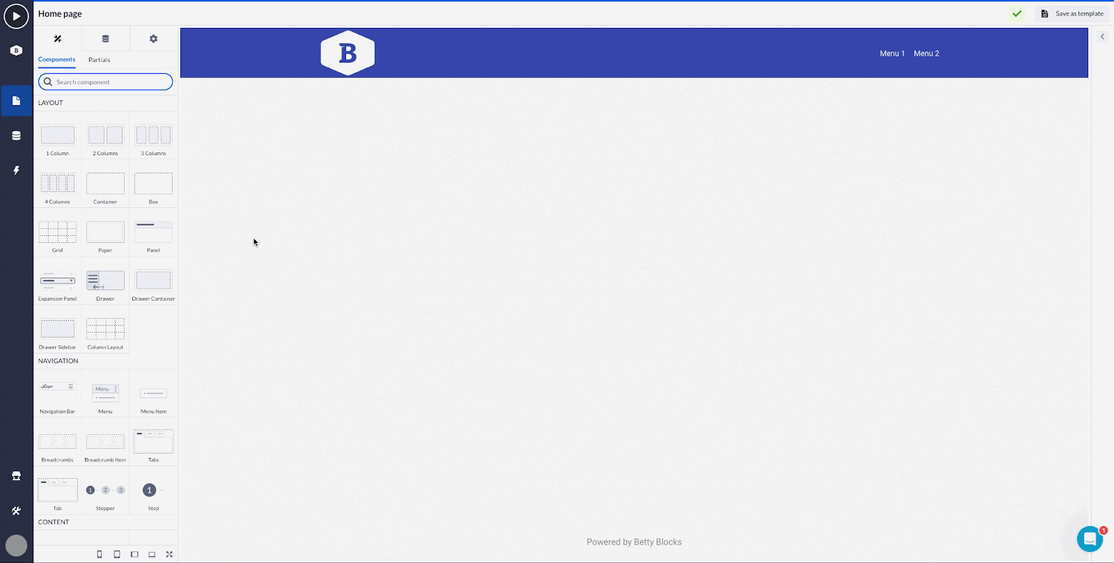
Now we can start adding new elements to the page. Find the app bar component within the header and click on it to open the options. You can add some text or a logo using either the image’s URL or an image from the public files. Adjust the logo’s width to your liking (the header’s size will be set according to it as well).
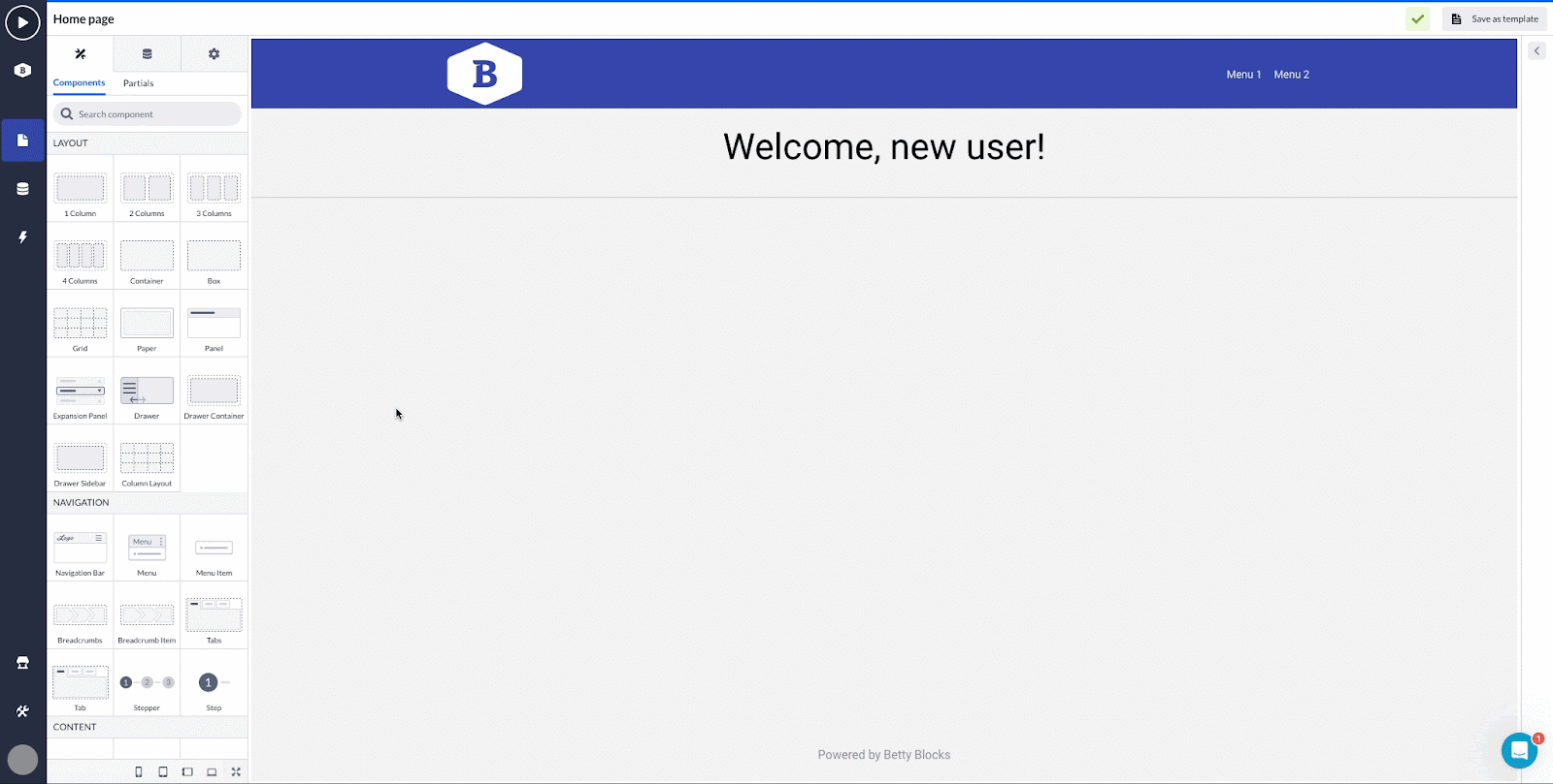
Welcome message
Next comes the welcome message. For adding this one, we can take a column and add it to the page first. Pick up a text component and drop it in the column. Choose the text component by clicking on the ‘Empty content’. The options on the left will be open and you will be able to type in the message you need in the content field, change the text style, and align the message to the center of the page in text alignment.
Also, we used a divider component at the bottom of our welcome message to separate it from the rest of the page components.
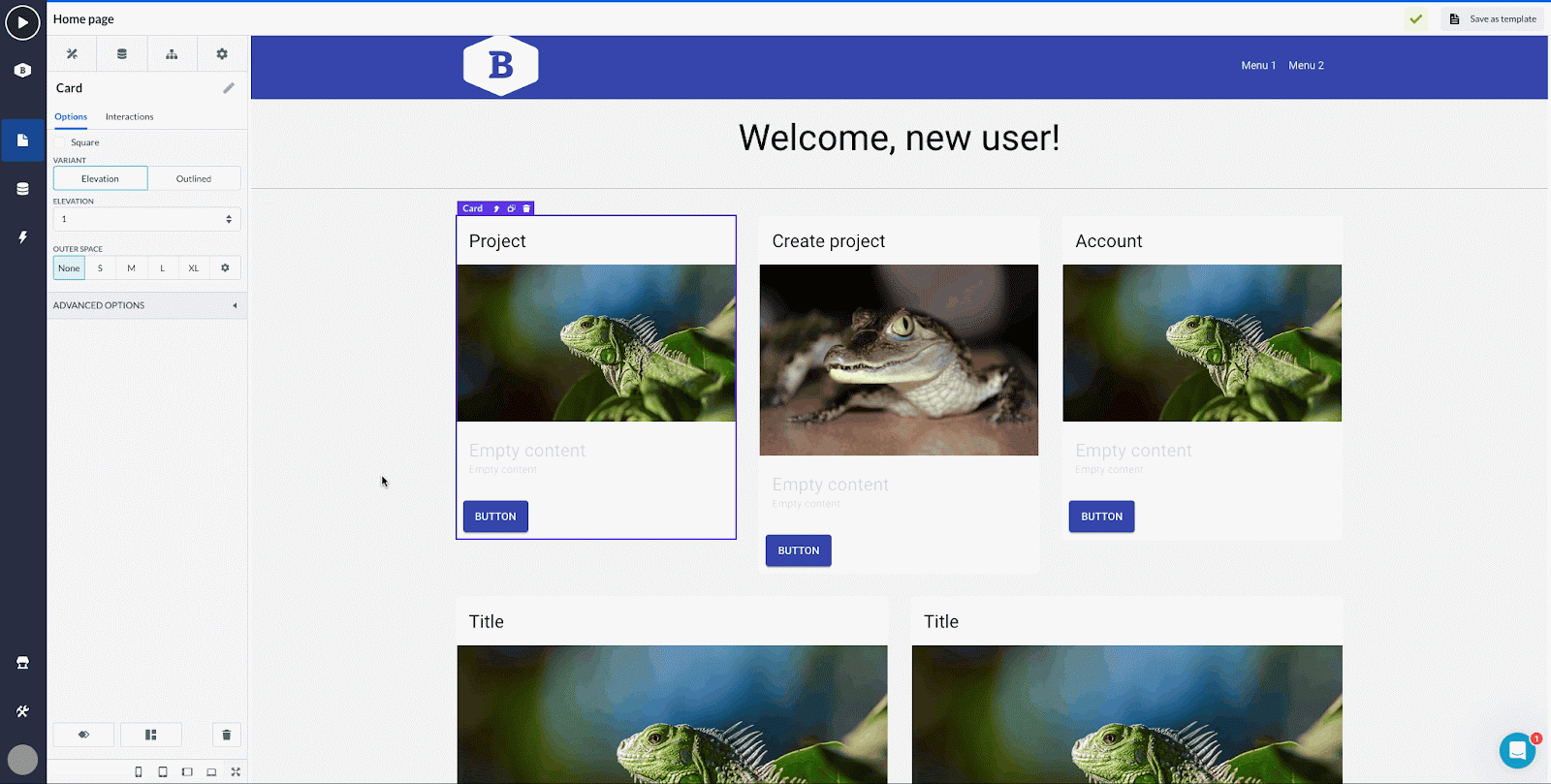
Adding cards
Imagine you have five pages with different content and you want to navigate your users to them from your home page. Nothing works better in this case than a bunch of cards, that serve as placeholders for several components: title, text, media, and button, that can be edited and restructured.
First, take some columns to structure the layout for the cards. You can take two, three, or four columns at the same time. Add them in a way you want the cards to look on your page. Search for a card component and drop it on one of the columns. Now, instead of picking up another card from the component menu, you can just use the duplicate option as shown below, and drag a duplicated card onto the next column.
You can easily rearrange elements within a card by just dragging them, or using the component tree.
Additionally, you can create a contact info panel using the show/hide interaction functionality. The way it’s done is explained in Creating component interactions.
Meanwhile, we are going to wrap up our home page by adding some buttons and details.
This is what it looks like when compiled: we created a very basic page layout with the elements that one might find useful to have within a home page. In the next article, we’ll present a more detailed overview of creating navigation between pages, aligning/spacing components, and styling page elements.

If you want to dive into designing pages with a video guide, we recommend our Essential path course. Also, you can have a look at how the home page is created in the Essential path - Review template.