After reading this article, you'll know how to:
-
Compile components in a widget
-
Enable component options within a widget
What are widgets?
Widgets offer several advantages when configuring applications or web pages. By grouping multiple components, they help reduce clutter and make the configuration process more intuitive.

Within a widget, you can specify which settings users can modify, allowing them to focus on the most relevant options instead of sifting through a lengthy list for each component.
Another advantage of widgets is the speed they provide for page building. An example of this is by looking at the Betty Blocks's neutral widget kit. The neutral kit offers a variety of widgets, including page examples.

Pick a page example that matches the objective of your page, drag it onto the canvas and see an entire page appear out of thin air. Providing inspiration and direct customization options for you to continue your page-building journey.
But besides the neutral kit, you can also create your own set of widgets, including your own branding, allowing you to enable your co-builders to quickly build all the pages they have dreamt of.
Creating your widget
To create a new widget that your users can use and configure, drag the Empty widget component onto your canvas. Add components to your Empty widget by dragging them into its area.
To determine which component options within the widget can be configured, navigate to the options for the specific component. When you hover over an option, an icon (represented by three dots) will appear, indicating that it is customizable.
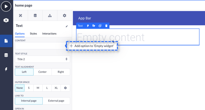
You can then select the Add option to 'Empty widget' . This will add the options to be configurable from the widget. Choose as many options as you wish, including those from various components.
Using the dropzone
If you want to allow builders to build in certain segments of your widget, you can enable the dropzone option in the advanced options of any layout component you add to your widget.

Using dropzones will show widget users an allocated space for them to add widgets or other components. The dropzone will be marked with a blue tint, as demonstrated in the GIF above.
The dropzone feature becomes testable only after the widget is locked; at that point, the options and dropzone are the sole elements that can be customized within your widget's space.
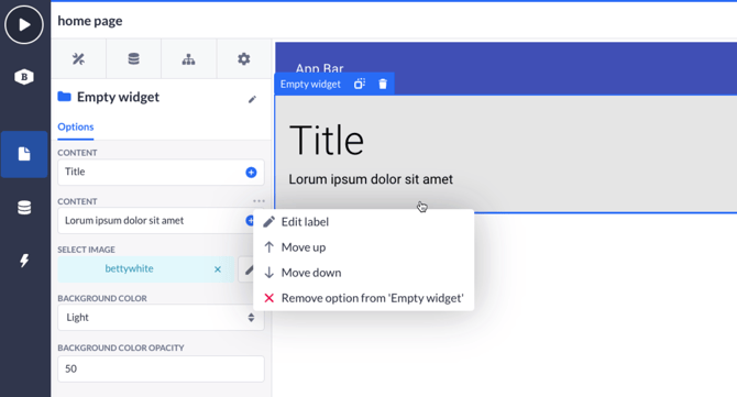
Editing your options
After you're done creating your widget by adding new components and enabling them in options, you can click the options menu in your widget to edit the label, move the component option up or down, and remove the option from your widget.
When everything is done and fine-tuned, you can lock your widget by clicking the lock icon at the bottom of your widget component. A locked widget will behave as a regular widget would, and prevent any changes from happening aside from the options you have pushed to your widget.

Edit and update your widget
To update any options or components in your widget, unlock the widget by pressing the lock icon to 'open' the widget. This will allow you to continue your widget building or updating.
Important note: Any updates made to your widget will not appear in widgets already placed on your canvas. Once you have updated a widget, you will have to update the shared widget in the sharing options (more about that further down in the article)
Sharing your widget
Once the widget is completely built to your liking, simply click the button at the bottom left of the options panel to save it.

Save the widget with the corresponding information, keep in mind that a representable image and title will allow other users to use it with more ease.

There you go, you'll now find the widget in the sidebar! Ready to be used by you and all of the builders you have shared it with. You may even toggle the "Share via Block Store" option to share the widget within your organization.
Provide the necessary details and specify the environments permitted to use it, and voilà! Developers with granted access can now install your widget through the Block Store and incorporate it into their application development.

Create your own widgets to speed up other users and be able to use your defined branding out of the box when building applications.