The low-code environment extends the platform's capabilities by enabling low-coders to add their own custom functionalities. In this article, we’ll show you how to create your own custom component(s) to use later in the page builder.
Requirements & tools
Before you start working in the low-code environment, let’s ensure you know the requirements. For creating low-code components they are as follows:
- React
- Javascript (ES6)
- Using terminal or CMD
- Node Package Manager (NPM)
Following this, let’s take a look at what kind of tools we’ll be using:
1) The first requirement for creating a component set is Node.js as a custom component is a Node-based project. Go to http://nodejs.dev to download the latest version.
2) The following tool is an optional tool called Yarn, a package manager. You can use this or NPM which is automatically installed when you install Node.js. Yarn on the other hand is quicker and more secure. The link for download is here: https://classic.yarnpkg.com/lang/en/docs/install/
3) Of course, you will also need a code editor. We recommend you use Visual Studio Code as the code editor for creating your custom components as this is the one we use in this guide. Download the latest version via this link: https://code.visualstudio.com/. Some of the extensions used for VS Code in this guide are Prettier & ESLint.
4) Lastly is the Betty Blocks CLI - the command line interface of our platform used when creating new component sets, setting up local development environments, serving a component set to multiple people, and publishing a component set to the Block Store.
In order to install the Betty Blocks CLI, open your command line tool - Command Prompt or Terminal (later in the text referred to as just “terminal”) and enter:
npm install -g @betty-blocks/cli
Note: To check if the CLI is installed correctly, type bb -v and you’ll be able to see the version installed. While writing this article the newest version is: 25.101.0, visit our GitHub to check for the latest version
Also, if you run into multiple errors while installing Betty CLI, try using 'sudo' before each command:
sudo npm install -g @betty-blocks/cli
New component set
In this section, we will use CLI to create a new empty project for our components, then use NMP to install all dependencies needed to run the components, and lastly, run a development server to add the component to the page builder. Let’s get started!
1) Open your terminal and use the following command to create a new component set. Each step will be supported by a real example with a project called 'cardview'.
bb components create <project name>

Note: You can also use the command bb --help which will display all the commands of the CLI. In order to check if this folder exists now, use the cd <project name> command.
2) Now that we have our new empty project, let’s set the dependencies by installing Node Package Manager (NPM).
- First, open up the project in VS Code and find the newly created project folder (‘cardview’ in our case). Once you open it, go to the package.json file. This one will contain all the dependencies that need to be installed.
- In the VS Code terminal, type in the command:
npm install
When installed, the node_modules folder will appear in the file explorer.
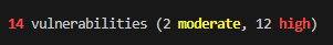
It is possible to get a notification like this:
No need to worry, this will cause no harm.
Everything mentioned here can also be found in Betty Blocks CLI documentation on GitHub.
Note: When opening the terminal in VS Code, check if the terminal is switched to “command prompt” instead of “PowerShell”.
3) In the next step, we are going to run a development server so we can use the component in the page builder.
- Open the file package.json and see the dev script there. Type in the command npm run dev, which will start the development server.
Every time you make changes to your code and save it, this command should run automatically after you enter it the first time. If not, you have to enter it manually again to add the changes to your Betty Blocks environment.

- Copy the retrieved URL: * In case you have a custom URL other than http://localhost:5001
- Create a new page in the page builder (ours is called ‘Open view’), go to its options, then choose ‘Local' in the component set options. This will use the component set you have published via your development server.
In case you are hosting your component set: paste the URL you retrieved earlier and choose 'Custom' in the component set options of your page. Now you will see your hosted component set in the components overview of the page builder.

4) As you can see, our component set is live in our page builder, with only the “Hello World” component present. Let's change this and add our own custom component in the next section.

Creating component & prefab
Component from scratch
The first thing we need to do in order to make a new component from scratch is to create a new file in our ‘cardview’ folder. We will call it ‘text.js’. Copy and paste the component code snippet below.
Note: A similar example can also be found on our GitHub.
-1.png?width=587&height=354&name=image%20(4)-1.png)
(() => ({

    name: 'text',

    type: 'BODY_COMPONENT',

    allowedTypes: [],

    orientation: 'HORIZONTAL',

    jsx: (() => {

        const value = 'Example';

        return <div className={classes.root}>{value}</div>;

    })(),

    styles: B => theme => {

        const style = new B.Styling(theme);

        return {

            root: {},

        };

    },

}))();
What we have now is a default snippet for a component. Let's add some stuff to it so you can see how you can make changes to your own components. The first thing we'll do for this example is to change the JSX to its most basic form. I'll add a div in there with the text 'Hello world'.
1) Remove this bit:
jsx: (() => {

const value ='Example';

return <div className={classes.root}>{value}</div>;

})(),
And replace it with:
jsx: <div>Hello world!</div>,
JSX is a part of React that allows you to write HTML elements in JavaScript. In this example, we are adding “Hello world!” to JSX, when we drag the component on our canvas this sentence will show. To change the HTML of your component, you need to change or add it to the JSX.
2) Let's also add a bit of styling, in the root part of the styles we'll simply add:
root: {

color: '#E9004E',

},
This will give the component the Betty Blocks red color. Now to apply the root class to the div we made; we do this as follows:
jsx: <div className={classes.root}>Hello world!</div>,
Eventually, here's what our code looks like.

(() => ({

name: 'text',

type: 'BODY_COMPONENT',

allowedTypes: [],

orientation: 'HORIZONTAL',

jsx: (<div className={classes.root}>Hello world!</div>),

styles: B => theme => {

const style = new B.Styling(theme);

return {

root: {

color: '#E9004E',

},

};

},

}))();
Creating a prefab
A prefab is something that you can drag onto the canvas inside the page builder. All your prefabs can be found on the left side of the screen. For example the “Hello World” icon we created earlier is a prefab.
In order for us to be able to use this component in the page builder, we also need to create a prefab - the element we see in the overview of all components.
1) Create a new file in the prefabs folder. It will be called ‘text.js’ in our case. Usually, it’s better to call both the component and prefab by the same name. Use the prefab code snippet copied from our GitHub page.
(() => ({

    name: "Hello World",

    icon: "TitleIcon",

    category: "CONTENT",

    structure: [

      {

        name: "Heading",

        options: [

          {

            label: "Heading text",

            key: "text",

            value: "Hello World",

            type: "TEXT"

          }

        ],

        descendants: []

      }

    ]

}))();
2) Name the prefab (‘My custom Component’ in our example), then choose the icon for it (for instance, ‘ParagraphIcon’) and choose the category (like ‘CONTENT’).
Just like a component, a prefab is an object immediately returned by an arrow function. The properties set in this step are descriptive information.
3) Next, we have a prefab structure. It’s an array of component configurations while this configuration is an object itself. That object needs to point to a specific component by name. Therefore, we type the following into ‘structure’:
name ‘text’,
That will point to the component name defined in our component file.

If you want, you can also change “Heading text” to “Content” because we aren’t creating a Heading.
4) Now you just need to make this component available through the terminal. Let's open it and type:
npm run dev
5) After you create a new page and copy-paste the localhost into the settings there, you'll see the text component we created in the list of components! Let’s drag it onto our canvas.
.png?width=342&height=171&name=image%20(3).png)
6) Lastly, you can compile the page to test it out. As you can see, the component is right there.
%20(1).png?width=290&height=155&name=image%20(1)%20(1).png)
If you want to learn more about creating custom components, visit our GitHub wiki!
For more discussions on creating custom components, we recommend visiting the community, where developers discuss options and new components together!