Header and footer template
Start with a full height page containing a header, footer and body.
After reading this article you’ll know:
-
How to set up the Header and footer template
-
How to customize it and add navigation
-
Some tips on the stylization of your page
This template provides a simple page with a header, footer and body that will scale to the content's height. You can choose either already existing partials for the header and footer or use and customize the default ones.
Creating and configuring new page
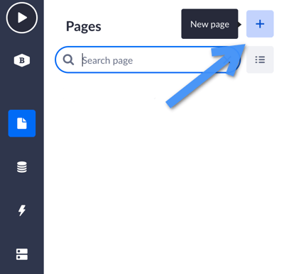
Once you open your application’s dashboard, go to the Pages section and choose the + button to add a new page.
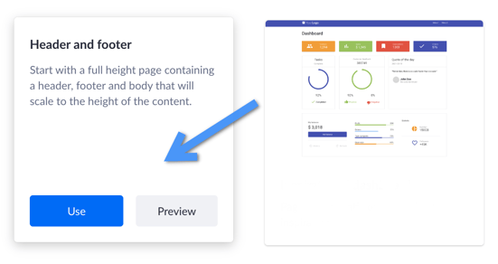
Next, you will see the “Choose a page template” section. Here you need to find the “Header and footer” template and click the Use button (or Preview if you want to see the interactive example of use).
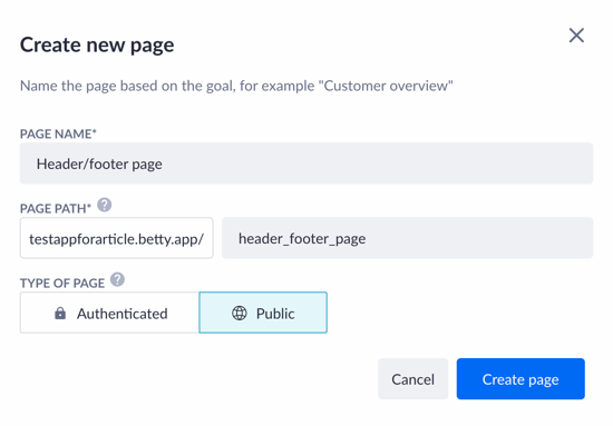
Now fill in the name and edit the page path to your liking (use an underscore instead of a dash, for example). Then select the type of your page. “Authenticated” type will require users of your application to log in, whereas the “Public” option will allow the page to be accessible by everyone.
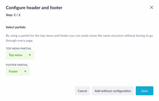
The next window is the partial selector configuration. It will try to find partials with a specific name in your application. If it succeeds, they will be automatically added (see the screenshot below). If no partials are found, the Generate button will appear. It allows users to either select their own partial or let the platform generate one for them
If you select the option Add without configuration, you will finish this setting without adding partials to your page.
Click on the Save button to confirm using the partials you’ve chosen and finish configuring the newly created page.
Customizing and adding navigation
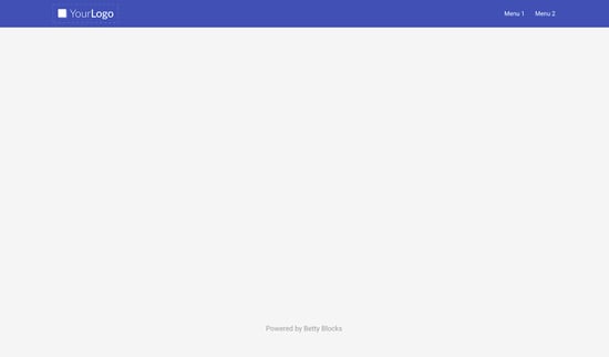
After the page has been created, it will look like this: a blank page with the header that serves as the navigation bar, and the footer with the default text on it.
From the page builder view, there will be one large box component with the ‘stretch’ option between either two partials (if you chose partials in the previous configuration) or the app bar and box. This ‘stretch’ option makes it possible for the footer to stay at the bottom of your page.
The first thing you might think of doing is adding your own logo and navigation interactions to the header.
Adding logo
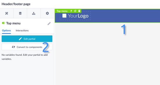
Click once on the header to select the partial component. Then, in the pages menu, click on the Edit partial option.
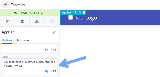
When you are in the partial editor, click on the header (‘AppBar’) once again in the options menu on the left and scroll down to the logo section. Here, replace the default URL with one of your company’s logo.
Note: If you haven’t used partials while creating this template, just find the needed component with a logo and replace its URL as in the example above.
More information about adding a logo and customizing the navigation bar can be found here.
Adding navigation
In order to create navigation in your application, try using interactions of the header’s components, in particular, the menu buttons.
Click the menu button component once to open its options (1). In the options menu, you can change the name of the button and link it to either internal or external pages (2). For internal linking, click on Select a page and choose the page you would like to redirect your users to in a dropdown menu.
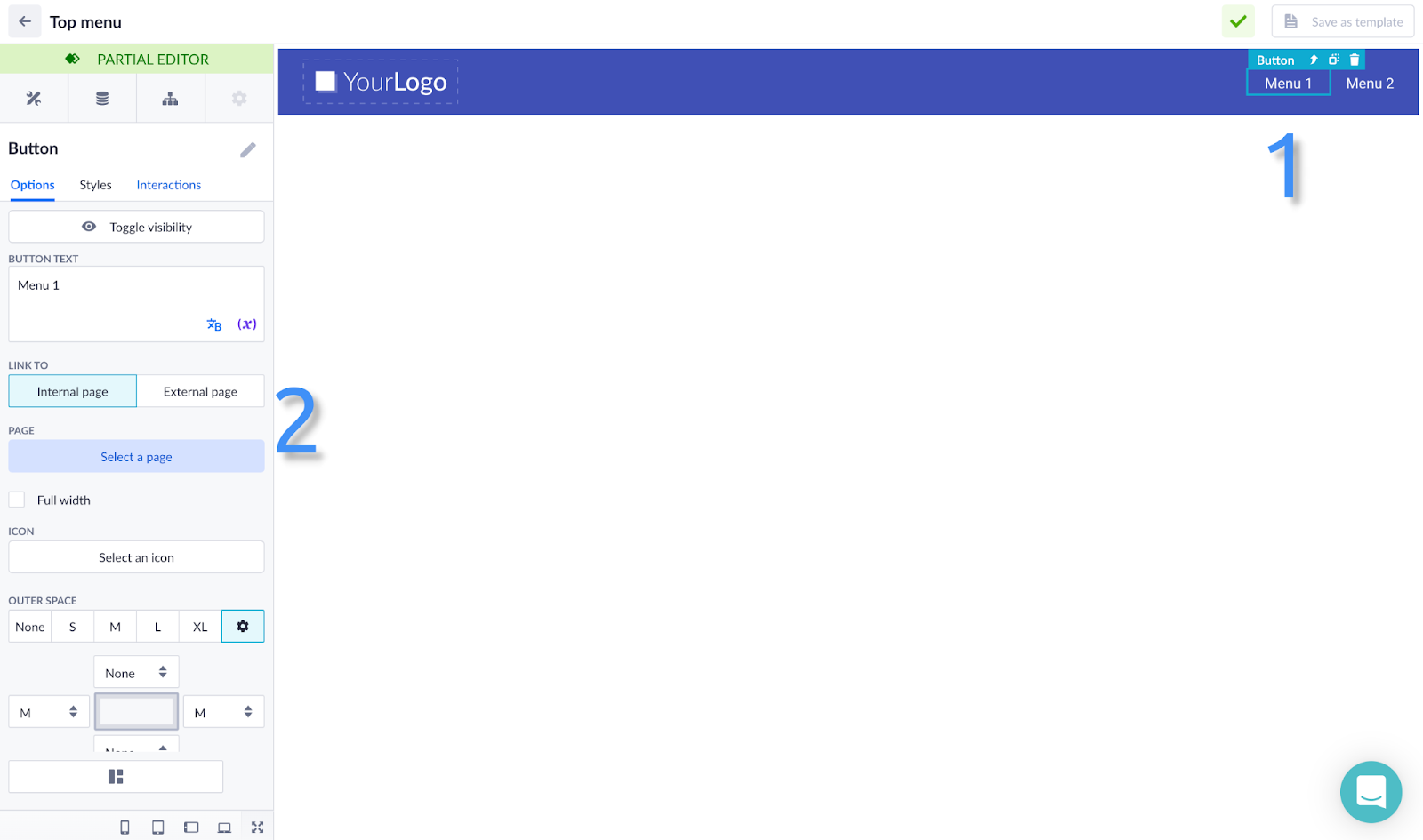
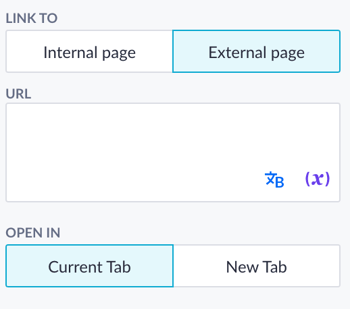
If you want to navigate your users to the internal resource, click on the External page option and insert a link to this resource. Then you can pick up an option of opening this external page in the current tab or the new one.
You can add more interactions if you wish to. More information about that in this article.
Front-end customization via theme builder
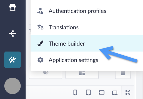
It is also possible to change your page style via the theme builder. You can find it in the tools section.
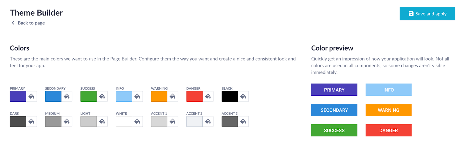
Here you can pick up the most suitable color scheme for your application.
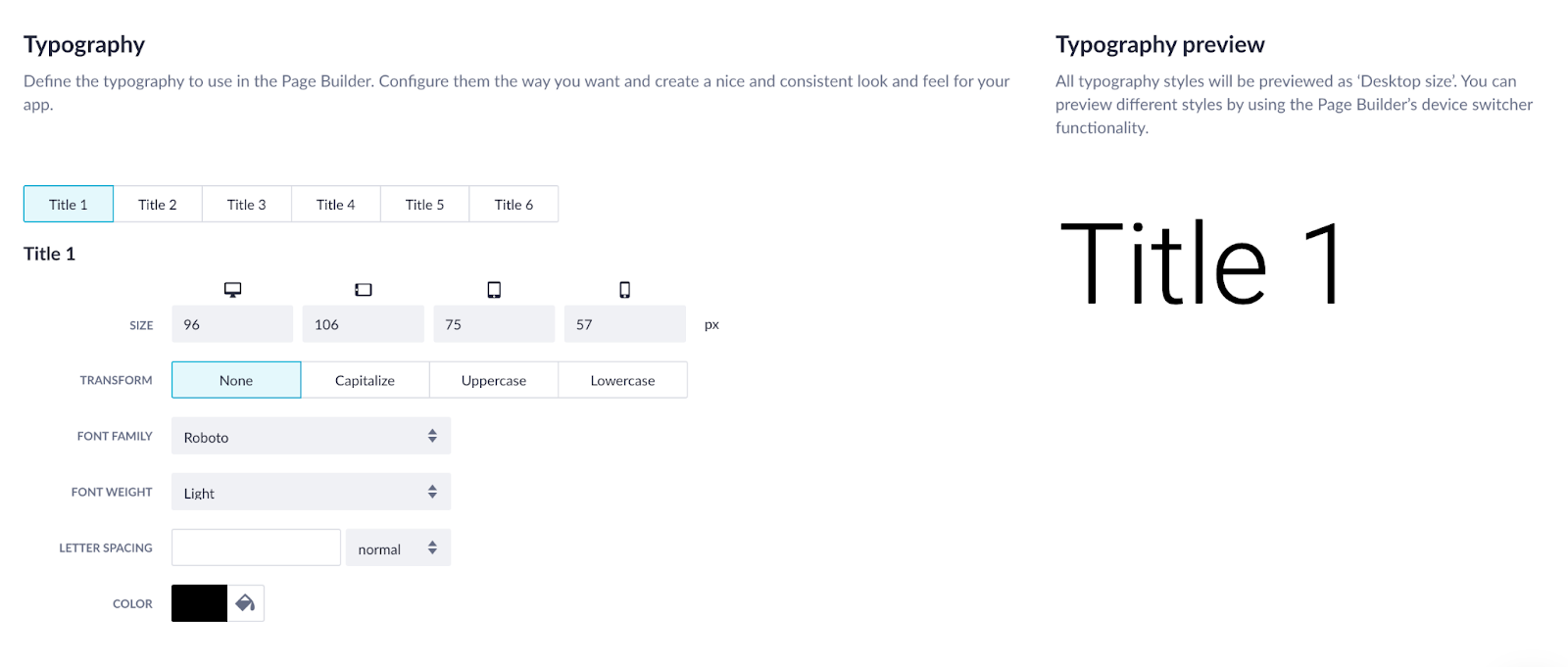
Also, it’s possible to configure your typography. Choose the fonts for the page titles and body text.
After you’ve finished customizing, don’t forget to click Save and apply.
Customizing your application could be really fun, whether you already have some references or want to do everything from scratch. Play around with styles and find the one you enjoy. More information about the theme builder is available here.
