After reading this article, you’ll know:
-
What are the Card components and their major options
-
Using the Card components
-
How to use the Box component in your application to build page layouts
What are the Card components?
The Card components are a neat set of components that, combined, are used as an eye-catcher for dashboard applications or object pages where you want to display different content at the same time on the same page.
Each item from the card component individually is very much like other components. The true power lies in the pre-styled combination of the card, content, header, media and button component. Which together showcase a piece of internet best-practice of introducing an object in your application.

In our page templates, two of the overview templates use the card components as main page item to showcase page objects.
Options
You can use the default card components to group content into visible units with controlled information layout and appearance. Using cards, you can create a linked entry point for further details on a piece of content. You need to base your design decisions on the information you want to present.
The following card components are available in the Components menu when building your pages:
Card
Square: Apply a rounded outline or square outline.
Variant: The variant of the card, giving an elevated or an outlined effect.
Elevation: The level of elevation. Only available when choosing the Elevation variant.
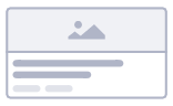
Card content

The card content component is the container part of the card component.
Card header

The card header component is a header component placed within a card component.
Avatar: The avatar of the card header.
Avatar type: Option to show text or an image as avatar
Title: The title that is displayed at the top of the card.
Sub header: A header that will be displayed underneath the title.
Card media

Media component that can be used to display images, videos, or i-frames.
Media type: The type of
Source: The source URL
Title: The title of the card media.
Card actions
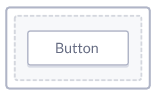
The card actions component is a container used for buttons within a card component.
Alignment: The alignment of the child components
Disable spacing: Disables the spacing of the card action.
For more info on Button components, check our button documentation.
Using the component
Card components are best used as display components for objects in which you would like to provide the user with more information and/or put out a call for action.
The standard set of the card can be customized into a segment to your liking by using the card or other content components. It is important to know that Card components can only be dragged into their card parent item.
Drag the card component onto your canvas within a layout component, configure the header, image, content, and button to your liking and you are already done.

After you are happy configuring the card to your liking, by adding/updating the components, you can duplicate the card and use them to display multiple objects, or use the card component in a list component and make every segment variable based on your application's data.
Cards vs other components
In certain cases, a list may prove a more suitable option as part of your design, It could be more compact and align will in the drawer component. But the out-of-the-box use of the card component is what allows you to speed up your development as it is a package of components that you don't have to configure yourself.
You could use layout components and content components to create custom cards, which could be more suitable depending on your use case.
In the end, the card is an enabler for eye-catchers on your page that can be configured relatively fast. Give it a try, and have a look at our page templates that use the card component to get started yourself.