Using the Page builder menu, you can design and then build web pages for your application. The page name (A) indicates the current page on which you are working. The Components menu contains an extensive array of components that can be used for building web pages.

The initial steps involve creating a layout or format. A series of layout options varying from a single-column layout to multi-column and multi-row layouts are available.
You can drag and drop the individual layout components to the canvas.
Once you have added a layout component, you can add additional components. For example, you can scroll to the Content components to add, for example, a Title component.
Before continuing, you may find some useful information about the layout components in this video:
In the below example, the column layout is dragged onto the empty canvas. The component is then displayed in the top area of the canvas as a Column. When you click on the component, the Options menu is displayed. As shown when you scroll through the menu, there are a variety of options available for customizing the component. For example, you can specify the background color and alignment of the column.

You can drag and drop the additional components to the selected layout to create the required format for your page. When you select a component, you can use the tab buttons displayed as follows:

You can use the Select parent component button to navigate to the parent component in which the current component is nested.
You can then apply options as required to the parent component.

You can use the Clone component button to replicate a component that you want to reuse. You can apply consistent formats and layouts across your web page based on the original component.

Where you decide that you do not require a component, you can use the Trash icon when the component is selected to delete the component.
The following components are available in the Layout section of the page builder menu:
Columns

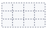
Columns are layout-type components that are used to create sections in the grid of your page. This is based on the MaterialUI framework (12 sections principle).
You can use the different column components to create an initial wireframe for your web page.
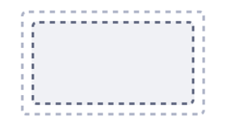
Container

Use the Container layout as an anchor for other components that you want to use such as lists or buttons.
Box

Boxes are layout-type components that are used to create empty containers for your page.
Grid
You can create a Grid for organizing the layout of your web page.
Paper

Papers are slightly altered columns with a border effect to give it a ‘paper’ look, elevating or outlining the component.
Panel

Panels are slightly altered columns with a styled border added to it. On panels, however, you’re able to add a title to its header.
Expansion panel

Expansion panel is a panel that can be expanded to show the contents within, displaying them in a dropdown manner.
Drawer
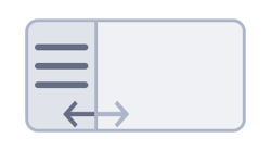
Drawer is a sidebar containing elements such as menu items.
Drawer container
A Drawer container is the container part of the drawer component.
Drawer sidebar

A Drawer sidebar is the sidebar part of the drawer component.
You can use the options available for setting, for example, the width or height of a component, or to set the padding or background color.