The Betty Blocks low-code environment allows you to expand the platform’s functionality by developing your own custom features. In this article, we’ll walk you through creating a custom page component that you can later use in the page builder (Pages).
Important! Before you begin, make sure to review the Setting up your low-code environment guide. It covers all the necessary tools and requirements for building custom components.
Creating a new component set
1. Open a Terminal window (macOS) or Command Prompt (Windows)
2. Create or navigate to your development folder. When coding, you usually have one folder named ‘dev’ to organize all your code projects.
3. Enterbb components create <name>-
- Replace
<name>with your desired name. - Tip: Use the following naming convention to keep your component sets organized between apps: appname-custom-components. Example:
myapp-custom-component
- Replace
4. After the component set is created, the terminal will display something like:
Component set successfully created in directory 'myapp-custom-components'5. Navigate into the component set with
cd <name>-
- Replace
<name>with the name you’ve given your set.
- Replace
6. After the dependencies have been installed, the terminal will display something like:
added 566 packages, and audited 567 packages in 22s

148 packages are looking for funding

run `npm fund` for details
7. After completing these steps, your component set should have the following contents:

Serving your component set
Before you can use your component set in the platform, you need to serve it locally.
- Open Visual Studio Code.
- Click ‘File’ > ‘Open…’ and open your component set’s folder.
- Click ‘Terminal’ > ‘New Terminal’ to open a new terminal window.
- Type
npm run devand press Enter.
The terminal window will display something like:
Success, the component set has been built

Total time: 1.645 seconds

Serving the component set at http://localhost:5002
If your component set is serving at http://localhost:5001, then follow these steps to change the port:
- Locate the ‘nodemon.json’ file in the component set and open it.
- Edit the command
bb components serveby appending a-pflag with the number5002:
{
  "watch": ["src"],
  "ext": "ts,js",
  "exec": "rimraf dist && bb components build && bb components serve -p 5002"
}
This allows you to use the ‘Local’ option in the page setting ‘Component set’:

After setting the Component Set to Local and saving the settings, the custom component(s) become visible in the Components panel on the left:

Common errors when serving your component set
This section explains how to solve common errors when serving the component set.
ENOENT: No such file or directory, scandir
Error: ENOENT: no such file or directory, scandir '/Users/samdegroot/dev_bb/tutorials/myapp-custom-components/src/prefabs/partials'

    at async readdir (node:internal/fs/promises:950:18) {

  errno: -2,

  code: 'ENOENT',

  syscall: 'scandir',

  path: '/Users/samdegroot/dev_bb/tutorials/myapp-custom-components/src/prefabs/partials'

}

[nodemon] app crashed - waiting for file changes before starting...
If your terminal displays the above message after running npm run dev for the first time, you simply need to restart your dev server.
- Activate the terminal window by clicking inside it.
- Press
Ctrl + Cto stop the server. - Type
npm run devto start the server again.
Creating a new component
- With your project open in Visual Studio Code, open a new terminal window or use an existing one.
- Enter
bb components generate <name>and press Enter.- Replace
<name>with the desired name - Use camelCase.
- For example: counter
- Replace
The terminal window will display something like:
The component set has been generated
This will have generated a couple of files:
- components/counter.js
- prefabs/counter.tsx
- prefabs/structures/Counter/index.ts
- prefabs/structures/Counter/options/index.ts
While working with your component, you will mostly be working with:
-
- This stores the JSX that is rendered on the page.

- prefabs/structures/Counter/options/index.ts
- This stores the options seen in the prefab panel of the page builder
Important! To ensure the refresh feature works correctly during development, make sure the component name matches the prefab name exactly. If there’s a mismatch, an error message such as Prefab not found will appear in your console.
Example component - Counter
This sample component highlights a range of techniques and platform-specific features to help you understand how to develop your own custom components.
Turn on developer tools
When developing components, you want to enable developer tools in your application. This allows you to refresh the component on the page without having to delete it first and drop it on the page again.
1. Go to your application’s configuration
2. Create a new configuration
-
- Name: “SECRET_DEVELOPER_TOOLS”
- Kind: “Single”
- Value: TRUE

⚠️ Disclaimer: If you’re using the SECRET_DEVELOPER_TOOLS configuration to enable advanced development features, please note that this setting is currently unsupported. Use it at your own risk, as Betty Blocks does not provide official support or troubleshooting for issues related to this configuration.
3. Save the configuration
You have now enabled the developer tools! Open a page and select a component. You will now see a refresh icon:
Creating the UI element
1. Create a new component using the bb components generate command and name it ‘counter’.
2. Open the components/counter.js file.
3. You will see the following snippet that has been generated:
(() => ({
  name: 'Counter',
  type: 'CONTENT_COMPONENT',
  allowedTypes: [],
  orientation: 'HORIZONTAL',
  jsx: (() => {
    const { useText } = B;
    const { content } = options;

    return <div className={classes.root}>{useText(content)}</div>;

  })(),

  styles: () => () => ({
    root: {},
  }),
}))();
Below is an explanation of each of the keys you see:
“Name” → Name of the component, which is visible in the page builder when highlighting the component
“Type” → This is the type of the component; see Component conventions for information on the different types
“allowedTypes” → This defines what type of component can be assigned as a child of this component. For example, a row can only contain a column
“Orientation” → How to display the component in the prefab picker
“JSX” → The JSX code to render. See JSX. This holds the logic of your component
“Styles” → Each key in this object will become a precompiled class that you can use in your component. In this example, a ‘root’ has been defined in the styles section, which is then used in the component via classes.root.
4. Add a new state variable named count:
const [count, setCount] = useState(0);
💡 Read more information on the useState hook and others in React’s official documentation.
5. Next, we’re going to add two buttons to the component and make sure we can see the current count:
return (
  <div className={classes.root}>
    <button onClick={increment}>Increment</button>
    <button onClick={decrement}>Decrement</button>
    {counter}
  </div>
);
5. Then, we'll implement the increment/decrement functions. Use the setCount function to do this.
const increment = () => {
  setCount((prev) => prev + 1);
};

const decrement = () => {
  setCount((prev) => prev - 1);
};
Your component should look like this:
(() => ({
  name: 'Counter',
  type: 'CONTENT_COMPONENT',
  allowedTypes: [],
  orientation: 'HORIZONTAL',
  jsx: (() => {
    const { useText } = B;
    const { content } = options;
    const [counter, setCount] = useState(0);

    const increment = () => {
      setCount((prev) => prev + 1);
    };

    const decrement = () => {
      setCount((prev) => prev - 1);
    };

    return (
      <div className={classes.root}>
        <button onClick={increment}>Increment</button>
        <button onClick={decrement}>Decrement</button>
        {counter}
      </div>
    );
  })(),

  styles: () => () => ({
    root: {

    },
  }),
}))();
6. Drop the component on the page
7. You now have a very basic component that has an increment and a decrement button. Compile the page and try it out!

⚠️ Warning: Component size limit
Avoid creating very large custom components (monolithic designs). Large components are harder to maintain, test, and reuse. Instead, aim for a modular approach by splitting functionality across multiple smaller components.
Maximum allowed size per component: 64 KB.
Interactions
In our example, we’ve used two simple HTML buttons, but what if we want to use the buttons already provided by the platform to increase/decrease the counter? We can solve this by defining interactions in our component.
💡 Read more information about interactions on the official GitHub documentation.
1. Let’s first clean up our component. We can remove the two button elements we placed earlier.
return (
  <div className={classes.root}>
    <button onClick={increment}>Increment</button>
    <button onClick={decrement}>Decrement</button>
    {counter}
  </div>
);
To define an interaction that can be used by other components, we need to use the B.defineFunction() helper function.
The B.defineFunction helper takes two arguments.
- Name
- Function
2. Use B.defineFunction to define two new interactions for “increment” and “decrement”:
B.defineFunction('increment', (e) => increment());

B.defineFunction('decrement', (e) => decrement());
Your component should now look like this:
(() => ({
  name: 'Counter',
  type: 'CONTENT_COMPONENT',
  allowedTypes: [],
  orientation: 'HORIZONTAL',
  jsx: (() => {
    const [counter, setCount] = useState(0);

    const increment = () => {
      setCount((prev) => prev + 1);
    };

    const decrement = () => {
      setCount((prev) => prev - 1);
    };

    B.defineFunction('increment', (e) => increment());

    B.defineFunction('decrement', (e) => decrement());

    return <div className={classes.root}>{counter}</div>;

  })(),

  styles: () => () => ({

    root: {},

  }),

}))();
3. Reload the component on your page by using the refresh icon.
Before we can add two buttons to the page to interact with our component, we quickly need to set our component back to ‘Default’ in our page settings
The component set on the left will refresh automatically, and you will be able to access the default components again. Remember to toggle it back to ‘Local’ if you wish to update your component.
1. Place a new button on the page.
2. Set the button text to ‘Increment’:

3. Click on the Interactions tab of the button.
4. Create a new interaction on ‘Click’.
5. Search for the ‘Increment’ interaction.
If you do not see your interaction(s), refresh your page or check the console for any errors.
6. Select our ‘Counter’ as the target component and click ‘Save’.
7. Repeat the same steps for the 'Decrement' button.
8. Compile your page and test it out!

Prefab
Our counter component is nothing without some basic options. Let’s add three options to our component:
- Starting value
- Increment value
- Decrement value
The platform offers a list of options to choose from, and you can find all of them on the official GitHub wiki. Currently, these options are still described in JSON instead of the platform’s default language for prefabs, which is TypeScript. You can find information about Typescript prefab’s here.
Because the prefab options are now in TypeScript, we literally have a dictionary in our IDE on how to use the components. Throughout this course, you will learn how to use these features to build your prefab.
Start by adding our first option, the ‘Starting value’:
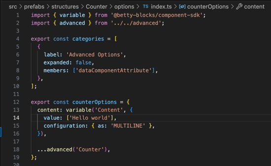
1. Open the ‘prefabs/structures/Counter/options/index.ts’ file.
The contents of this file currently look like this:
import { variable } from '@betty-blocks/component-sdk';
import { advanced } from '../../advanced';

export const categories = [
  {
    label: 'Advanced Options',
    expanded: false,
    members: ['dataComponentAttribute'],
  },
];

export const counterOptions = {
  content: variable('Content', {
    value: ['Hello world'],
  }),
  ...advanced('Counter'),
};
Let’s go through this code step by step to make it make sense, and that we have a general understanding of what we’re looking at.
We first see our imports at the top. These are files that were generated when the component was created. We will skip them for now, but feel free to take a look.
By holding down the ‘Ctrl’ button and hovering your mouse over either of the import variables, you will see a snippet of the code that’s imported:

While still holding down the ‘Ctrl’ button, you can also click on the variable. VSCode will then navigate to where this variable was declared.

We will get back to these files at a later moment. Let’s first look at the variables inside the options/index.ts file.
Categories
export const categories = [
  {
    label: 'Advanced Options',
    expanded: false,
    members: ['dataComponentAttribute'],
  },
];
The platform allows you to neatly organize your options in specific categories. Let’s take the default Button’s prefab as an example:

We can see that some of the options are immediately visible, but some of them are inside a collapsed panel, which can be opened/closed for accessibility.

The category variable is simply an array of objects. Each object has a couple of keys:
“label” → The label to display in the Page builder.
“expanded” → Whether the category is expanded by default.
“members” → Array of options that are in this category.
Creating a new category
To create a new category:
- Copy the existing “Advanced Options” category object.
- Paste it inside the categories array.
- Change the name to your desired name.
- Enter the keys of the options you want to have inside this category in the ‘Members’ field.
Options
export const counterOptions = {
  content: variable('Content', {
    value: ['Hello world'],
  }),
  ...advanced('Counter'),
};
The options variable contains the options that are displayed in the prefab. This is what allows you to simply pass values via a configurator instead of having to manually edit your options each time.
Let’s take a look at the ‘content’ option from the snippet above.
“Content” → This is the key of the option and allows you to access the option in the JSX code of your component.
“variable” → This function is imported from the ‘@betty-blocks/component-sdk’ dependency and constructs our option so that it can be used by the platform. Depending on the type of option your using, this function can take various types of arguments. In the above example, we first see the label of the option, followed by an object that contains information about the option itself.
“...advanced” → This is an imported option that is spread using spread syntax.
Creating an option
With all the important information out of the way, let’s start by adding our first three options.
1. In the counterOptions object, define a new key named startingValue:
export const counterOptions = {
  startingValue: ,
  ...advanced('Counter'),
};
2. Now, as the value of this key, start typing: number. VSCode will show a window with some suggestions:

3. Select the ‘Number’ value which has the ‘@betty-blocks/component-sdk’ tag at the end and confirm by hitting ‘Enter’ or clicking on the option.
VSCode will automatically create/update the import statement for you as well. Just make sure that when using this method, the functions are tagged with ‘@betty-blocks/component-sdk’.
4. Hover your mouse over the ‘Number’ function you’ve just added.

VSCode will tell you exactly what type of arguments it’s expecting because the prefab runs on the power of TypeScript!
As we can see, the first argument is a label and the second argument is an object of Attributes.
5. Insert ‘Starting value’ into the function’s first argument and set the second argument to an empty object first:
startingValue: number("Starting value", {

}),
Again, let’s use VSCode to help us finish the configuration of our first option.
6. Place your caret in the empty object and hit ‘Ctrl’ + ‘Spacebar’.

VSCode will show you all the available options for this number field. Each field that is appended with a ‘?’ mark are not required! So, don’t go adding all those fields if it’s not necessary.
For now, we’ll just be using the ‘Value’ option to set the default value of this option to 0.
7. From the list, select the ‘Value’ option and set it to 0.
startingValue: number("Starting value", {
  value: 0
}),
8. Your code should now look like this:
import { number, variable } from '@betty-blocks/component-sdk';
import { advanced } from '../../advanced';

export const categories = [
  {
    label: 'Advanced Options',
    expanded: false,
    members: ['dataComponentAttribute'],
  },
];

export const counterOptions = {
  startingValue: number("Starting value", {
    value: 0
  }),
  ...advanced('Counter'),
};
9. Go back to Pages and refresh your component.
10. Your component now has a new option!

You can now decide the starting value of the counter in the prefab; however, nothing is happening in our component. That’s because we still need to get this value from our options:
11. Open the components/counter.js file.
12. At the top of the JSX, insert the following snippet:
const { startingValue } = options
The options variable is a global variable provided by the platform in runtime. All the keys that are defined inside the options of the component will be available in this object.
13. Now, hook up the startingValue to the initial value of our count state:
const { startingValue } = options;
const [counter, setCount] = useState(startingValue);
14. Go back to the page builder and refresh your component.
You can now change the starting value to a different number and see it get reflected on the component as well.
15. Repeat all previous steps for the other two options:
-
- Incremental value
- Decremental value
components/counter.js
(() => ({
  name: 'Counter',
  type: 'CONTENT_COMPONENT',
  allowedTypes: [],
  orientation: 'HORIZONTAL',
  jsx: (() => {
    const { startingValue, incrementalValue, decrementalValue } = options;
    const [counter, setCount] = useState(startingValue);

    const increment = () => {
      setCount((prev) => prev + incrementalValue);
    };

    const decrement = () => {
      setCount((prev) => prev - decrementalValue);
    };


    B.defineFunction('increment', (e) => increment());
    B.defineFunction('decrement', (e) => decrement());

    return <div className={classes.root}>{counter}</div>;

  })(),

  styles: () => () => ({
    root: {},
  }),
}))();
prefabs/structures/Counter/options/index.ts
import { number, variable } from '@betty-blocks/component-sdk';
import { advanced } from '../../advanced';

export const categories = [
  {
    label: 'Advanced Options',
    expanded: false,
    members: ['dataComponentAttribute'],
  },
];


export const counterOptions = {
  content: variable('Content', {
    value: ['Hello world'],
  }),
  startingValue: number("Starting value", {
    value: 0
  }),
  incrementalValue: number("Incremental value", {
    value: 0
  }),
  decrementalValue: number("Decremental value", {
    value: 0
  }),
  ...advanced('Counter'),
};
Now that we have our own options, it’s time to say goodbye to the 'Hello world' example.
17. Delete the following snippet from your code.:
content: variable('Content', {
  value: ['Hello world'],
}),
18. Make sure to save all edited files.
19. Go back to the Pages and refresh your component.
You now have three options available in the prefab of your component. Feel free to change them and try them out!
Adding style options
Without styling, components can start to feel boring really quickly. Luckily, Betty Blocks provides you with some nice features to allow users to quickly style their components via conventional options.
1. Open /prefabs/structures/Counter/options/index.ts.
2. Add a new option named fontType:
fontType: font("Font", {
  value: "Body1"
}),
3. Make sure to save all edited files.
4. Go back to the Pages and refresh your component.
5. You can now pick the font size to display the counter in:

To properly hook up this option and actually be able to change the displayed font, we still need to configure our component’s styling.
6. Open components/counter.js.
We need to edit the function call of the styles key in our component. This is because we want to be able to access our platform’s helper functions and also our theme. To do this, we replace the () with B and T:
7. Replace the styles section in your component with the following snippet:
styles: B => T => {
  const style = new B.Styling(T);

  return {
    root: {},
  }
},
In this section, we’ve defined a new variable style which will translate the values in the prefab options to values from your theme.
When changing the font size of our theme, we want to change the following CSS elements:
- font-family
- font-size
- text-transform
- font-weight
8. In the root object, add the following styles:
root: {
  fontFamily: ({ options: { fontType } }) => style.getFontFamily(fontType),

  fontSize: ({ options: { fontType } }) => style.getFontSize(fontType),

  textTransform: ({ options: { fontType } }) => style.getTextTransform(fontType),

  fontWeight: ({ options: { fontType } }) => style.getFontWeight(fontType),

}
9. Make sure to save all your changes.
10. Go back to Pages and refresh your component.
You can now change the size of the font via a simple dropdown!
Styling tab
You can also choose to use the Styles tab:

To implement the Styles, simply replace your classname with includeStyling()
- Open components/counter.js.
- Replace
classes.rootwithincludeStyling(classes.root):
return (
  <div className={includeStyling(classes.root)}>
    {counter}
  </div>
);