Genius Pages only. The components described here belong to the Genius component set. They are not interchangeable with classic Pages components — even when the names look the same, the options and runtime behavior differ.
Icon
Displays a single icon from the built-in icon library. Often paired with a list item, or a status indicator. An Icon can also act as a link on its own.
Options
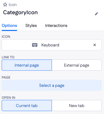
- Icon — the icon name from the library (for example,
AccountCircle). - Link to — Internal page or External page.
- Page — the target page when Link to is Internal page.
- Open in — Current tab or New tab.
Example
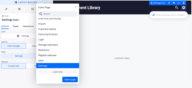
In the top-right corner of a page header, an Icon set to Settings links to a settings page. Open in is set to Current tab so users stay in the same browser tab when they click through.
Image
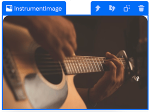
Displays an image. The source can be uploaded directly to the application's file storage or pulled from a URL. An Image can also act as a link.
Options
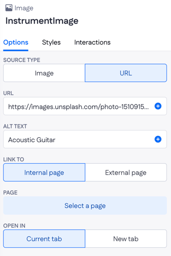
- Source type — Image (upload) or URL.
- URL — the image URL when Source type is URL. Accepts dynamic values, so the source can be bound to a property like
contact.avatar. - Alt text — accessible description of the image. Used by screen readers and search engines.
- Link to — Internal page or External page.
- Page — the target page when Link to is Internal page.
- Open in — Current tab or New tab.
- Display logic — show or hide the Image.
Example
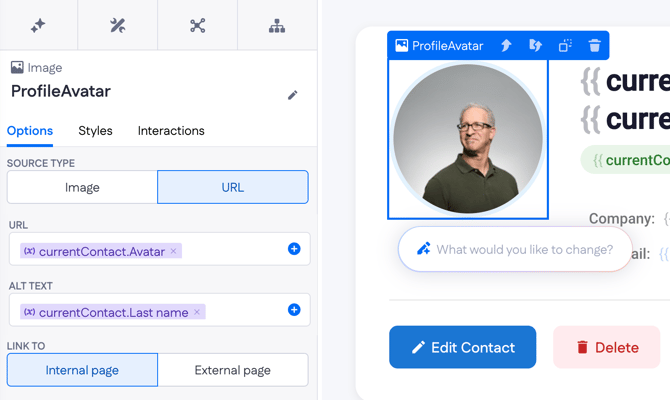
On a contact detail page, an Image displays the contact's profile photo. Source type is set to URL, the URL is bound to contact.avatar, and Alt text is bound to contact.name so each photo announces the right person to screen readers.
Text
Renders text on the page. Content can be static, or bound to a page variable or a property on a record. Text can also act as a link.

Options
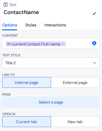
- Content — the text to render. Accepts a mix of static text and dynamic values (for example,
Welcome, {user.name}). - Text style — Title 1, Title 2, Body, and other typography presets that set the size and weight.
- Link to — Internal page or External page. Turns the Text into a link.
- Page — the target page when Link to is Internal page.
- Open in — Current tab or New tab.
- Display logic — show or hide the Text. Supports the Is empty and Is not empty predicates on Text properties, so fallback text can show when a field is blank.
Example
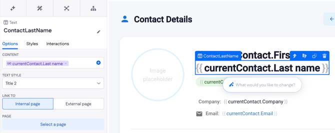
On a contact detail page, two Text components with Text style → Title 2 show the contact's first and last name, bound to currentContact.First name and currentContact.Last name. A smaller Text below them is bound to currentContact.Tag to display the contact's category. Further down, two more Text components show the company and email, each combining a static label ("Company:", "Email:") with a dynamic value from the record.