
A form fieldset is made out of components. These components all look different and have different options depending on what kind of property the component is for. In this article, every type of component and how to use them will be explained.
Auto increment
The auto increment component is shown as a non-editable input field, much like expression properties. How the value is set, depends on the settings in the property.
Checkbox
The checkbox component is shown as a clickable checkbox. After saving the record, it will display as either a Yes or a No.
Date
The date component consists out of 3 dropdown lists. These dropdowns are for the day, month and year of the date property.
Min year: Here you can set the minimum year that can be selected in the dropdown.
Max year: Here you can set the maximum year that can be selected in the dropdown.
Date picker
The date picker component acts like a regular input field. By clicking on the calendar icon, a date picker will pop up. It is also possible to manually enter a date.
Calendar weeks: By selecting the calendar weeks option, the numbers of the weeks will display inside of the date picker.
Date time
The date time component consists out of 5 dropdown lists. These dropdowns are for the day, month, year, hours and minutes of the date time property.
Min year: Here you can set the minimum year that can be selected in the dropdown.
Max year: Here you can set the maximum year that can be selected in the dropdown.
Date time picker
The date time picker component acts like a regular input field. By clicking on the calendar icon, a date picker will pop up, by clicking on the clock inside of the pop-up, you'll switch to a time picker.
Show seconds: By selecting this option it will be possible to also select the seconds inside of the time picker.
Calendar weeks: By selecting this option the numbers of the weeks will display inside of the date picker.
Time
The time component consists of 2 dropdown lists. These dropdowns are for the hours and minutes of the time property.
Show seconds: By selecting this option a third dropdown list will be visible, this list is for the seconds of the time property.
Time picker
The time picker component acts like a regular input field. By clicking on the clock icon a time picker will pop up. It is also possible to enter a time manually.
File
The file component will be shown with a button Add file. By clicking this button your file browser will pop up where you can select the file you want to upload.
Open in new window: By selecting this option, clicking on the file after uploading will open a new tab, depending on your browser the file will be shown or downloaded in this new tab.
Multi file
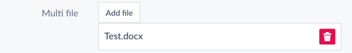
The multi file component looks a lot like the file component at first. The difference between them is that with the multi file component you can, surprise, upload multiple files. After uploading one file it is possible to remove it by clicking on the bin icon.
Open in new window: By selecting this option, clicking on the file after uploading will open a new tab, in this new tab the file will be shown.
Image
The image component acts and looks the same as a file upload, by clicking on the Add image button your file browser will pop where you can select the image to upload.
Display version: With this setting you can choose between the sizes created in the image property. When displaying the image in your form, it will be that chosen size.Popup version: With this setting you can choose between the sizes created in the image property. When clicking on the image, it will be displayed with that chosen size.
Multi image
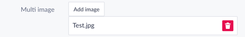
With the multi image component, it is possible to upload multiple images. After uploading an image it is possible to remove it by clicking on the bin icon.
Open in new window: By selecting this option, clicking on the image after uploading will open a new tab, depending on your browser the image will be shown or downloaded in this new tab.
PDF File
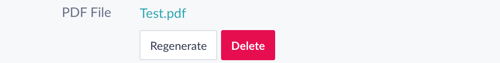
The PDF File component looks the same as the file upload at first, by clicking on the Generate button you will generate a pdf. The generated pdf will be in the format that you have set up in the property settings. Depending on your property settings after generating 2 buttons can be visible. By clicking on the Regenerate button the pdf file will be generated again and by clicking on the Delete button the file will be removed.
Minutes
The minutes component is an input field that doesn't allow text, only numerical values. By clicking on the arrows on the right side the value will become higher or lower. After saving the value will be shown as a Time property, so 260 minutes will be displayed as 04:20 .
Output format: With this option, you can choose in which format you want to display your time. By choosing Digital, the time will be displayed like HH:MM and by choosing Text the time will be displayed like x hours and x minutes . By default, the output format will be Digital.
Integer
The integer component is an input field that doesn't allow text, only numerical values. By clicking on the arrows on the right side the value will become higher or lower.
Decimal
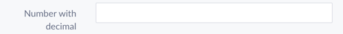
The decimal component works the same as a integer component except that you can add a decimal value to the number. The decimal has to be after a comma to be read correctly.
Price
The price component is an input field that doesn't allow text, only numerical values. On the left, the currency will be displayed.
Text field
The text field component is a regular input field.
Text area
The text area component looks like a text field at first, but what makes this component special, is that it is expandable. You can make the input field bigger or smaller by dragging the bottom right corner.
Max height: Here you can set the maximum size that the input field can expand, the size is measured in pixels.
Html
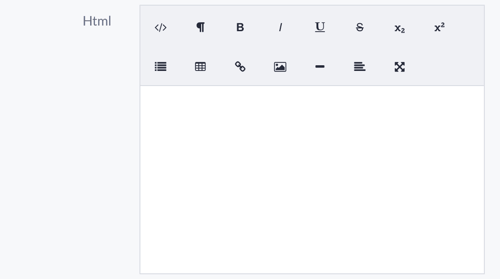
The html component has a rich text editor. In this editor, you can add HTML code, images, tables and much more.
Email address
The email address component works the same as a text field. The field checks if the input value is a valid email address.
Gravatar
The Gravatar component is an additional component that you can use to show a Gravatar. The Gravatar works with an email address component in the same form. When everything is set up correctly the gravatar will be shown.
Phone number
The phone number component works the same as a text field. After saving you can click on the phone number to open your device's preferred calling service.
Url
The Url component works the same as a text field. After saving you can click on the url to open that link in a new tab.
Password
The password component looks the same as text field, the difference between the text field and a password is that the value of a password will be hidden. For each character that is entered a black dot will be shown instead of the character that is entered. This way the password will always stay a secret.
Zipcode
The zipcode component uses the Dutch zipcode format, therefore it has 2 input fields. The first one is for the numbers, it is not possible to write text in this input field. The second one is for the letters, in this field it is not possible to write numbers.
List select
The list select component is a dropdown list. The dropdown list displays all list items that are set on the property. You can choose a list item by clicking on it.
Token input
With the token input, you can search through another model to create a relation between 2 objects. By typing in the text field available options will be displayed. Multiple objects can be chosen for this input.
Source: With the source option you can choose the model that the input searches through. If no source is set the input will use the model of the path.
Filter: Here you can set a filter for the model that the input searches through. Every object that doesn't meet the condition of the filter will not be shown in the results.
Order: By clicking on the set button the Model browser modal will pop up, in this modal you can pick the property that the results will be ordered on.
Order direction: Here you can set the direction of the order that the results will be displayed in. By choosing asc the order will be ascending and by choosing desc the order will be descending.
Limit results: Here you can set the amount of results that will be shown when searching through the model. By default this will be 15.
Radio button group
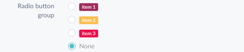
The radio button group component looks a bit different than the other components. It will display all list items that are set on the property. By clicking on a list item that item will be selected.
Alignment: With this option, you can choose how you want to align your radio button group. By choosing horizontal the radio buttons will be displayed horizontally and by choosing vertical the radio buttons will be displayed vertically.
Mutations
The mutations component shows the changes made to certain properties, the component will only work when assigned to a mutation property.