Betty Genius is your assistant built directly into the builder, designed to optimize both the design and logic of your application. It gives you immediate, intuitive control over your page’s front end with two ways to make changes: precise component editing and broader full-page editing.
First steps in Pages
Right after you've generated your application's pages, they will appear in your Pages overview.
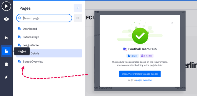
By clicking one of the existing pages, you'll see your page canvas and the page builder menu on the right - this is where your editing practice starts!
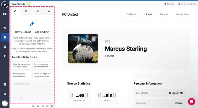
Component editing
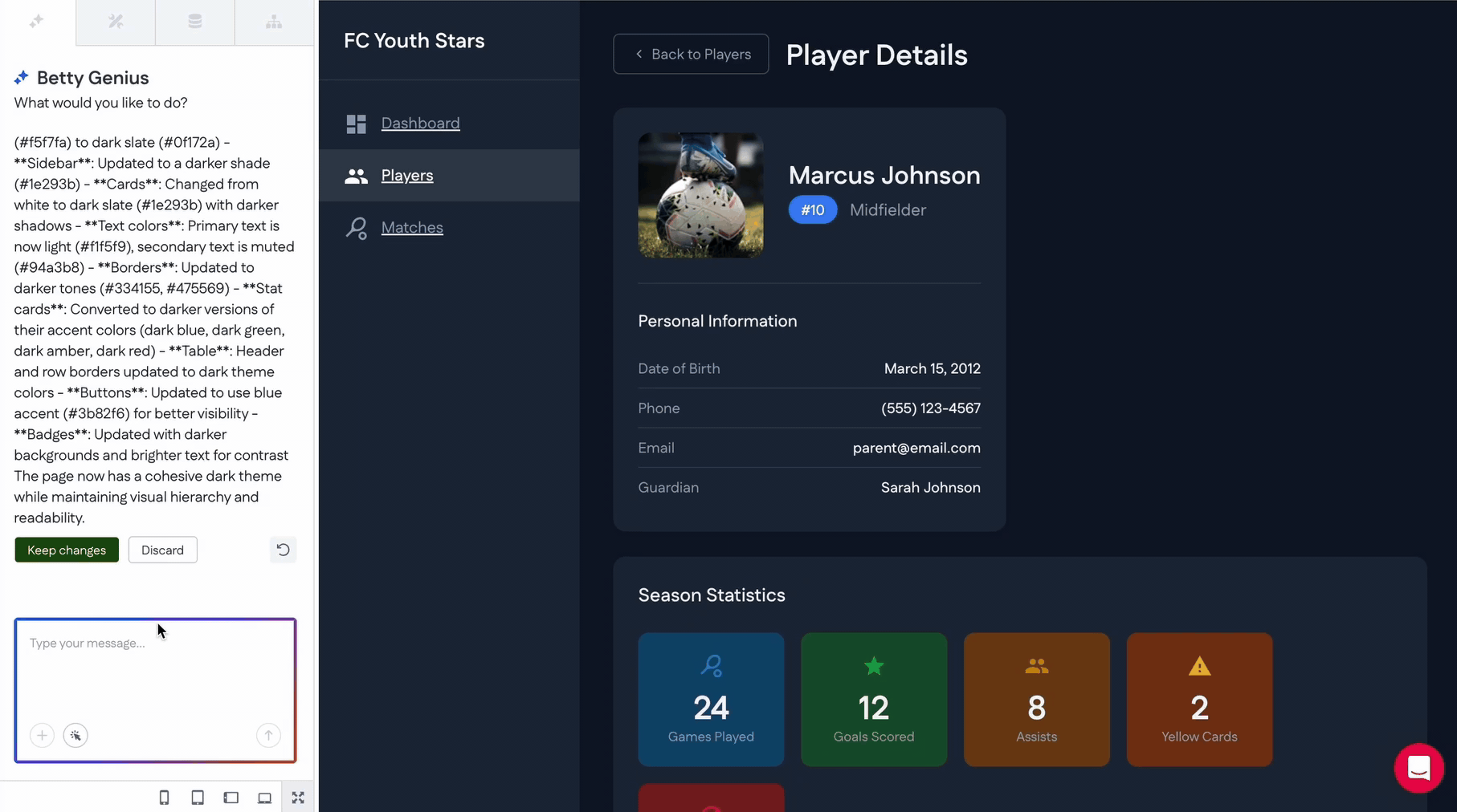
For quick adjustments to specific page components, Betty Genius is available directly on the canvas.
- How it works: Simply click on any component within your page builder
- Interface: A small Betty Genius text box ('What would you like to change?') will appear directly underneath the selected component

- Usage: Type your command to modify that specific element (e.g., "Change the background color to primary blue" or "Make this text bold").
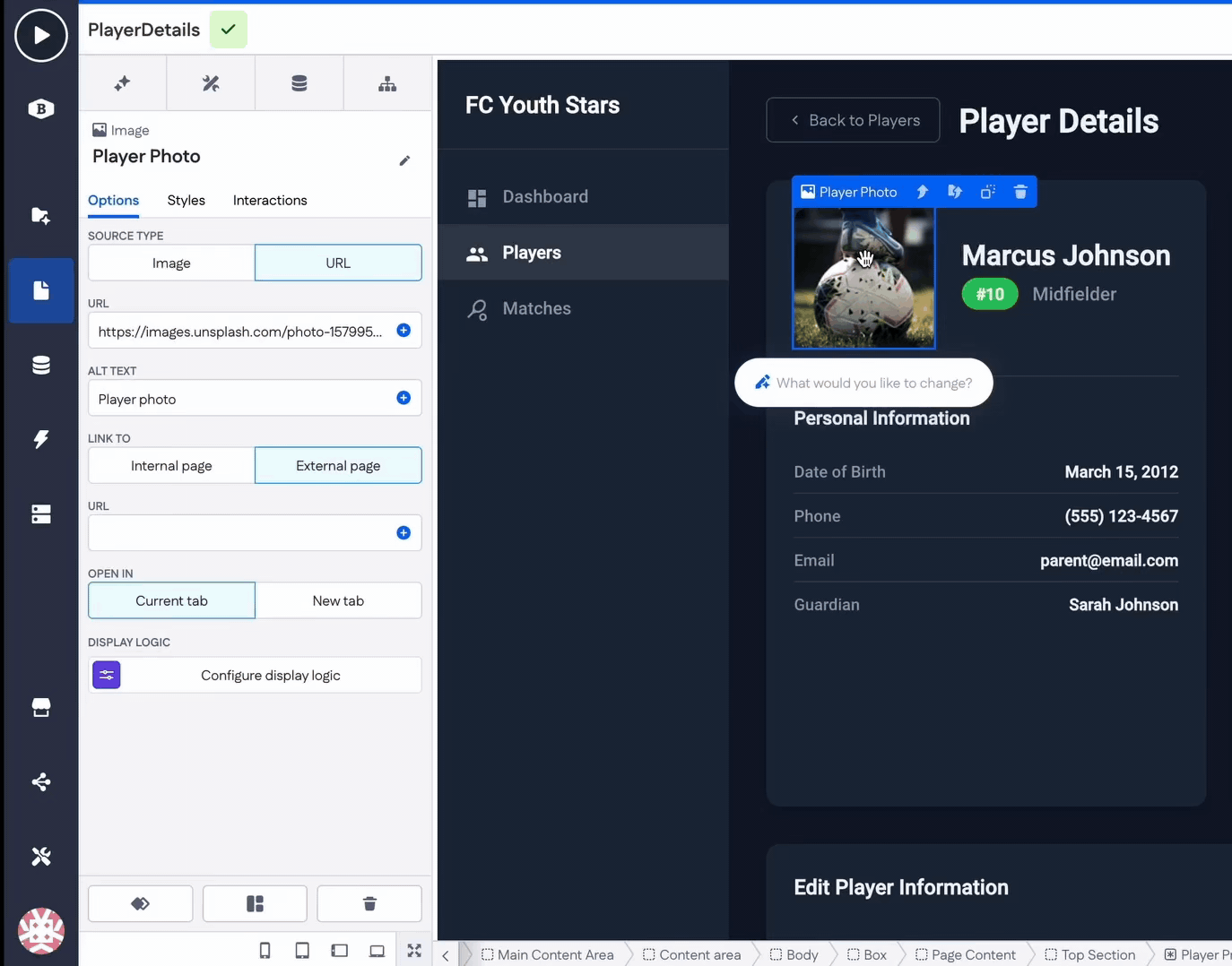
Another way to select a specific page component for editing is by using the small Pick and edit button inside the Type your message field. Click it once to activate selection mode, then click the widget or page component you want to adjust. After that, simply type your prompt describing the change you’d like to make.

Full-page editing
For broader changes, layout overhauls, or complex multi-component instructions, use the dedicated Genius chat.
- How to access: Click the Betty Genius tab located in the top-left corner of the builder
- Interface: This opens a dedicated chat panel where you can chat with Betty Genius about what you would like to be changed on your page
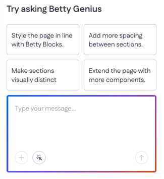
- Usage: Enter a prompt that affects the entire page (e.g., "Rearrange this dashboard to have the metrics at the top and the data table at the bottom").an
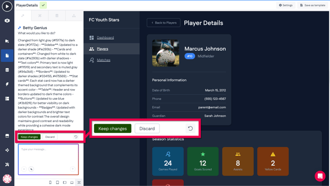
Reviewing your changes
Once the generation is complete, you are given full control to review the output using three specific tools found at the bottom of the chat:
|
Button |
Description |
|
Keep changes |
Accepts the edit and applies the changes to your page. |
|
Discard |
Rejects the edit. The page immediately reverts to exactly how it looked before you entered the prompt. |
|
Compare |
(Represented by a looped arrow). Pressing this button toggles the view between the Before and After states. Use this to spot differences before deciding to keep or discard the changes. |
Adding components manually
Another way to customize your pages is by using the classic Betty Blocks drag-and-drop method. This classic approach lets you manually set up various elements from scratch.
1. To add new components from the default set, go to the Components tab.
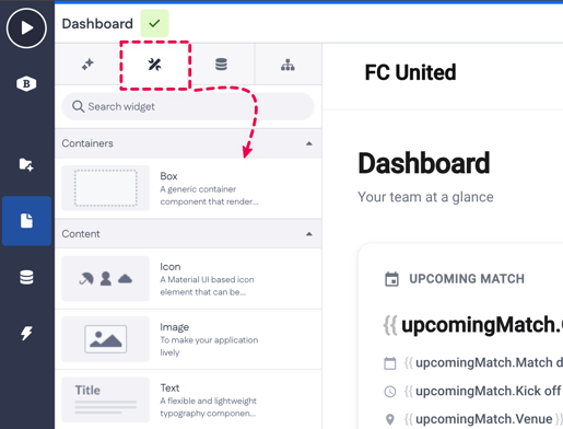
2. Then you can drag the desired component onto your page canvas. For example, we'll add an Image component to the page here:

3. Once added, the component becomes active and you can adjust its settings (1) — for example, choose the image source, add a link to an internal or external page, and more.
You can also return to AI-based editing at any time by entering a prompt in the Betty Genius text box beneath the component (2).

Another example - Form component
Let’s look at another example of manually working with page components to set up a simple flow.
On the page, an upcoming match is already displayed in a list. Next, we want to add a Form component that allows a website admin to create new matches.
1. Start by dragging a Form component onto the page and placing it where it fits best in the layout.
2. Connect the Form to a data model so the submitted input can be stored in the database. In this case, the data model is called Match, which was generated earlier using a prompt.

Note: At the moment, only the Create Form type is available and selected by default. The Edit and Custom types are still under development.
3. Add input components to the Form to make it ready for data entry.
Insert a Text input, a Date input, and a Button inside the Form. This is important because the Form is already linked to the Match model and expects inputs that map to its fields.
.gif?width=670&height=381&name=Screen-Recording-2026-02-09-at-1%20(2).gif)
Component options
Every page component has its own set of options. For example, if you select a Box component on a page, there are such options as:
- Background image – Set a static image or bind it dynamically via data or URL
- URL – Provide the image source when using a data/URL-based background
- Background size – Control how the image is displayed: initial, contain, or cover
- Background position – Define the image alignment (for example, left top)
- Link to – Make the box clickable, linking to an internal or external page
- Open in – Choose whether the link opens in the current tab or a new tab

The available options depend on the type of page component. Most components, however, include a Display logic option that lets you define under which conditions the component is shown.

For example, you can configure the Form to be visible only to users who are marked as Developer.
Keep in mind that our Product team is still expanding the functionality of Betty Genius. You can stay up to date by subscribing to our release notes.
Component styling with CSS
When a component is generated, it already comes with a visual style applied through CSS properties generated from your prompt by AI. You’re not locked into that look: styles can be adjusted at any time, and once you’re happy with the result, you can save it as a reusable component style in other app(s).
Let’s look at how to create and save a new component style straight from Pages. Pick any of the page components from the canvas (or drop a new one). For example, it can be the Button component.
-
Click on the component to select it on a page canvas (1). In its options, head to the Styles tab (2):
-
See the Default style applied
-

-
To start changing styles, go down to CSS Properties and press Add CSS property (3)
-
On the left, you can add a property from existing ones. Start typing the property (like ‘color’, ‘align-items’, ‘border’, etc.), or just click once on the input field to access a CSS properties reference window
-
In the right field, type in the value you want to set for the selected property (e.g., 'red', '12 px', '#dac8ae', etc.)
-
Read more about component styles in Using unified component styles (CSS).
We hope this gives you a solid start on your application-building journey with Betty Blocks. If you’d like a more in-depth walkthrough, you can easily request it via this link: Request demo