Adding fonts to your application
Learn how to use extra fonts in your application's theme builder.
After reading this article you’ll know how to:
-
Install additional font in the theme builder
-
Use fonts for component styling
The Betty Blocks theme builder allows no-code developers to customize their application’s styling to align it with their company’s branding. It includes choosing a color scheme, fonts, typography, icon sizing, spacing, etc. When it comes to picking up the font you want to use, there are two font families to select by default: Roboto and Sans Serif. But what if you would like to set your own fonts, like Ubuntu or Merriweather? The answer is: pretty easy. Let’s try to figure this out in this article.
Adding a new font to the theme builder
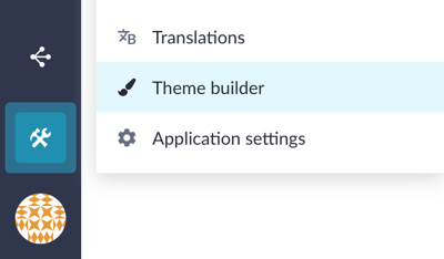
Open the theme builder by going to ‘Tools’ > ‘Theme builder’.
A bit below ‘Colors’, find the ‘Fonts’ section. Here you can define the fonts you want to use within your application. As a default example, you now see the Roboto font in front of you, but as the new fonts get added, you’ll be able to observe them along this font overview section. The default font (Roboto) cannot be deleted or altered yet.
Click on the Add font button on the right.

A new modal window will open, this is where you can upload the required font files. You can upload multiple files at once. The supported formats are ttf, otf or woff. Builders are allowed to add a maximum of five fonts (families) per application and upload up to 5 files to each font.
Note: If you have a font of a different format than mentioned above, use one of the online converters you can find on the web.
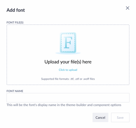
When the file has been uploaded, the font family name is automatically derived from the files. This name will be displayed in the theme builder and in the page builder component options. The upload font will check whether you have added font files that belong to the same font family. Obviously, you can’t mix different font files under the label of one font family.
Press Save when you’ve done adding all the needed files.
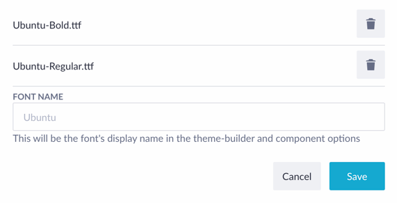
After the fonts have been successfully added, they will be rendered in the fonts overview and you’ll be ready to use them in component styling.

Note: If you are using Google fonts, you also have to upload them as the rest. Later we will enhance the flow of using Google fonts without uploading.
Using a new font in component styling
Now we are ready to have a look at how to use newly uploaded fonts in the component styling. When in the theme builder, scroll down to the ‘Typography’ section. Choose the title, for example, Title 2, and change the Roboto font family to the one you’ve just added, Ubuntu in our case.
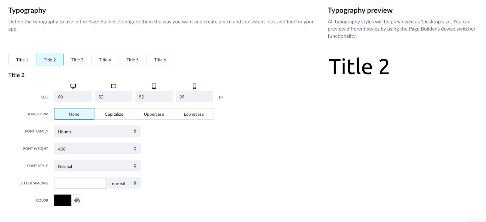
All other features, like font size, weight, color, etc., are customizable as usual, and if you scroll a bit lower, you’ll see basically the same configuration for Body 1 and 2. After you are done configuring, don’t forget to click Save and apply at the top right corner of the theme builder.

Alright, let’s take a look at how it can be applied while working with page components.
Open the page builder and add a text component to the canvas. Click on it once and in the options, choose Title 2.
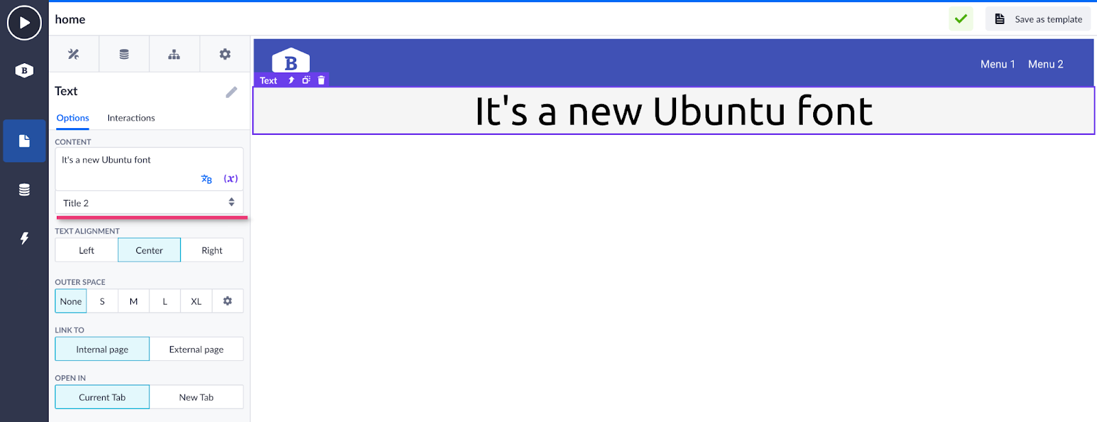
As an example, let’s also add a button component and change its font. Click on the button once to open its options. Then go to the ‘Styles’ tab and scroll down to the font selector. As you can see, we’ve changed it to Ubuntu as well.
